

The Stacking Cards widget by Responsive Addons for Elementor is a trendy content display tool that lets you showcase information in an engaging, layered card format. As users scroll or interact with the page, the cards stack, overlap, or animate smoothly.
This widget can be used for portfolios, services, product highlights, team profiles, or step-by-step processes, where you want to present your content in a clean, intuitive way.

Content Settings
Source
This lets you control where you source the content for the cards.
Items Source: The Items Source option lets you choose what type of items you want to stack. There are two items, namely, Posts and Items.
If you select Posts, then you get multiple options regarding the source:
- Title Source: Here, you can select how the title on your cards appears. You can select sources through which you want to add content to your title by clicking on the + icon.
- Description Source: Here, you can choose the source through which you want to add the description to your card. You can also add more sources by clicking on the +.
- Link Source: You can add the link source in the same way by clicking on the + and selecting from the options in the dropdown.
- Button Text Source: Using the same method, you can add the sources for what you want the button text to be.
- Image Source: By clicking on the + icon, you can select what image you want to display on the cards.
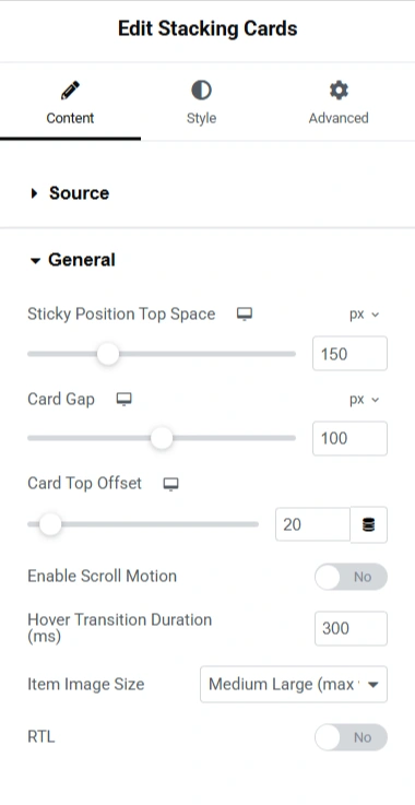
General
- Sticky Position Top Space: You can use the slider to set the gap between the meta and the stacking cards.
- Card Gap: Use the slider to set the gap between the cards
- Card Top Offset: This determines the gap between the stacking cards widget and the content of your post
- Enable Scroll Motion: If you want to add scroll motion to your widget, enable this option.
- Hover Transition Duration:
- Item Image size: If you have an image in your cards and you want to adjust its size, you can make use of the slider.
- RTL: RTL enables you to change the position ot the images and the text from right to left or vice-versa.
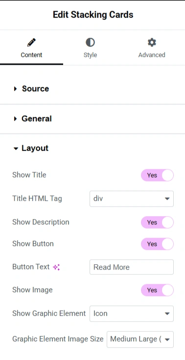
Layout
- Show Title: If you want to show the title on your cards, you can enable this option.
- Title HTML Tag: If you click on the dropdown, you have options to choose the title tag for your cards.
- Show Description: Enable this option if you want to show the description in your cards.
- Show Button: Enable this option if you want to display the button on your cards.
- Button Text: You can add any text you want to display on your buttons in the box given.
- Show Image: Enable this option if you want to display the image on your cards.
- Show Graphic Element: You have an option to display the graphic element on the cards. There are four options, i.e., icon, image, text, and none.
- Graphic Element Image Size: You can select the size of the graphic element in this setting.
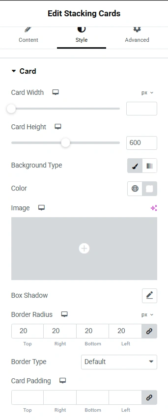
Card
- Card Width: This controls the horizontal size of the card in pixels.
- Card Height: You can control the vertical size of the card.
- Background Type: This setting lets you choose what kind of background the card will have. The options are Classic and gradient.
- Color: If Classic is chosen as the background type, you can select the background colour
- Image: You can upload an image for the background of the card
- Box Shadow: This adds a shadow to the cards.
- Border Radius: This setting rounds the corners of the card
- Border Type: Choose the style of the border, like Solid, Dashed, Dotted, None, and more.
- Card Padding: You can set the spacing inside the card by entering values for top, bottom, right, and left.
Card
- Card Width: This controls the horizontal size of the card in pixels.
- Card Height: You can control the vertical size of the card.
- Background Type: This setting lets you choose what kind of background the card will have. The options are Classic and gradient.
- Color: If Classic is chosen as the background type, you can select the background colour
- Image: You can upload an image for the background of the card
- Box Shadow: This adds a shadow to the cards.
- Border Radius: This setting rounds the corners of the card
- Border Type: Choose the style of the border, like Solid, Dashed, Dotted, None, and more.
- Card Padding: You can set the spacing inside the card by entering values for top, bottom, right, and left.
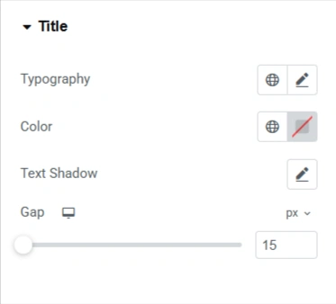
Title
- Typography: Here you can control the typography of the title, i.e., font family, style size, font weight, and so on.
- Color: Sets the title text colour using the color palette.
- Text Shadow: Adds a shadow effect behind the title text.
- Gap: This controls the spacing below the title before the next element
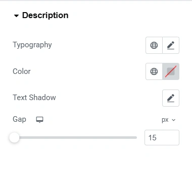
Description
- Typography: Here you can control the typography of the description, i.e., font family, style size, font weight, and so on.
- Color: Sets the description text colour using the color palette
- Text Shadow: Adds a shadow effect behind the title text.
- Gap: This controls the spacing below the description before the next element
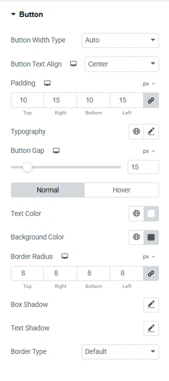
Button
- Button Width Type: You can set the width of the button using this setting. Auto adapts to the text length, full-width stretches to fill the card container, and custom lets you set a fixed width.
- Button Text Align: You can align the text of the button to the right, left, and centre.
- Padding: Defines the space inside the button, between text and button edges.
- Typography: Here you can control the typography of the button text, i.e., font family, style size, font weight, and so on.
- Button Gap: Adjusts the space between the button and other elements above/below it.
- Normal: Here, you can adjust how the button looks if you do not hover on it
- Hover: Here you can adjust how the button looks when you hover on it.
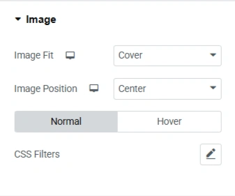
Image
- Image fit: Defines how the image fits into the card. You get options like cover, contain, fill, and none.
- Image Positions: Defines where the image is placed in the card, i.e., centre, left, right, top, and bottom.
- Normal: You can set the CSS style when you’re not hovering over the image.
- Hover: You can set the CSS style when you’re hovering over the image.


