

Responsive Addons for Elementor (RAE) LearnDash Course List is a widget that allows showing the course list in different layout skins with many customizable options.
Content
Layout Settings

- 1.Skins – Layout skins for the widget.
- 2.Layout Mode – Layout mode for the courses in the list. Available options are Grid, Masonry, and Fit To Screen.
- 3.Number of Courses – Number of courses to be displayed in the widget.
- 4.Show course by category – Filter the courses by category.
- 5.Show by course tag – Filter the courses by tag(s).
- 6.Columns – Set the number of columns for the widget.
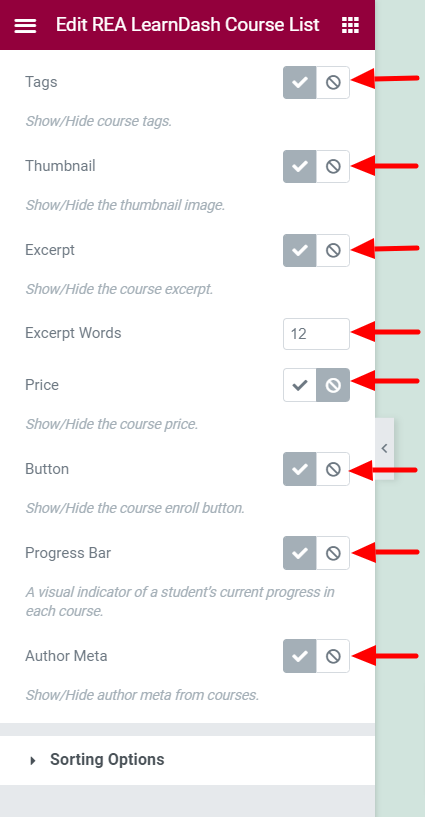
- 7.Tags – Show/Hide the course tags. This setting is available only if Skins is not set to Layout 3.
- 8.Thumbnail – Show/Hide the course thumbnail. This setting is available only if Skins is not set to Layout 3.
- 9.Course Meta – Show/Hide the course meta. This setting is available only if Skins is set to Layout 2.
- 10.Category – Show/Hide the course category. This setting is available only if Skins is set to Layout 3.
- 11.Date – Show/Hide the course date. This setting is available only if Skins is set to either Layout 2 or Layout 3.
- 12.Excerpt – Show/Hide the course excerpt.
- 13.Excerpt Words – Set the limit for the length of the excerpt. This setting is available only if Excerpt is set to Show.
- 14.Price – Show/Hide the course price.
- 15.Button – Show/Hide the course enroll button.
- 16.Progress Bar – Show/Hide the course progress bar.
- 17.Author Meta – Show/Hide the course author meta. This setting is available only if Skins is set to either Default or Layout 1.
Sorting Options

- 1.Course Sorting – Set the field based on which the courses will be sorted.
- 2.Order of Sorting – Set the sorting order. Ascending or Descending.
- 3.My Courses – The courses to be displayed, whether current user’s enrolled or not-enrolled courses.
Style
Card Style
Normal State

- 1.Background Type – Set the background for the cards.
- 2.Border Type – Set the border for the cards.
- 3.Border Radius – Set the border radius for the cards.
- 4.Box Shadow – Set the box shadow for the cards.
- 5.Transition – Set the transition duration for the cards.
Hover State
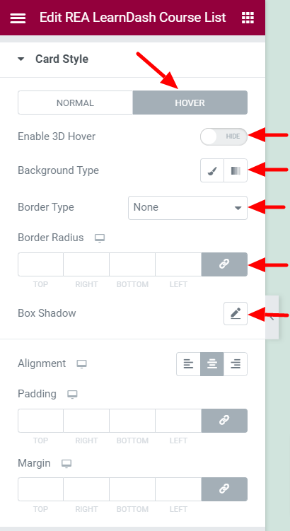
- 1.Enable 3D Hover – Enable/Disable 3D Hover effect for the cards.
- 2.Border Type – Set the border for the cards.
- 3.Border Radius – Set the border radius for the cards.
- 4.Box Shadow – Set the box shadow for the cards.
- 5.Background Type – Set the background for the cards.
Common Settings
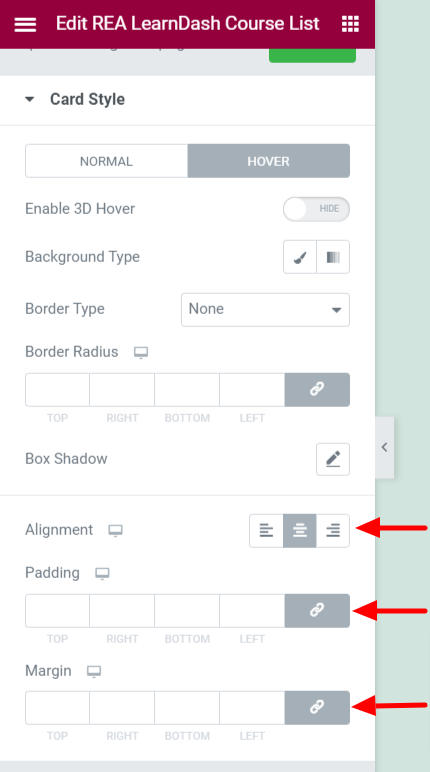
- 1.Alignment – Set the text alignment for the cards.
- 2.Padding – Set the padding for the cards.
- 3.Margin – Set the margin for the cards.
Tags Style

This section is available only if Skins is not set to Layout 3 and Tags is set to Show.
- 1.Typography – Set the typography options for the tags.
- 2.Margin – Set the margin for the tags.
- 3.Color – Set the color for the tags.
- 4.Background Type – Set the background for the tags.
Image Style

This section is available only if Skins is not set to Layout 3 and Thumbnail is set to Show.
- 1.Border Radius – Set the border radius for the image.
- 2.Bottom Space – Set the bottom space for the image.
Color & Typography

Title
- 1.Title Tag – Set the HTML tag for the course title.
- 2.Typography – Set the typography options for the course title.
- 3.Color – Set the color for the course title.
- 4.Margin – Set the margin for the course title.
Content
This section is available only if Excerpt is set to Show.
- 1.Typography – Set the typography options for the course content.
- 2.Color – Set the color for the course content.
- 3.Margin – Set the margin for the course content.
Course Meta & Price
This section is available only if Skins is set to Layout 2.
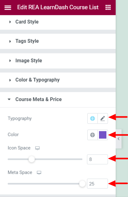
- 1.Typography – Set the typography options for the course meta and price.
- 2.Color – Set the color for the course meta and price.
- 3.Icon Space – Set the spacing for the icon.
- 4.Meta Space – Set the spacing for the meta content.
Price

This section is available only if Skins is not set to Layout 2 and Price is set to Show.
Below settings are available when Skins is not set to Layout 1.
- 1.Background Type – Set the background for the course price.
- 2.Typography – Set the typography options for the course price.
- 3.Color – Set the color for the course price.
- 4.Border Radius – Set the border radius for the course price.
- 5.Size – Set the size for the course price.
Below settings are available when Skins is set to Layout 1.
- 1.Typography – Set the typography options for the price ticker.
- 2.Color – Set the color for the price ticker.
- 3.Position – Set the position for the price ticker.
- 4.Border Radius – Set the border radius for the price ticker.
- 5.Height – Set the height for the price ticker.
- 6.Width – Set the width for the price ticker.
- 7.Background Type – Set the background for the price ticker.
Author Meta
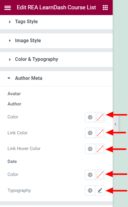
This section is available only if Skins is set to either Default and Layout 1 and Author Meta is set to Show.
- 1.Space Around – Set the space around for the author meta. This setting is available only if Skins is set to Layout 1.
Avatar
This section is available if Skins is set to Layout 1.
- 1.Avatar Size – Set the avatar size.
- 2.Avatar Border Radius – Set the border radius for the avatar.
- 3.Avatar Space – Set the spacing for the avatar.
Author
- 1.Color – Set the text color for the course author.
- 2.Link Color – Set the link color for the course author.
- 3.Link Hover Color – Set the link hover color for the course author.
Date
- 1.Color – Set the text color for the date.
- 2.Typography – Set the typography options for the date.
Button
This section is available only if Button is set to Show.
Normal State
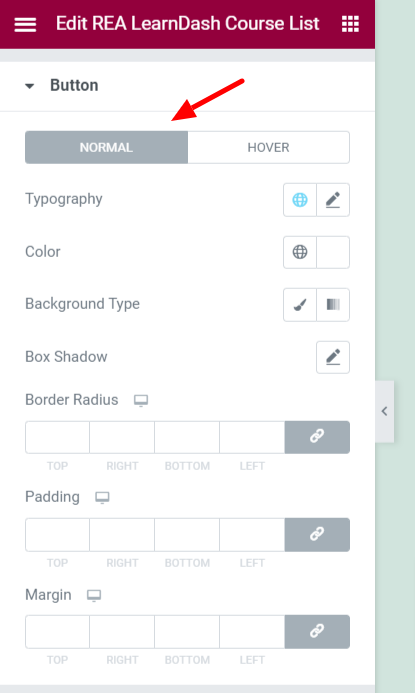
- 1.Typography – Set the typography options for the course to enroll button.
- 2.Color – Set the color for the course to enroll button.
- 3.Background Type – Set the background for the course to enroll button.
- 4.Box Shadow – Set the box-shadow options for the course to enroll button.
- 5.Border Radius – Set the border radius for the course to enroll button.
- 6.Padding – Set the padding for the course to enroll button.
- 7.Margin – Set the margin for the course to enroll button.
Hover State

- 1.Color – Set the color for the course to enroll button.
- 2.Background Type – Set the background for the course to enroll button.
- 3.Box Shadow – Set the box-shadow options for the course to enroll button.
- 4.Transition – Set the transition duration for the course to enroll button.
- 5.Border Radius – Set the border radius for the course to enroll button.
Progress Bar

This section is available only if Progress Bar is set to Show.
- 1.Typography – Set the typography options for the progress bar.
- 2.Label Color – Set the label color for the progress bar.
- 3.Fill Color – Set the fill color for the progress bar.
- 4.Space – Set the spacing for the progress bar.
- 5.Label Alignment – Set the label alignment for the progress bar.
- 6.Enable Steps Label – Enable/Disable the steps label.
- 7.Typography – Set the typography options for the progress bar. This setting is available if Enable Steps Label is Enabled.
- 8.Label Color – Set the label color for the progress bar. This setting is available if Enable Steps Label is Enabled.
- 9.Space – Set the spacing for the progress bar. This setting is available if Enable Steps Label is Enabled.


