
↓ Skip to Main Content
Cyberchimps Logo

Main Navigation

  • Pro
  • Starter Templates
    • Free Templates
    • Premium Templates
  • Pricing
  • Login
Get Started
Cyberchimps Logo

Off Canvas Menu

  • Pro
  • Starter Templates
    • Free Templates
    • Premium Templates
  • Pricing
  • Login

Installation & Updates

1
  • How to Install & Activate the Responsive Addons for Elementor

Widgets

91
  • Animations Extension
  • RAE Duplicator
  • Product Related
  • RAE Product Data Tabs
  • Stacking Cards
  • Before After Image Slider
  • Image Gallery
  • Advanced Tabs
  • Archive Posts
  • Archive Title
  • Audio Player
  • Author Box
  • Banner
  • Breadcrumbs
  • Business Hour
  • Button
  • Contact Form 7 Styler
  • Call To Action
  • Custom Add To Cart
  • Content Switcher
  • Countdown
  • Facebook Feed
  • ย Data Table
  • Divider
  • Dual Color Header
  • FAQ
  • FlipBox
  • Featured Image
  • Feature List
  • Fancy Text
  • Icon Box
  • Gravity Forms Styler
  • Google Map
  • Image Hotspot
  • LearnDash Course List
  • Lottie
  • Logo Carousel
  • Mailchimp Styler
  • Login & Register
  • Media Carousel
  • Menu Cart
  • Modal Popup
  • MultiButton
  • Nav Menu
  • OffCanvas
  • Portfolio
  • Post Comments
  • Post Content
  • Post Excerpt
  • Post Info
  • Post Navigation
  • Post Title
  • Posts
  • Post Carousel
  • Price Box
  • Price List
  • ย Pricing Table
  • Product Carousel
  • Product Category Grid
  • Products
  • Progress Bar
  • Reviews
  • Search Form
  • Site Logo
  • Slider
  • Sticky Section
  • Sticky Video
  • Table of Contents
  • Team Member
  • Testimonial Slider
  • Theme Builder
  • Timeline
  • Twitter Feed
  • Video
  • WooCommerce Breadcrumbs
  • WP Forms Styler
  • One Page Navigation
  • Content Ticker
  • Woo Checkout
  • Back to Top
  • Particle Backgrounds for Elementor
  • Product Price
  • Product Image
  • Product Stock
  • Product Upsells
  • Product Meta
  • Product Title
  • Product Rating
  • Product Content
  • Product Short Description
  • Product Additional Information
View Categories
  • Home
  • Docs
  • Responsive Addons For Elementor
  • Widgets
  • Call To Action

Call To Action

The REA Call to Action Widget is a tool for creating beautiful boxes that combine an image, some text, and a button.

action widget

REA Call To Action

Content

Image

setting of image
  1. 1.Skin: Choose either the Classic skin or the Cover skin.
  2. 2.Position: (Only shown for Classic skin) Select position as left, center, or right.
  3. 3.Choose Image: Select Image for the widget.

Content

settings
  1. 1.Graphic Element: Choose between None, Image, or Icon to display a graphical Element above the Call to Action title. If Image is selected as the Graphic Element: Choose Image: Select or upload an image. Image Size: Set the size of the image, from thumbnail to full, or set a custom size. If Icon is selected as the Graphic Element: Icon: Select an icon from the FontAwesome library. View: Choose the default icon view, or select Stacked or Framed.
  2. 2.Title & Description: Choose the title and description that appears in the front of the flip box.
  3. 3.Title HTML Tag: Set the titleโ€™s HTML tag to H1- H6, Div, or Span.
  4. 4.Button Text: Enter the text to be displayed on the button.
  5. 5.Link: Enter the URL for the buttonโ€™s link. Click the Link Options cog to either add rel=nofollow to the link or to open the link in a new window.

Ribbon
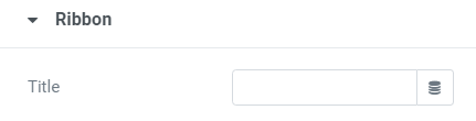
ribbon
  1. 1.Title: Enter the text to be displayed on the ribbon.

Style

Box

style
  1. 1.Background Color: Choose a background color for the entire box.
  2. 2.Min. Height: Set the minimum height of the entire box.
  3. 3.Alignment: Align the content to the left, center, or right of the box.
  4. 4.Vertical Position: Align the content to the top, center, or bottom of the box.
  5. 5.Padding: Set the padding for the content.
  6. 6.Image
    1. 1.Min. Width: Set the minimum width for the image.
    2. 2.Min. Height: Set the minimum height for the image.

Graphic Element

graphic element
  1. 1.Spacing: Spacing around the graphic element.
  2. 2.Primary Color: Select color for the graphic element.
  3. 3.Icon Size: Select the size of the icon.

Content

styles
  1. 1.Title
    1. 1.Typography: Set the typography options for the title.
    2. 2.Spacing: Set the amount of space between the title and description.
  2. 2.Description
    1. 1.Typography: Set the typography options for the title.
    2. 2.Spacing: Set the amount of space between the description and the button.
  3. 3.Colors > Normal/Hover State
    1. 1.Background Color: Choose the background color.
    2. 2.Title Color: Choose the title color.
    3. 3.Description Color: Choose the description color.
    4. 4.Button Color: Choose the button color.

Button

button
  1. 1.Size: Select the button size, from Extra Small to Extra Large.
  2. 2.Border Width: Set the border width.
  3. 3.Border Radius: Set the border radius to control corner roundness.
  4. 4.Text Color (Normal & Hover): Choose the color for the buttonโ€™s text.
  5. 5.Background Color (Normal & Hover): Choose the color for the buttonโ€™s background.
  6. 6.Border Color (Normal & Hover): Choose the color for the buttonโ€™s border.

Ribbon

colour of ribbion
  1. 1.Background Color: Choose the color for the ribbonโ€™s background.
  2. 2.Text Color: Choose the color for the ribbonโ€™s text.
  3. 3.Distance: Move the slider between 0-50 to set the distance for the ribbon.
  4. 4.Typography: Set the typography options for the ribbonโ€™s title.
  5. 5.Box Shadow: Set the box-shadow settings for the ribbon.

Hover effects

hover effects
  1. 1.Sequenced Animation: Choose if the animation for the text elements appears sequenced or all at once.
  2. 2.Hover Animation: Choose the hover animation for the image: Zoom in or out, or move left, right, up or down.

The following items can be set independently for both the Normal and Hover states:

  1. 1.Overlay Color: Choose the overlay color for the image.
  2. 2.CSS Filters: Set blur, brightness, contrast and saturation for the image.
  3. 3.Blend Mode: (For Normal state) Set a blend mode.
  4. 4.Transition Duration (ms): (For Hover state) Set the duration for the hover effect.
Updated on February 26, 2025

What are your Feelings

  • Happy
  • Normal
  • Sad

Share This Article :

  • Facebook
  • X
  • LinkedIn
  • Pinterest
Contact Form 7 StylerCustom Add To Cart

Our Products

Responsive Pro

Responsive Addons for Elementor

Starter Templates

Responsive Blocks

WP Legal Pages

GDPR Cookie Consent

Powered by Responsive WordPress theme

Our Products

Responsive Pro

Responsive Addons for Elementor

Starter Templates

Responsive Blocks

WP Legal Pages

GDPR Cookie Consent

Powered by Responsive WordPress theme

Resources

Starter Templates

Responsive Platform

Learn Elementor

Testimonials

Compare Astra/Kadence

TrustPilot

CCPA

Video Tutorials

Resources

Starter Templates

Responsive Platform

Learn Elementor

Testimonials

Compare Astra/Kadence

TrustPilot

CCPA

Video Tutorials

Theme Features

Responsive Features

WooCommerce

Header Footer Builder

Site Builder

Child Theme Generator

Download Free Theme

DFY Website Setup

Theme Features

Responsive Features

WooCommerce

Header Footer Builder

Site Builder

Child Theme Generator

Download Free Theme

DFY Website Setup

Company

About

Pricing

Blog

Brand Assets

Affiliate Program

Contact Us

Terms of Service

GDPR Privacy Policy

GDPR Cookie Policy

Website Design Service

Company

About

Pricing

Blog

Brand Assets

Affiliate Program

Contact Us

Terms of Service

GDPR Privacy Policy

GDPR Cookie Policy

Website Design Service

Support

Login

Whatโ€™s New

Documentation

Request Support

Video Tutorials

Refund Policy

Service

Discount Coupon

Bug Bounty Program

Support

Login

Whatโ€™s New

Documentation

Request Support

Video Tutorials

Refund Policy

Service

Discount Coupon

Bug Bounty Program

Copyright © 2010-2026 CyberChimpsย ย 

Copyright © 2010-2026 CyberChimpsย ย 

Top
Top