
The Responsive Addons for Elementor (RAE) Content Switcher is a widget that allows the user to have two contents with a switching functionality giving the end-user to switch between the two contents with a simple click.

Content
Content 1
- Heading – Allows the user to add a heading for the first content.

- Section – Allows the user to select the type of content/section to be displayed for the first content. Available options are – Content, Saved Section, and Saved Page.
- Content – Allows the user to add the content using a given text editor.
- Select Section – Allows the user to select a section from the available saved sections. This setting is only available if the Section setting is selected to be Saved Section.
- Select Page – Allows the user to select a page from the available saved pages. This setting is only available if the Section setting is selected to be Saved Page.
Content 2
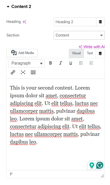

- Heading – Allows the user to add a heading for the second content.
- Section – Allows the user to select the type of content/section to be displayed for the second content. Available options are – Content, Saved Section, and Saved Page.
- Content – Allows the user to add the content using a given text editor.
- Select Section – Allows the user to select a section from the available saved sections. This setting is only available if the Section setting is selected to be Saved Section.
- Select Page – Allows the user to select a page from the available saved pages. This setting is only available if the Section setting is selected to be Saved Page.

Style
Switcher

- Default Display – Allows the user to select which content should be displayed by default(content 1 or content 2).
- Switch Style – Allows the user to select the switcher style. Available options are Round 1, Round 2, Rectangle and Label Box
- Color 1 – Allows the user to set the background color of the switcher for the first content(depending on the Default Display setting value).
- Color 2 – Allows the user to set the background color of the switcher for the second content(depending on the Default Display setting value).
- Controller Color – Allows the user to set the switcher’s inner controller color.
- Switch Size – This is a responsive control that allows the user to set the switch size for different devices.
Headings
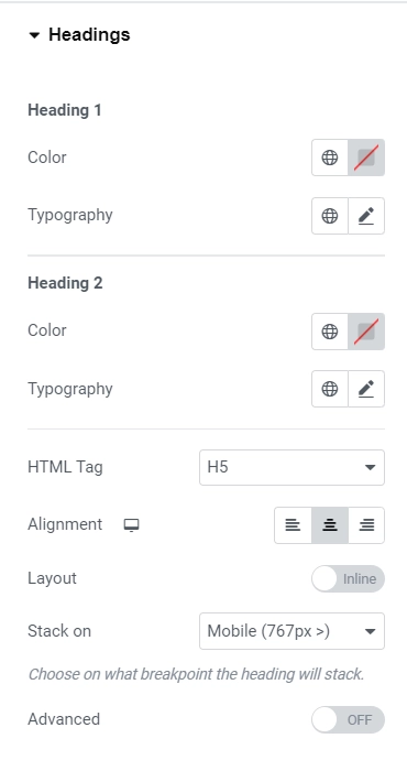
Heading 1
- Color – Allows the user to set the color of the heading for the first content.
- Typography – Allows the user to set the typography of the heading for the first content.
Heading 2
- Color – Allows the user to set the color of the heading for the second content.
- Typography – Allows the user to set the typography of the heading for the second content.
General (Content Setting is set to Heading)
- Advanced: This option allows users to toggle advanced settings for the content headings. When turned on, various additional settings will become available.
- Background Color: This option enables users to set the background color for the content headings.
- Border Type: Users can select the border type of the content headings.
- Width: This responsive control lets users set the border width for the content headings. This setting is only available if the Border Type is something other than None.
- Color: Users can specify the border color for the content headings. This setting is only available if the Border Type is not None.
- Border Radius: Users can set the border-radius of the content headings.
- Padding: This responsive control enables users to set the padding for the content headings.
Content

- Color – Allows the user to set the color of the text for the first content.
- Typography – Allows the user to set the typography of the text for the first content.
Content 2
- Color – Allows the user to set the color of the text for the second content.
- Typography – Allows the user to set the typography of the text for the second content.
General (Content Setting is set to Content)
Below fields are only available when the Section setting is set to content.
- Advanced – Allows the user to turn on/off the advanced settings for the content text. If the advanced setting is turned on then the following settings will be available.
- Background Color – Allows the user to set the background color for the content text.
- Border Type – Allows the user to select the border type of the content text.
- Width – This is a responsive control that allows the user to set the border width for the content text. This setting is only available if the Border Type is other than None.
- Color – Allows the user to set the border color for the content text. This setting is only available if the Border Type is other than None.
- Border Radius – Allows the user to set the border radius of the content text.
- Padding – This is a responsive control that allows the user to set the padding for the content text.
Spacing
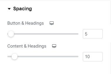
- Button & Headings – This is a responsive control which allows the user to set the spacing between the switcher button and content headings for different devices.
- Content & Headings – This is a responsive control that allows the user to set the spacing between the switcher button and content headings for different devices.


