The Visual Builder That Takes Your Headers to the Next Level
Create modern, user-friendly headers that keep visitors engaged. The Responsive Theme’s Header Footer Builder gives you everything you need to build complex designs with ease – no hassle, no code.

Take Full Control with a 3-Row Header Builder
The Responsive Theme’s Header Builder gives you three flexible rows – Above, Primary, and Below – to craft stunning multi-layered headers. Simply drag and drop elements like menus, logos, and buttons into any row to create rich, dynamic layouts that look great on every device.
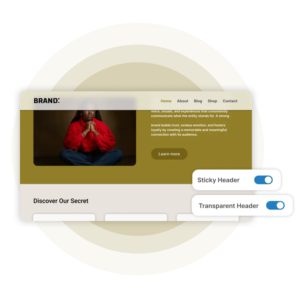
Create Sleek Transparent & Sticky Headers with Ease
Impress visitors with modern transparent headers and smooth navigation. Enable transparent headers with just a click without adding CSS manually. Plus, the Responsive Theme keep lets you create Sticky Headers that stay visible, functional, and beautiful across every scroll without activating any extra plugins.
Design truly mobile-first headers with Responsive.
The Responsive theme’s Header Builder lets you create fully optimized, mobile-specific headers for smaller screens. Customize layouts, spacing, and elements for mobile without impacting your desktop design – so every visitor gets a seamless experience on every device.
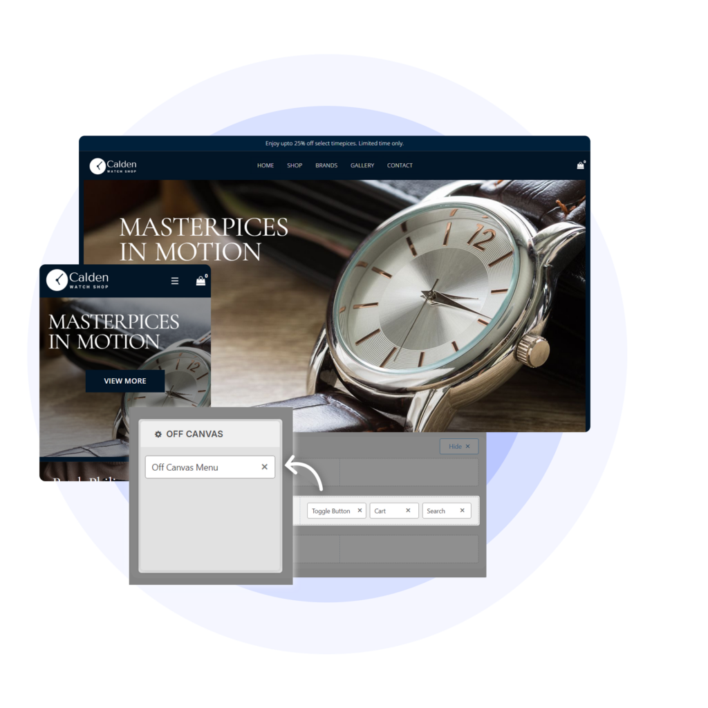
Get Advanced Header Elements in the Header Builder
Unlock powerful drag-and-drop elements to create a perfect header for your website.
Site Logo
Easily add your site logo and adjust its height and width directly from the Customizer without bothering your designers.

Secondary Menu
Make navigation smarter with a secondary menu in your header. A great way to display extra links without cluttering your layouts.

CTA Buttons
Add attention-grabbing buttons to your headers – perfect for highlighting CTAs like Sign Up, Contact, or Shop Now.

Search
Add a smart search bar to your header so visitors can find things fast – keeping them engaged and exploring your site longer.
Create Functional Footers That Keep Visitors Engaged
Design a footer that works hard for you. Drag, drop, and reorder elements to drive clicks, showcase key links, and support your brand.

Get Advanced Footer Features
Without Paying Extra
Explore all the additional features in the footer builder for building your beautiful footer.

Copyright
Add a copyright section to your footer to clearly communicate your site’s legal ownership and rights.

Widgets
Seamlessly integrate custom widgets into your header or footer to showcase extra content and enhance functionality.

Scroll to Top
Add a scroll-to-top button in your footer to help visitors quickly navigate back to the top of your page with ease.