
The Responsive Addons for Elementor (RAE) Post Carousel widget allows you to display your blog posts with Images, Post Titles, Excerpts, and Read More Buttons that slide smoothly.
Content
Query
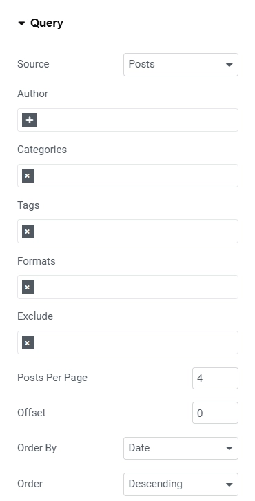
- 1.Source – Choose the source for the content of the Carousel. Default options are Posts, Pages and Manual Selection. Other custom post types are also added.
- 2.Search & Select – Search and add the posts manually for the content of the carousel. This setting is available only if Source is set to Manual Selection.
- 3.Author – Add the authors for which the content will be displayed.
- 4.Categories – Add the categories filter for which the content will be displayed.
- 5.Tags – Add the tags filter for which the content will be displayed.
- 6.Formats – Add the formats filter for which the content will be displayed.
- 7.Exclude – Add the exclude filter for which the content will be displayed.
- 8.Posts Per Page – Set the number of posts to be displayed per page.
- 9.Offset – Set the offset for the posts pagination.
- 10.Order By – Set the parameter for the order by query option.
- 11.Order – Set the parameter for the order query option.
Layout Settings
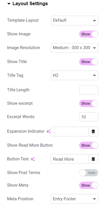
- 1.Template Layout – Set the template layout for the widget.
- 2.Show Image – Show/Hide the image of the carousel items.
- 3.Image Size – Select the image size of the carousel items image.
- 4.Show Title – Show/Hide the title of the carousel items.
- 5.Title Tag – Select the tag for the carousel items’ title.
- 6.Title Length – Set the title length.
- 7.Show Excerpt – Show/Hide the excerpt of the carousel items.
- 8.Excerpt Words – Set the length of the excerpt.
- 9.Expansion Indicator – Set the excerpt expansion indicator.
- 10.Show Read More Button – Show/Hide read more button.
- 11.Button Text – Add the read more button text.
- 12.Show Post Terms – Show/Hide post terms.
- 13.Show Terms From – Select the taxonomy from the where terms to be displayed.
- 14.Max Terms to Show – Select the number of max terms to be displayed.
- 15.Show Meta – Show/Hide meta of the posts.
- 16.Meta Position – Select the position for the meta data of the posts.
- 17.Show Avatar – Show/Hide the author’s avatar of the posts.
- 18.Show Author Name – Show/Hide the author name of the posts.
- 19.Show Date – Show/Hide the published date of the posts.
Carousel Settings

- 1.Effect – Select the carousel effect.
- 2.Visible Items – Set the visible items for the carousel.
- 3.Items Gap – Set the gap between the items.
- 4.Items Height – Set the height of the carousel items.
- 5.Slider Speed – Set the speed of the carousel slider.
- 6.Autoplay – Enable/Disable the autoplay for the carousel.
- 7.Autoplay Speed – Set the autoplay speed for the carousel.
- 8.Pause On Hover – Enable/Disable pause-on-hover property for the carousel.
- 9.Infinite Loop – Enable/Disable infinite loop property for the carousel.
- 10.Grab Cursor – Enable/Disable grab cursor property for the carousel.
- 11.Arrows – Enable/Disable arrows for the carousel navigation.
- 12.Dots – Enable/Disable dots for the carousel navigation.
Marquee Settings
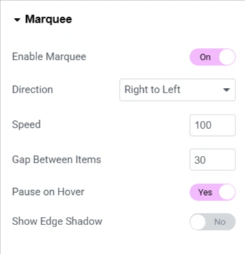
- Enable Marquee – Toggle on to enable the marquee scrolling effect.
- Direction – Select the transition direction for the carousel.
- Speed – Set the carousel transition speed.
- Gap Between Items – Set the gap between items in the carousel.
- Pause on Hover – Stop the scrolling animation when a visitor hovers over the marquee.
- Show Edge Shadow – Displays a subtle shadow at the edges to indicate that the content is continuously scrolling.
Links

Image
- 1.No Follow – Enable/Disable no follow for the image link.
- 2.Target Blank – Enable/Disable target blank for the image link.
Title
- 1.No Follow – Enable/Disable no follow for the title link.
- 2.Target Blank – Enable/Disable target blank for the title link.
Read More
- 1.No Follow – Enable/Disable no follow for the read more link.
- 2.Target Blank – Enable/Disable target blank for the read more link.
Style
Post Style

- 1.Select Style – Select the style for the post items.
- 2.Use Gradient Background? – Enable/Disable to use gradient background for the posts.
- 3.Post Background Color – Set the background color for the posts.
- 4.Border Type – Set the border style for the posts.
- 5.Border Radius – Set the border radius for the posts.
- 6.Box Shadow – Set the box shadow for the posts.
Hover Style
- 1.Background Type – Set the background type for the posts.
Thumbnail Style

- 1.Post Hover Icon – Choose the icon to be displayed when hovering over a post.
- 2.Hover Style – Select the hover effect for the post thumbnail.
- 3.Use Gradient Background? – Enable/Disable to use gradient background for the posts thumbnail.
- 4.Thumbnail Overlay Color – Set the thumbnail overlay color.
- 5.Border Radius – Set the border radius for the post thumbnail.
- 6.Margin – Set the margin for the post thumbnail.
Read More Button Style
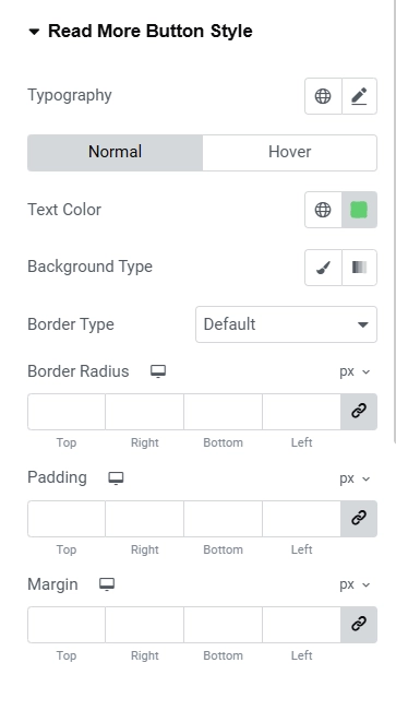
- 1.Typography – Set the typography for the read more button.
- 2.The following controls are for Normal and Hover state:
- Text Color – Set the text color for the read more button.
- Background Type – Set the background type for the read more button.
- Border Radius – Set the border radius for the read more button.
- 3.Padding – Set the padding for the read more button.
- 4.Margin – Set the margin for the read more button.
Color & Typography

Title Style
- 1.Title Color – Set the color of the title text.
- 2.Title Hover Color – Set the hover color of the title text.
- 3.Title Alignment – Set the alignment of the title text.
- 4.Typography – Set the typography of the title text.
- 5.Margin – Set the margin of the title text.
Excerpt Style
- 1.Excerpt Color – Set the color of the excerpt text.
- 2.Excerpt Alignment – Set the alignment of the excerpt text.
- 3.Typography – Set the typography of the excerpt text.
- 4.Margin – Set the margin of the excerpt text.
Terms Style
- 1.Terms Color – Set the color of the terms text.
- 2.Meta Typography – Set the typography of the terms text.
- 3.Margin – Set the margin of the terms.
Meta Style

- 1.Meta Color – Set the color of the meta data.
- 2.Meta Alignment – Set the alignment of the meta data.
- 3.Meta Typography – Set the typography of the meta data.
- 4.Margin – Set the margin of the meta data.
Meta Position

- 1.Position – Select the position of the meta data. If the position is selected to be Absolute then the below controls will be displayed.
- 2.Horizontal Orientation – Set the horizontal orientation of the meta data.
- 3.Offset – Set the horizontal offset value of the meta data.
- 4.Vertical Orientation – Set the vertical orientation of the meta data.
- 5.Offset – Set the vertical offset value of the meta data.
Arrows

This section is available only if Arrows is set to Yes under Content > Carousel Settings.
- 1.Choose Arrow – Select the arrow type.
- 2.Arrows Size – Set the arrows size.
- 3.Arrow Position – Set the arrows’ vertical position.
- 4.Align Left Arrow – Aligns the left arrow horizontally.
- 5.Align Right Arrow – Aligns the right arrow horizontally.
- 6.Padding – Set the padding for the arrows.
Normal State
- 1.Background Color – Set the background color for the arrows.
- 2.Color – Set the color for the arrows.
- 3.Border Type – Choose the border type for the arrows. If the value chosen is not None then Border Width and Border Color settings will be available.
- 4.Border Radius – Set the border radius for the arrows.
Hover State
- 1.Background Color – Set the background color for the arrows.
- 2.Color – Set the color for the arrows.
- 3.Border Color – Set the border color for the arrows.
Dots

This section is available only if Pagination is set to Yes under Content > Carousel Settings.
- 1.Position – Choose the position of the dots. Whether they should be Inside or Outside.
- 2.Use Custom Width/Height? – Enable/Disable for custom width and height controls of the pagination dots.
- 3.Size – Set the size of the dots.
- 4.Spacing – Set the spacing between the dots.
Normal State
- 1.Color – Set the color of the dots.
- 2.Border Type – Choose the border type for the dots. If the value chosen is not None then Border Width and Border Color settings will be available.
- 3.Border Radius – Set the border radius for the dots.
- 4.Padding – Set the padding for the dots. Only top and bottom padding is editable.
Hover State
- 1.Color – Set the color for the dots.
- 2.Border Color – Set the border color for the dots.
Dots Active Style
- 1.Color – Set the color for the active dot.
- 2.Width – Set the width for the active dot.
- 3.Height – Set the height for the active dot.
- 4.Border Radius – Set the border radius for the active dot.
- 5.Shadow – Set the shadow for the active dot.


