
The Responsive Addons for Elementor (RAE) Pricing Table widget allows you to create modern, advanced price tables that display your products.
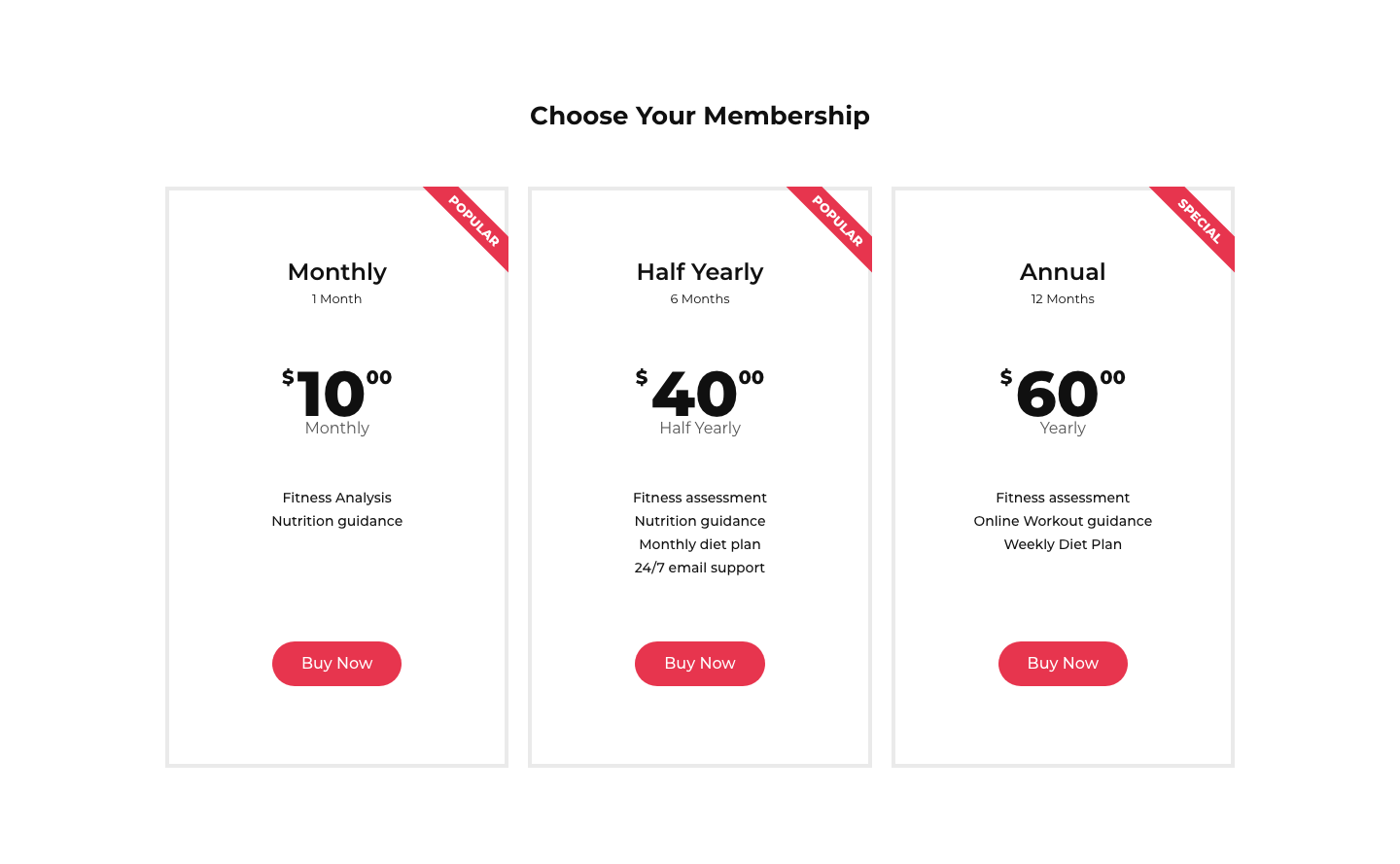
Content
Header

- 1.Title: Enter the title of the specific price plan.
- 2.Description: Enter the description that appears below the title.
- 3.Title HTML Tag: Set the Title’s tag, choosing from H2 – H6.
Pricing

- 1.Currency Symbol: Choose the main currencies, or choose a custom symbol.
- 2.Price: Set the exact pricing of your product or service, including cents
- 3.Currency Format: Choose the thousands separator format.
- 4.Sale: Switch this on to display the original price with a strikethrough and the new sale price.
- 5.Period: Enter text for the period of time for each payment that appears under the price.
Features

List Items
A list of all the features you are offering appears here. You can drag and drop them to change their order. Click on the Add Item button to add another item to the list or click on the cross icon to delete a list. Each item has separate settings available. By clicking on each item, you can customize its settings:
- 1.Text: Enter the description of the feature.
- 2.Icon: Choose from a list of Font Awesome icons or upload an SVG.
- 3.Icon Color: Choose a color for the icon.
Footer

- 1.Button Text: Write the text that will appear on the button.
- 2.Link: Enter the URL for the item’s link. Click the Link Options to either add rel=nofollow to the link or to open the link in a new window.
- 3.Additional Info: Include a line of additional info below the button.
Ribbon

- 1.Show: Show or hide a corner ribbon.
- 2.Title: Enter the text to be displayed on the ribbon.
- 3.Position: Display the ribbon on the top left or top right of the pricing table.
Style
Header

- 1.Background Color: Choose the background color for the top section of the widget.
- 2.Padding: Choose the padding for the heading.
Title
- 1.Color: Choose any color for the main title.
- 2.Typography: Change the title typography.
Sub Title
- 1.Color: Choose any color for the sub-title.
- 2.Typography: Change the sub-title typography.
Pricing

- 1.Background Color: Choose a background color for the pricing area.
- 2.Padding: Change the padding of the pricing area.
- 3.Color: Choose the color of the price.
- 4.Typography: Set the typography options for the pricing area.
Currency Symbol
- 1.Size: Change the size of the currency symbol.
- 2.Position: Display the currency symbol to the left or right of the price.
- 3.Vertical Position: Set the currency symbol to display at the top, middle, or bottom of the price.
Fractional part
- 1.Size: Set the size of the fractional part of the price.
- 2.Vertical Position: Set the fractional part to display at the top, middle, or bottom of the price.
Period
- 1.Color: Choose the color of the text of the time period.
- 2.Typography: Set the typography options for the text of the time period.
- 3.Position: Set the time period below or beside the price.
Features

- 1.Background Color: Choose the background color of the features list.
- 2.Padding: Customize the padding of the features list.
- 3.Color: Choose the color of the features list text.
- 4.Typography: Set the typography options for the features list text.
- 5.Alignment: Align the list to the right, left, or center.
- 6.Width: Set the width of the features list.
Divider
- 1.Style: Choose the features list divider style, from solid, dotted, double, or dashed.
- 2.Color: Choose the color of the divider.
- 3.Weight: Set the thickness of the divider.
- 4.Width: Set the width of the divider.
- 5.Gap: Set the distance between the divider and the featured item.
Footer

- 1.Background Color: Choose the background color of the footer area.
- 2.Padding: Set the padding of the footer area.
Button
- 1.Size: Choose from 5 button sizes.
- 2.Text Color: Choose the color of the button’s text.
- 3.Typography: Set the typography options for the button’s text.
- 4.Background Color: Choose the background color of the button.
- 5.Border Type: Select the border type, from none, solid, double, dotted, dashed, or grooved.
- 6.Border Radius: Set the border radius of the button to control corner roundness.
- 7.Text Padding: Set the distance between the button text and the border.
Additional Info
- 1.Color: Choose the color for additional info text.
- 2.Typography: Set the typography options for the Additional Info text.
- 3.Margin: Select margins for additional info.
Ribbon

- 1.Background Color: Choose the background color of the ribbon.
- 2.Distance: Control the distance between the ribbon and the corner.
- 3.Text Color: Choose the color of the ribbon’s text.
- 4.Typography: Set the typography options for the ribbon’s text.
- 5.Box Shadow: Add a box shadow effect to the ribbon.


