
Responsive Addons for Elementor (RAE) Media Carousel allows you to create carousels and sliders that beautifully showcase your images and videos.
Content
The widget comes with 3 types of skins-
- Carousel.
- Slideshow.
- Coverflow.

Carousel of images
Slides

Skin – Carousel
- Carousel – It is a carousel skin that showcases a customizable number of images and videos.
- Skin: Carousel.
- Slides: You can choose the image or video and set the custom URL to link to.
- Effect: You can choose slide transitions – Slide, Fade, Cube.
- Slides Per View: Set the number of slides to view at one time, maximum allowed is 10.
- Slides to Scroll: Set the number of slides to scroll per swipe at one time, maximum allowed is 10.
- Height: You can set the height of the carousel.
- Width: You can set the width of the carousel.

Skin – Slideshow
- Slideshow – It is a slider skin that displays the primary slide and number of small thumbnail images.
- Skin: Slideshow.
- Slides: You can choose the image or video and set the custom URL to link to.
- Effect: You can choose slide transitions – Slide, Fade, Cube.
- Height: You can set the height of the carousel.
- Thumbnails:
- Slides Per View: Set the number of slides to view at one time, maximum allowed is 10.
- Ratio: You can set the thumbnail ratio to 1:1, 4:3, 16:9, or 21:9.
- Centered Slides: To center the slides, enable this option.

Skin – Coverflow
- Coverflow – It is a slider skin that displays the main slide in the front side and other slides in the back side.
- Skin: Coverflow.
- Slides: You can choose the image or video and set the custom URL to link to.
- Slides Per View: Set the number of slides to view at one time, maximum allowed is 10.
- Slides to Scroll: Set the number of slides to scroll per swipe at one time, maximum allowed is 10.
- Height: You can set the height of the carousel.
- Width: You can set the width of the carousel.
Marquee Settings
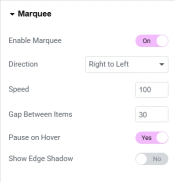
- Enable Marquee – Toggle on to enable the marquee scrolling effect.
- Direction – Select the transition direction for the carousel.
- Speed – Set the carousel transition speed.
- Gap Between Items – Set the gap between items in the carousel.
- Pause on Hover – Stop the scrolling animation when a visitor hovers over the marquee.
- Show Edge Shadow – Displays a subtle shadow at the edges to indicate that the content is continuously scrolling.
Style
Slides

- Space between – You can set the space between the slides.
- Background color – You can set the background color for the carousel.
- Border Size: You can control the size of the border.
- Border Color: You can control the color of the border.
- Padding: Set the padding for the carousel.
- Border Radius: Set the border radius to carousel.
Lightbox

- Color: Choose the background color for the Lightbox.
- UI Color: Choose the UI Color. This affects the arrow and dot navigations and the (X) closing icon for the Lightbox.
- UI Hover Color: Choose the UI hover color. This affects the Lightbox arrow and dot navigations and the (X) closing icon when the user hovers over each.
- Video Width: Set the width of the video for the Lightbox.


