The Responsive Addons for Elementor product upsells widget allows you to add cross-sells of complementary products to help increase average order value and provide personalized recommendations to your customers.
How to Add the RAE Product Upsells Widget? #
To add the Elementor Product Upsells widget on your product page, follow these simple steps:
- Go to WordPress Dashboard > Pages > Add New Page.

- Click the Edit with Elementor button to add the Product Upsells widget.

- Search by RAE Upsells and use the widget that has the RAE Badge.
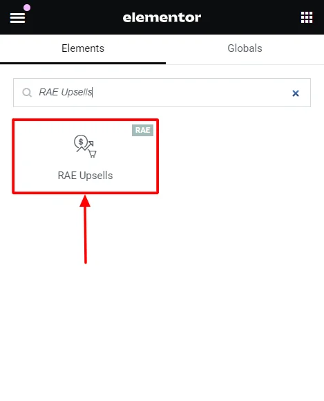
- Drag and drop the RAE Upsells widget onto your product page.
How to Customize the RAE Product Upsells Widget? #
The RAE product Upsells widget allows you to customize the content and style of the widget. Upon adding the product stock widget, it allows you to edit the following parts:
Content #
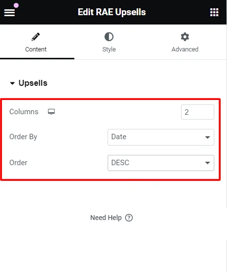
Under the widget content options, you can edit the following:
- Columns: Select the number of columns to display for the upsells.
- Order By: Display the order and category of the content based on data, title, price, popularity, rating, random or menu order.
- Order: Select an order of display among ascending (ASC) or descending (DESC) for the upsells.
Style #
Under the widget styling options, you can edit the following:
Products #

- Columns Gap: Adjust the horizontal spacing between columns of products.
- Rows Gap: Adjust the vertical spacing between rows of products.
- Alignment: Set the alignment of the products within their container (left, center, right).
- Image:
- Border Type: Define the border style around each product image (solid, dashed, dotted, etc.).
- Border Radius: Adjust the product image border radius to round the corners.
- Spacing: Set the spacing between the product image and its border.
- Title:
- Color: Set the color of the product title text.
- Typography: Adjust the font family, size, weight, style and other typographic settings for product titles.
- Spacing: Control the spacing around the product title.

- Rating:
- Star Color: Sets the color of the filled stars in product ratings for reviewed products.
- Empty Star Color: Set the color of the unfilled stars in product ratings.
- Star Size: Adjust the size of the star icons in the ratings.
- Spacing: Control the spacing around the rating stars.
- Price:
- Color: Set the color of the product price text.
- Typography: Adjust the font style, size, weight, and other typographic settings for the product price.
- Regular Price:
- Color: Set the color of the regular price text (usually shown when a discount is applied).
- Typography: Adjust the font style, size, weight, and other typographic settings for the regular price.

- Button:
- Text Color: Set the color of the text on the button in normal and hover states.
- Background Color: Change the background color of the button in normal and hover states.
- Border Color: Define the border color of the button in normal and hover states.
- Typography: Adjusts the font style, size, weight, and other typographic settings for button text. (Can be adjusted only if the button is in normal state)
- Border Type: Defines the style of the button border (solid, dashed, dotted, etc.).
- Border Radius: Adjust the border-radius to round the corners of the button for a softer look.
- Text Padding: Sets the inside spacing between texts in the button.
- Spacing: Adjust the spacing of the button.
- Automatically Align Buttons: Toggle for automatic alignment of the button.
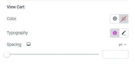
- View Cart:
- Color: Change the color of the “View Cart” button.
- Typography: Adjust the font style, size, weight, and other typographic settings for the “View Cart” button.
- Spacing: Control the spacing around the “View Cart” button.
Box #
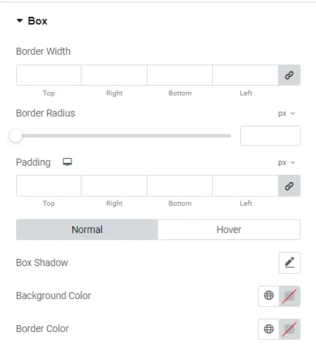
- Border Width: Set the width of the border around each product box.
- Border Radius: Adjust the border-radius to round the corners of the product box.
- Padding: Adjust the inner spacing of the product box.
- Box Shadow: Add a shadow effect around the product box for depth.
- Background Color: Set the background color of the product box.
- Border Color: Define the color of the border around the product box.
Sale Flash #
Sale Flash: Toggle to show a flash sale of products that will further allow you to edit:
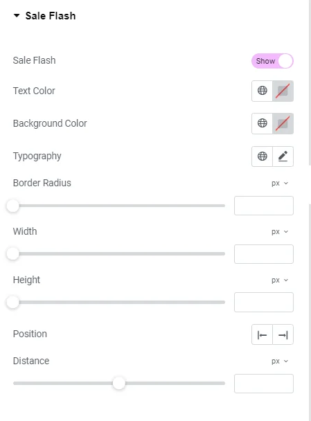
- Text Color: Change the content color within the sale flash texts.
- Background Color: Changes the background color of the sale flash label.
- Typography: Adjusts the font style, size, weight, and other typographic settings for the sale flash text.
- Border Radius: Adjusts the border-radius to round the corners of the sale flash label for a softer look.
- Width: Set the width of the sale flash label.
- Height: Set the height of the sale flash label.
- Position: Determine the position of the sale flash label on the product image.
- Distance: Set the distance of the sale flash label from the edges of the product image.
Heading #
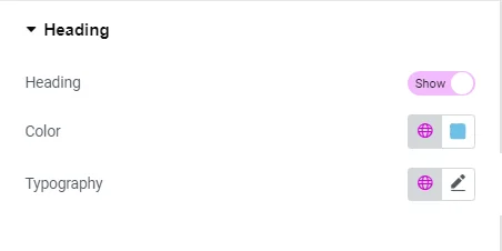
- Heading: Customize the heading text of the product section.
- Color: Change the color of the heading text.
- Typography: Adjust the font style, size, weight, and other typographic settings for the heading.


Leave a Reply