

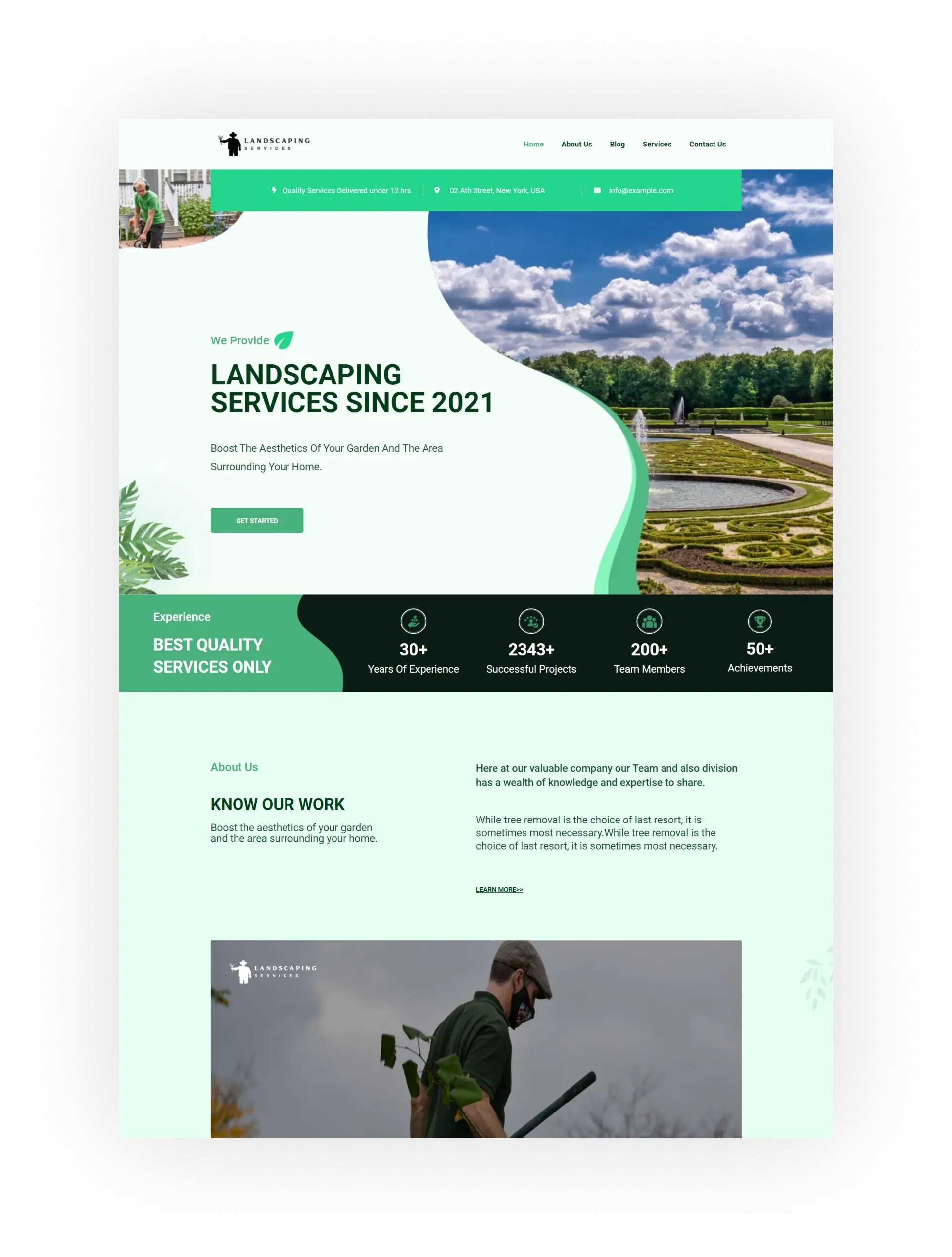
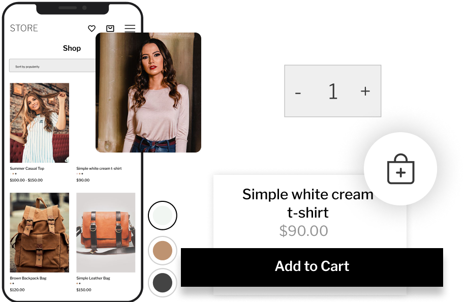
150+ Niche Templates
Pre-built, visually stunning and customizable website templates designed for a variety of business categories.
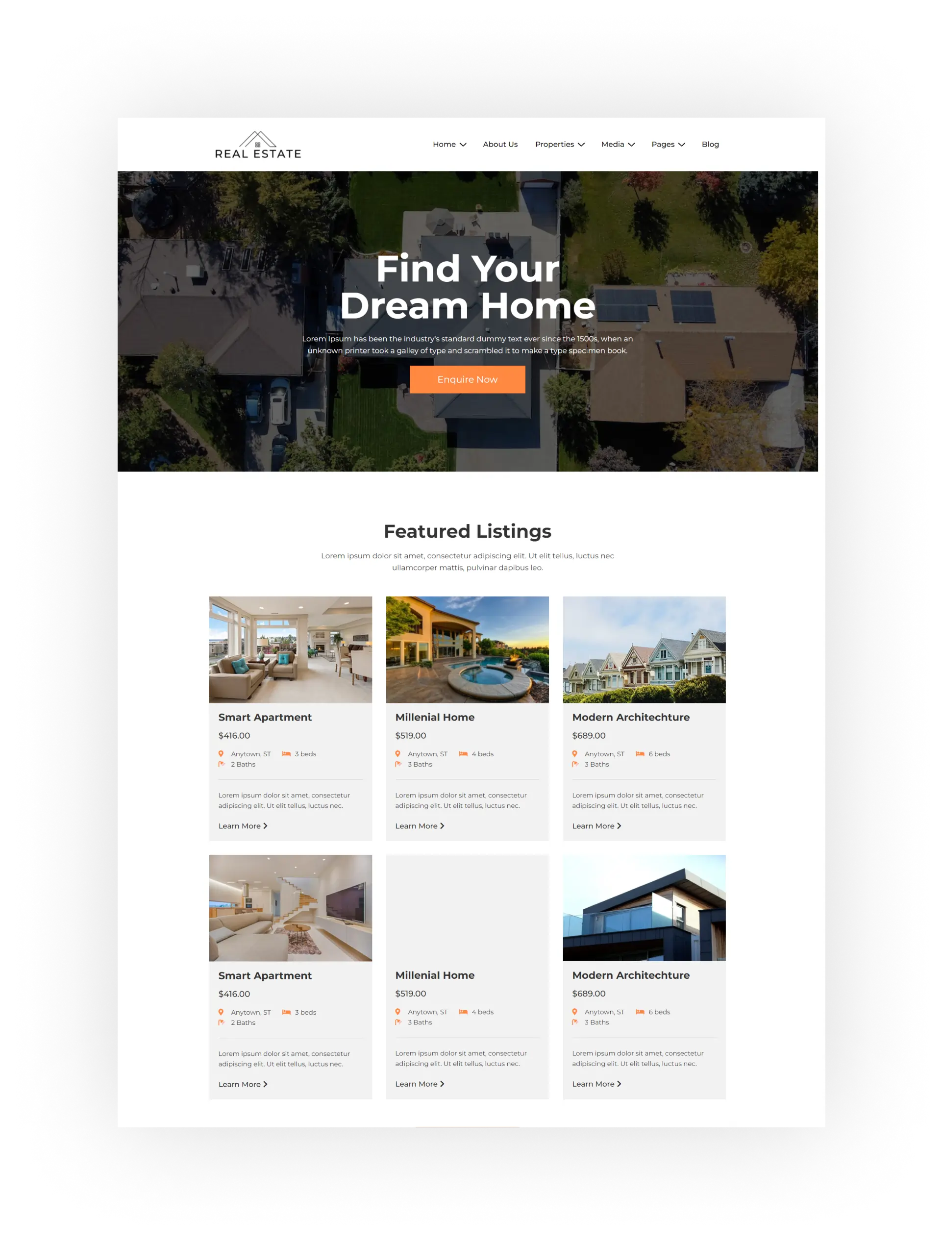
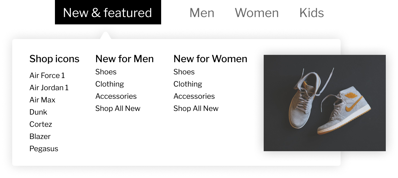
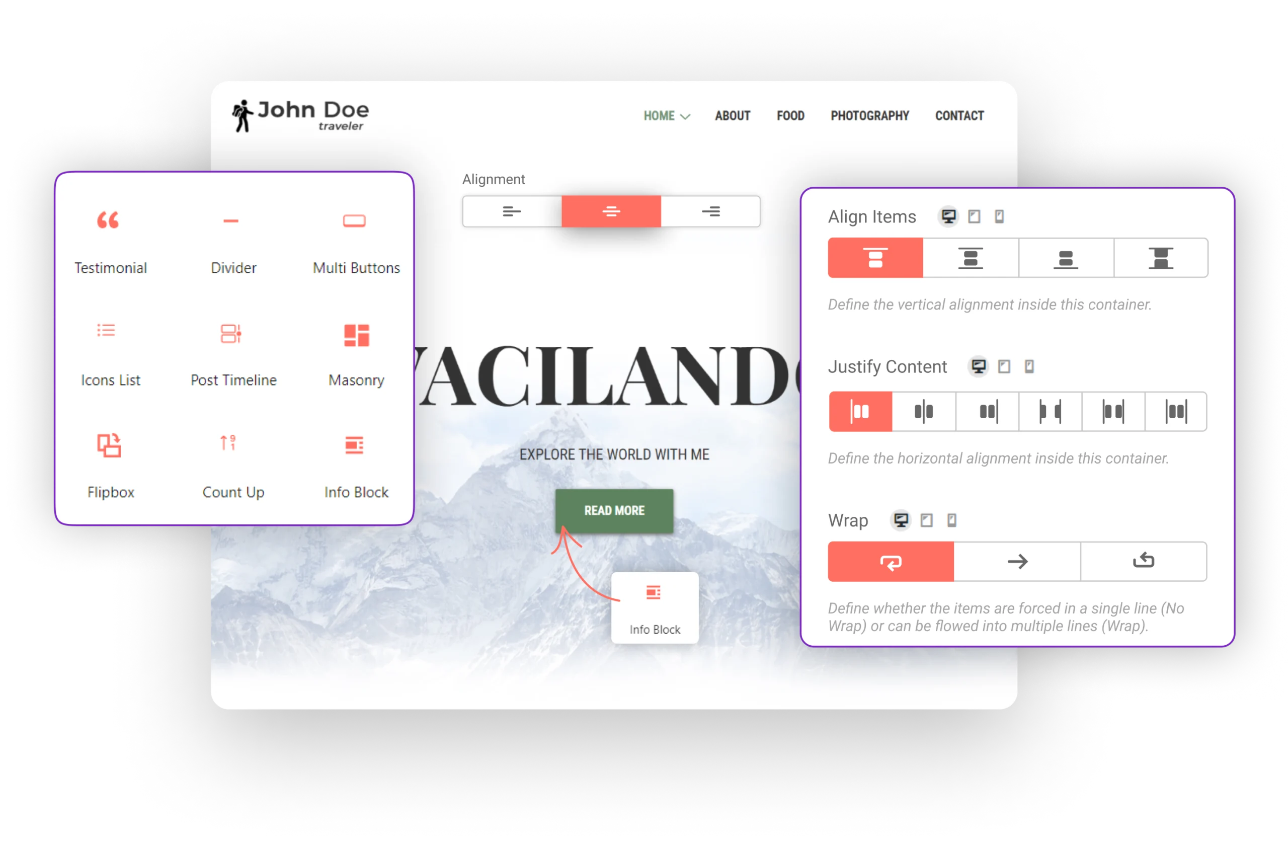
500+ Niche Sections
Supercharge your web design projects with niche-specific sections, impressing clients and delivering exceptional websites.
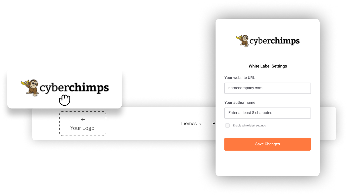
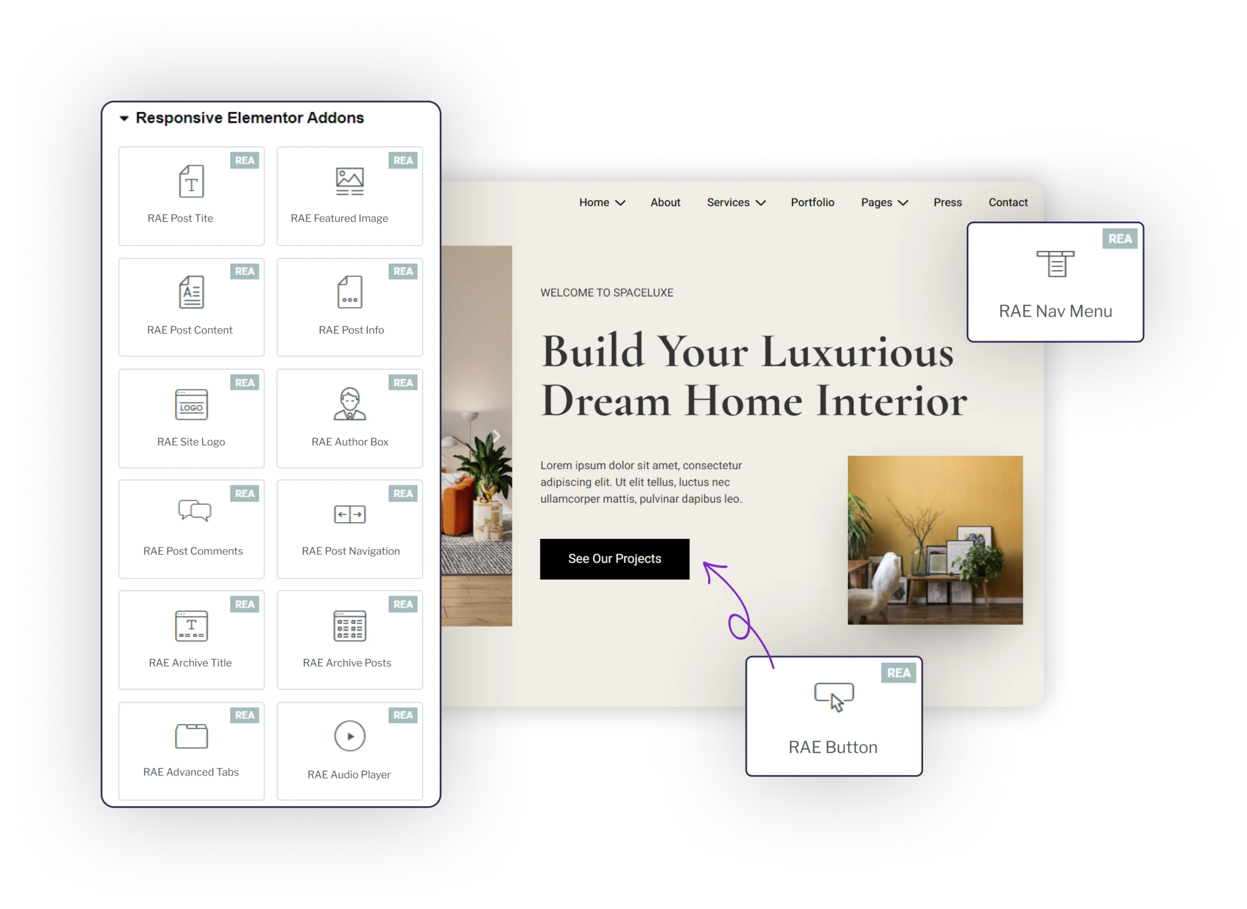
Easy Customization
Grab free sections built with the block editor and Elementor. Import and edit anything you want to deliver projects faster.
