
With the 6.2.2 release, Cyberchimps Responsive theme introduces a brand-new feature called the Site Builder, which helps you enhance your website-building capabilities.
You can now visually design and manage your website’s key sections, like the Header, Footer, and 404 pages, directly from your WordPress dashboard.
The Responsive theme includes the Site Builder feature completely free, making it easier for you to customize your site without incurring extra costs.
What is a Site Builder?
The Site Builder in Cyberchimps Responsive theme is an easy-to-use, interactive tool that helps you design, customize, and manage key parts of your website, such as the Header, Footer, Single Pages, Archive Pages, and 404 pages, directly from your WordPress dashboard.
Using the site builder, you can:
- Create, preview, and edit your website’s header and footer.
- Choose what kind of header or footer you want for each page of your site. You can add display conditions that allow you to choose a particular header or footer layout for a specific page or category, or you can opt for the default by selecting a single header for the entire site.
- See live previews of your designs, allowing you to view changes as you make them on Elementor.
- Apply unique designs for specific sections without needing complex coding.
This feature allows you to create different layouts of headers and footers for any page on your website.
Some of the examples you can use this feature include:
- Create a special homepage header
- Design a unique footer for your blog
- Build a branded 404 page
- Show different headers to logged-in users
- Time-limited seasonal designs during a sale
- Create a landing page with specific headers
- Create custom layouts for single pages and archive pages
How to Access the Site Builder
To start using the Site Builder:
- Ensure you have the latest version of the Responsive theme, 6.2.2, and the Responsive Pro plugin 3.3.0 installed on your WordPress site.
- In your WordPress dashboard, click on the Responsive menu. Toggle on the Site Builder option.

Next, click on the Site Builder menu under the Responsive option.

How To Create A Layout for Site Builder
Once inside the site builder, this is how it’ll look.
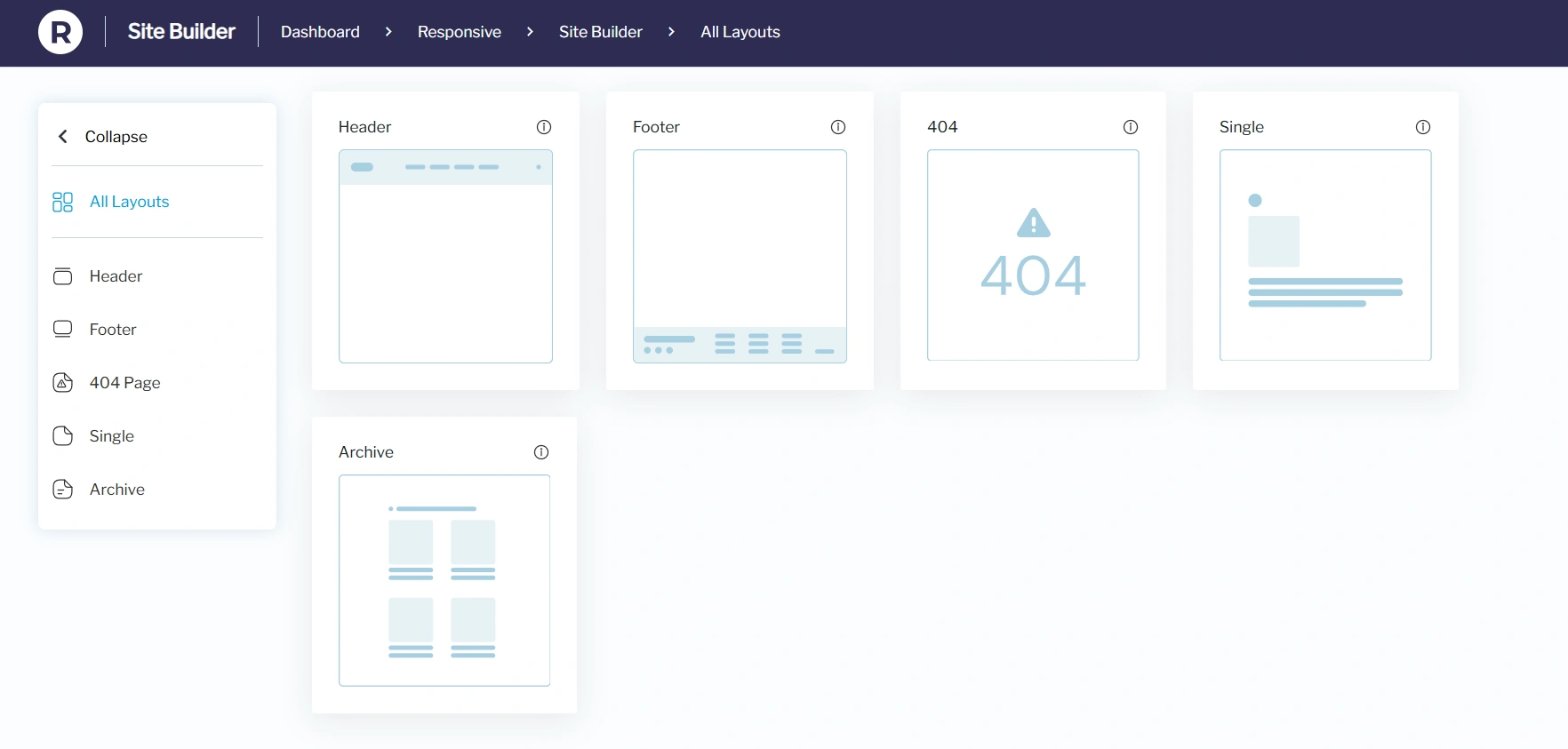
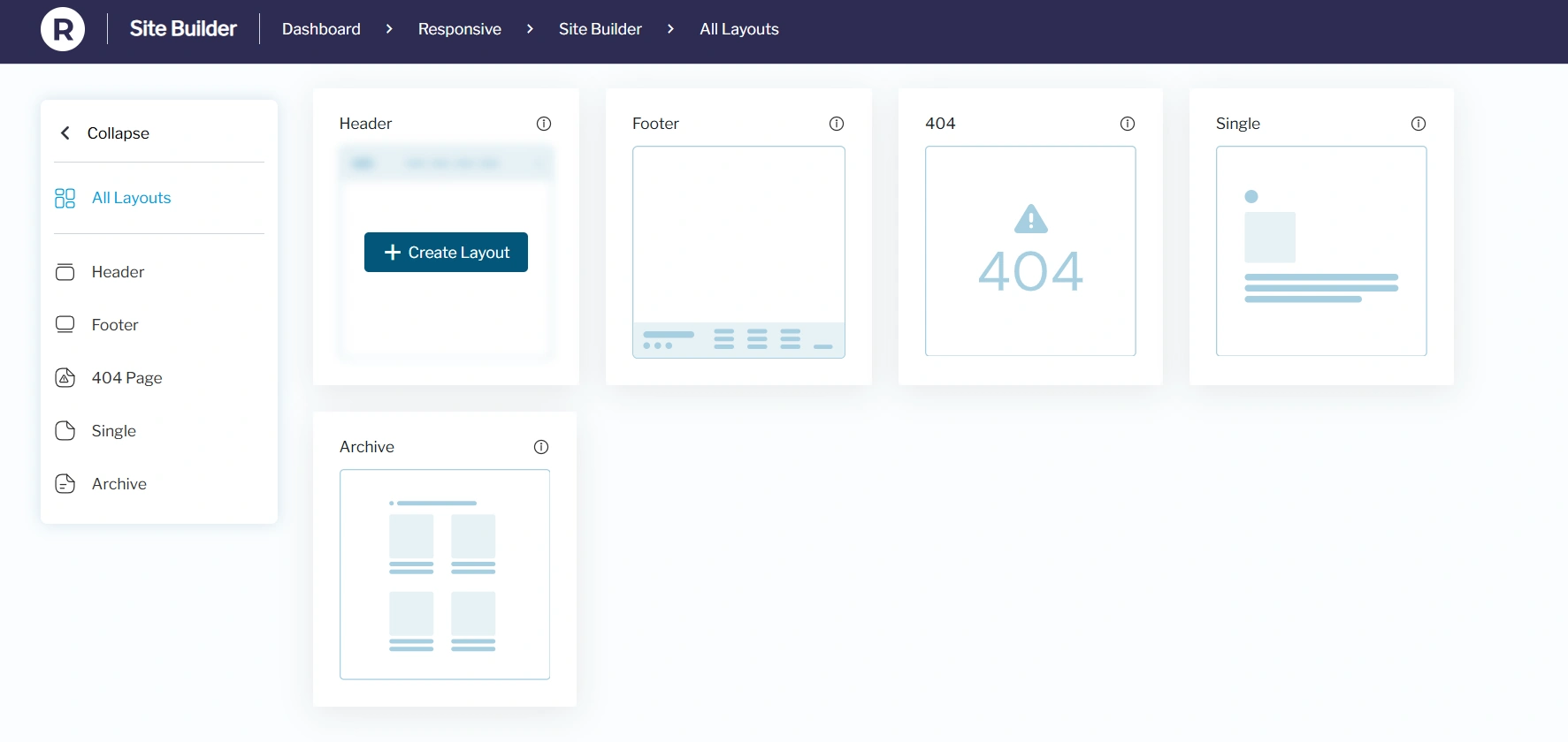
From the Site Builder dashboard, hover over the section you want to create (e.g., Header) and click Create Layout.
You’ll be taken to the default WordPress editor, where you can design your layout.
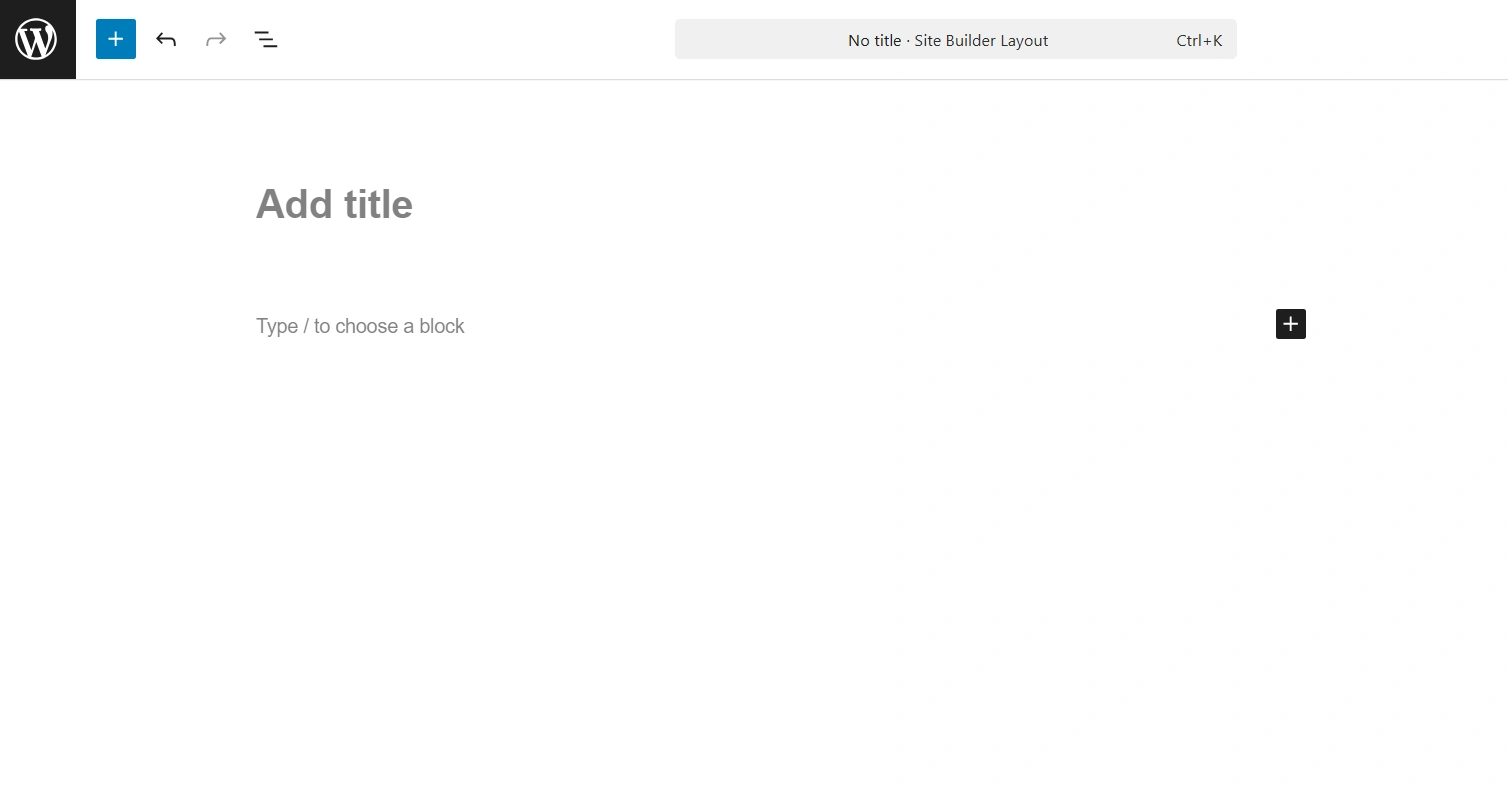
You can start creating your header, footer, 404 page, single and even archive pages. Also, if you are new to WordPress Block Editor, you can make use of the patterns by clicking on the + icon.
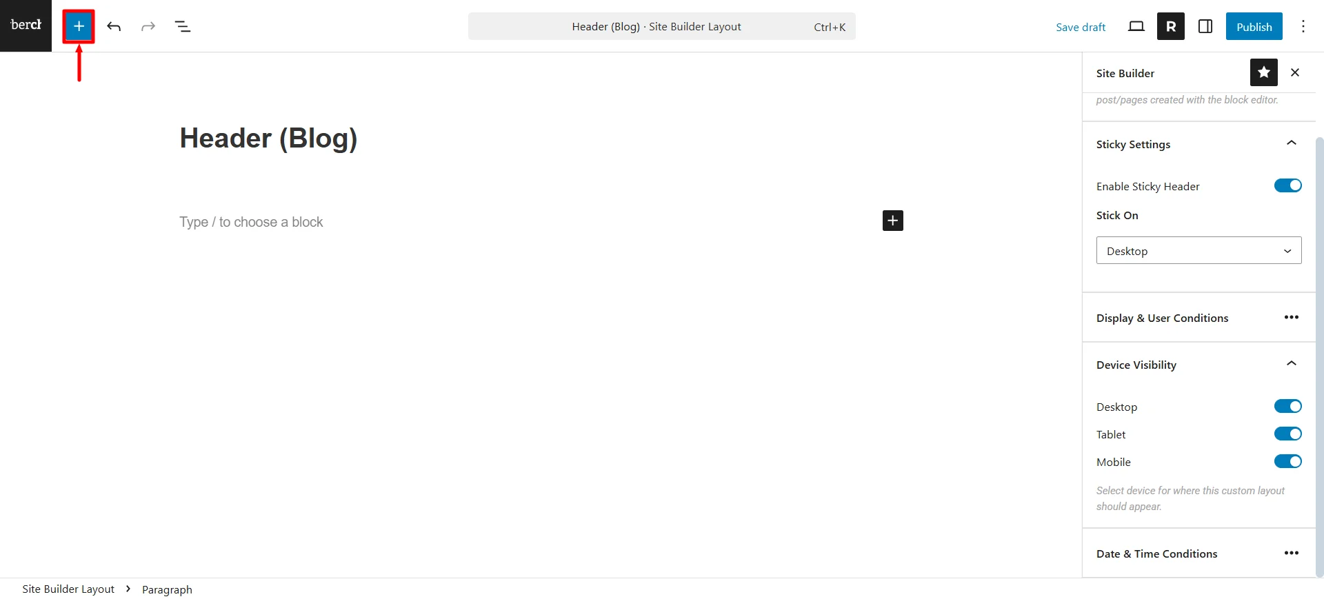
Click on Patterns and choose the Headers option.

You get basic patterns like the ones shown in the image below.

Once you’ve chosen the pattern, you can make some color changes to the layout.
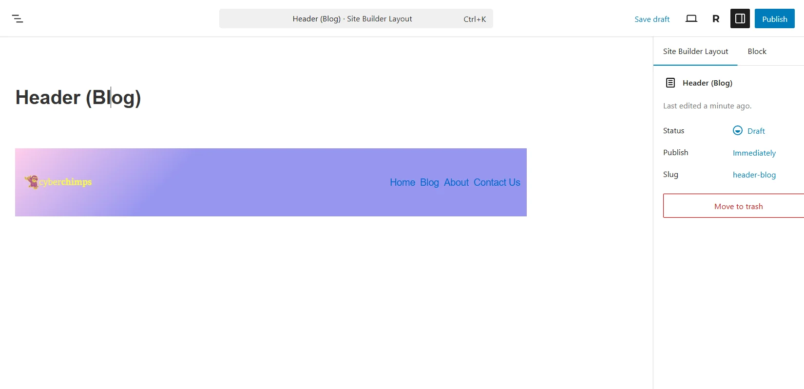
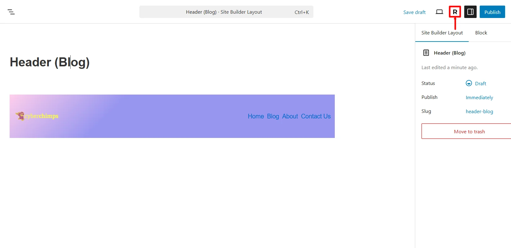
Next, click on the “R” icon to open the site builder settings.
In case you want to change the header layout to any other layout, you can do so by clicking on the dropdown under the Layout tab.

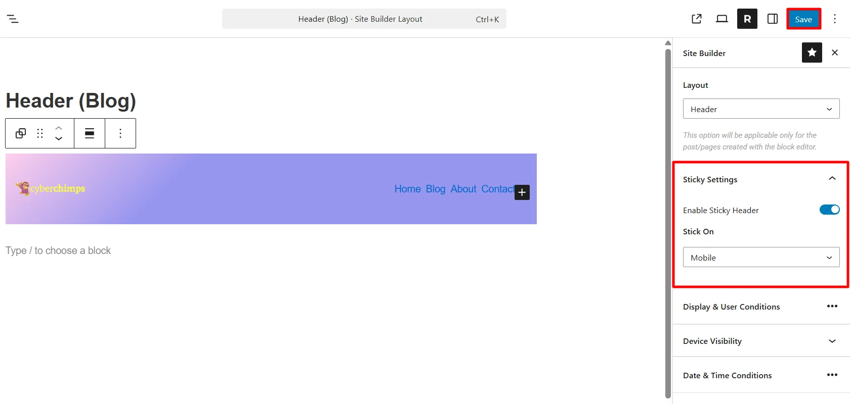
If you want the header to be sticky, you can enable it by using the toggle ON button under the Sticky Settings.

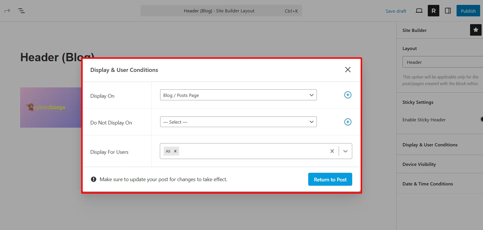
Under the Display & User Conditions settings, you get various options to choose where you want to display your header. For tutorial purposes, I’m choosing the Blog Page. Next, click on Return to Post.
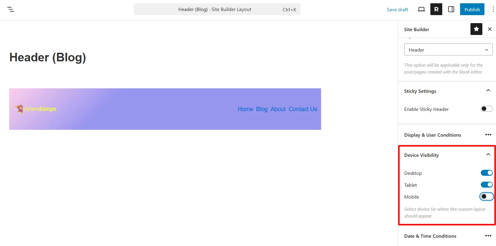
From the device visibility setting, choose which devices need to show this header.
Next, select the date and time for the event if the header you’re making is for an offer or sale page.
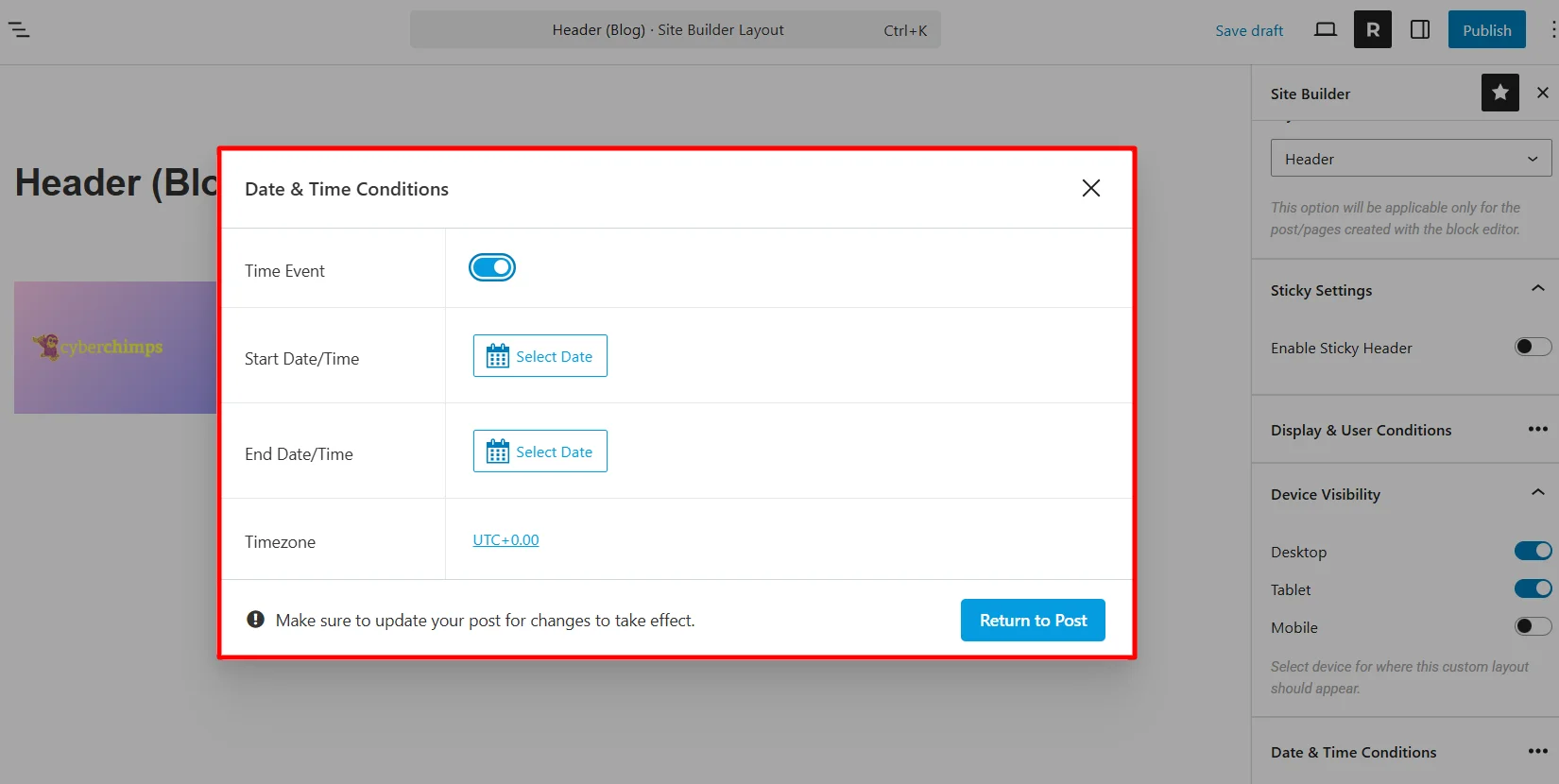
Once you’ve set up the template, you can now publish it.
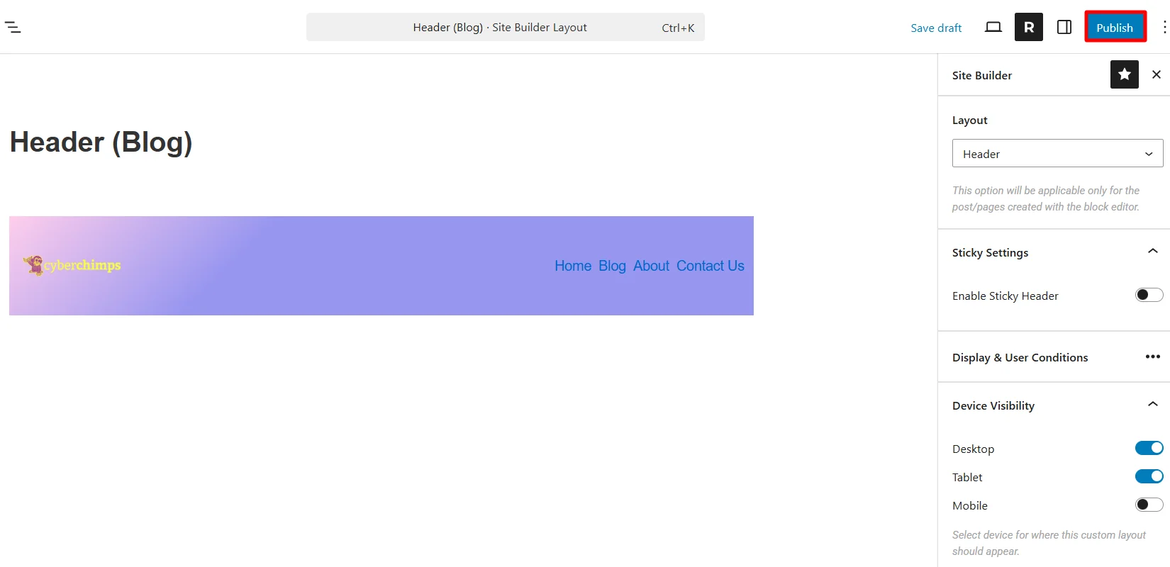
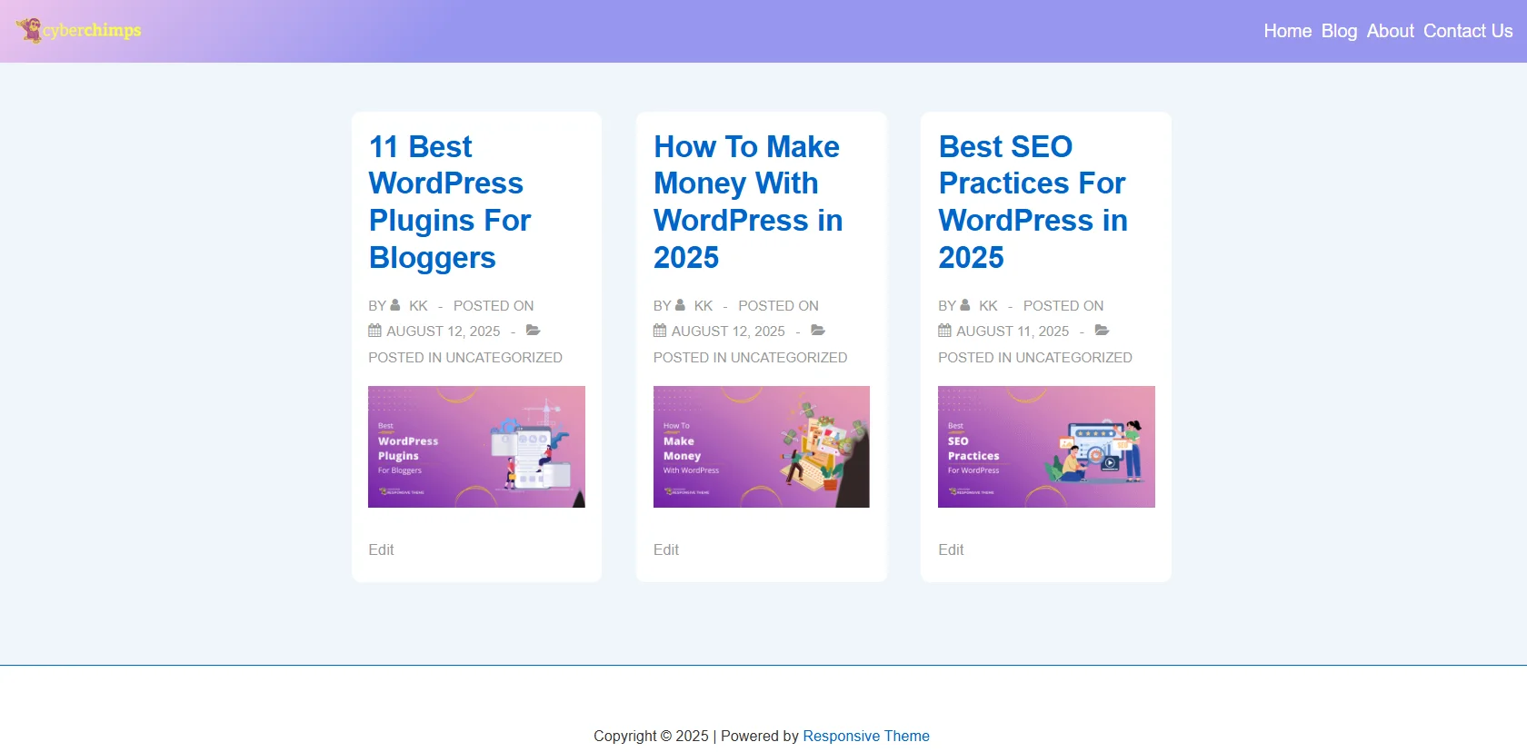
Once published, check that it will apply to the blog page. (Blog page is an example I have taken. You can take any page for your website and check for that particular website if there are changes.)
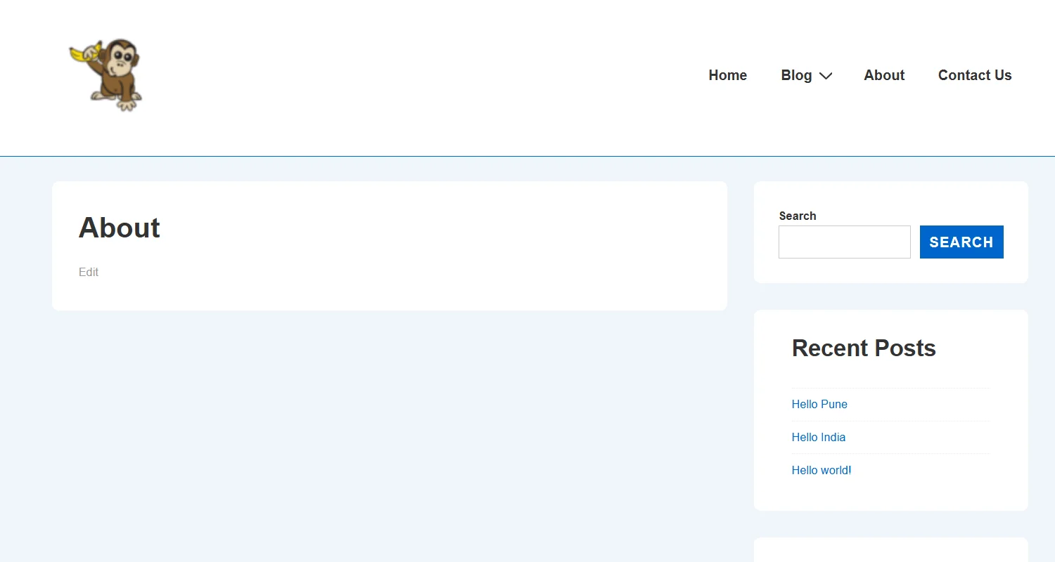
Other headers look basic, like the default header you’ve for your website.
Also, the published layout will be visible in the Site Builder dashboard.
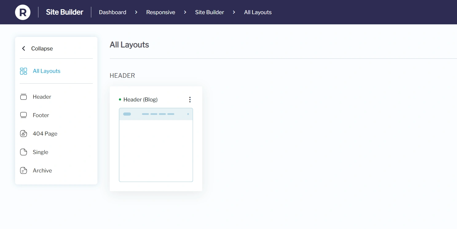
Similarly, you can create layouts for the Header, Footer, and 404 pages.
How to Use the Site Builder
Once inside the site builder, you’ll see the All Layouts section, where you can:
View existing layouts for Header, Footer, and 404 pages, Single and Archive pages.
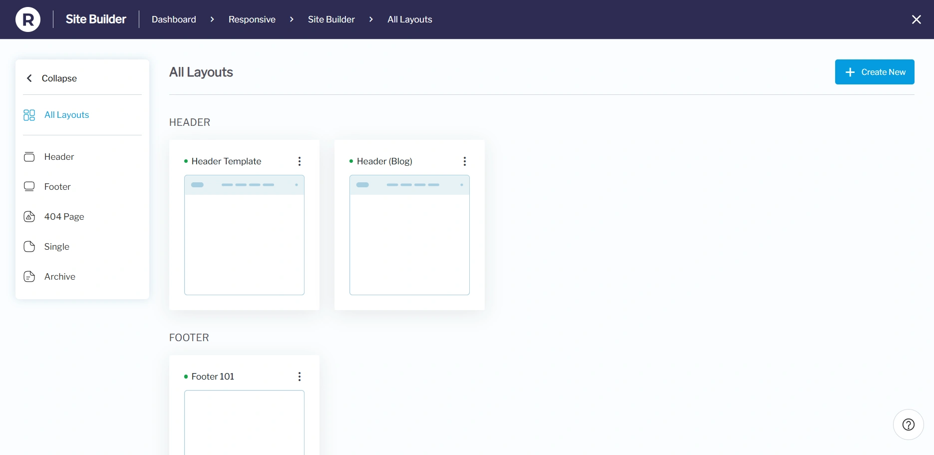
Hover over each layout card to:
- Quick View: See how it looks on your live site.
- Edit: Opens the layout editor to customize your design.
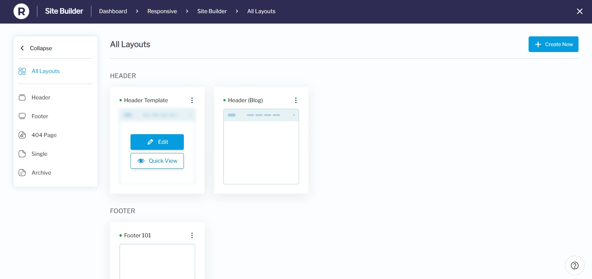
Select the Quick View to view your layout easily.
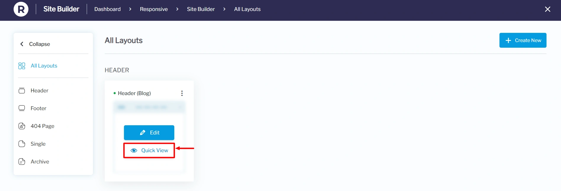
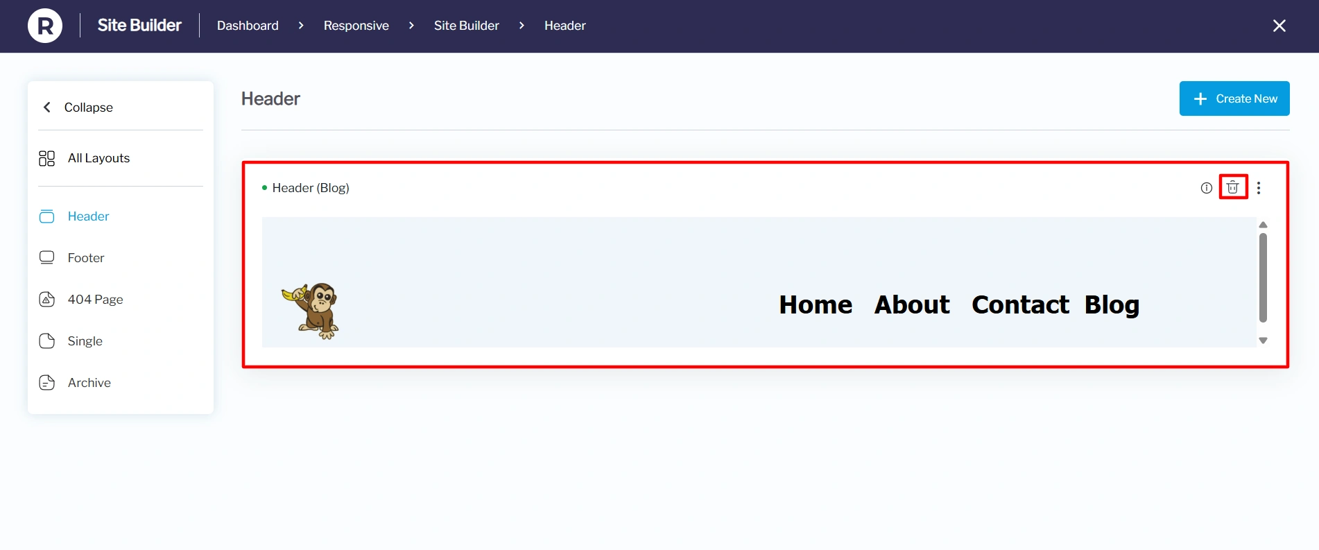
Under the Quick View settings, you can see the layout preview even before clicking the edit button. You can also delete the layout from the Quick View settings. Here’s an image of how it will look:
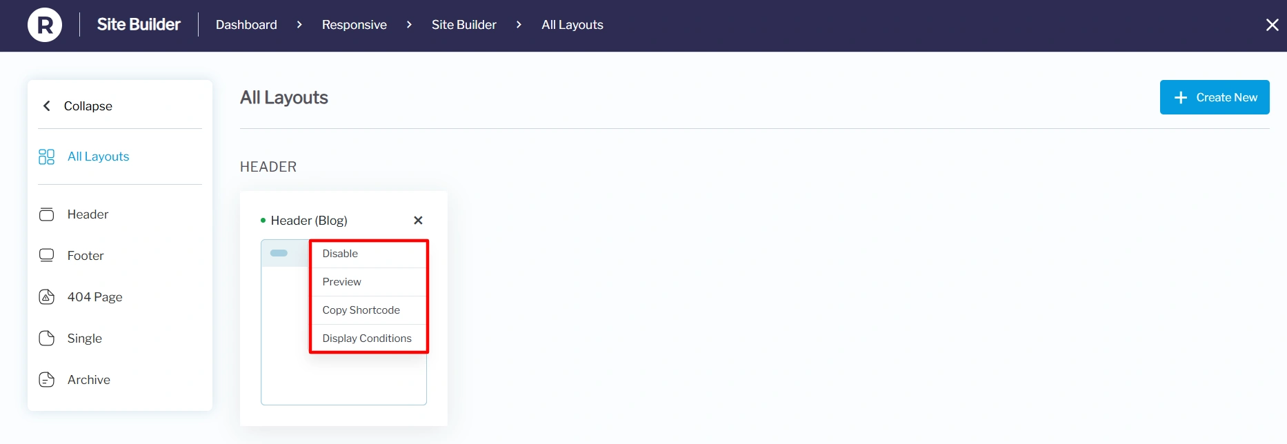
Moving back to All Layouts, each card contains a kebab menu that contains:
- Disable: You can disable this particular layout and enable it when required.
- Preview: See exactly how your custom layout will look on the front end before publishing it
- Copy Shortcode: Generate a shortcode so you can insert it anywhere on your site, such as in posts or pages.
- Display Conditions: Control where the layout should appear on the website, based on rules like page type, user role, or device.
If no layouts have been created yet, the site builder will display default placeholders, inviting you to create new ones.
Key Features in Responsive Theme’s Site Builder
Some of the key features of the Responsive site builder include:
1. Header Layouts
- Design stunning custom headers.
- Apply headers globally or conditionally on selected pages or posts.
- Customize for specific user roles (e.g., show a special header for logged-in users).
2. Footer Layouts
- Create custom footers for the entire site or specific pages.
- Control device visibility and display conditions.
- Build multiple footers for different parts of your website.
3. 404 Page Layouts
- Replace the default WordPress 404 page with a custom design.
- Add creative messaging, search bars, or links to improve user navigation.
4. Single Page Layouts
- Create custom single-page layouts for your WordPress website, enabling you to design unique content areas for specific pages or posts.
- These layouts can be highly customized, including display conditions (where they appear), user role visibility, and device visibility.
5. Archive Page Layouts
- Set how blog posts, products, or other content types are displayed on archive pages.
- Create custom layouts for archive pages using the Site Builder, allowing for more granular control over the design and content.
How to Edit Existing Layouts
To make changes to layouts you’ve already created:
1. Go to Responsive → Site Builder.

2. In All Layouts, hover over the layout you wish to change and click Edit.
3. Update your design and save the changes.
Single Page Layout
A Single Post Layout in a site builder is a designed template that defines how an individual blog post appears on a website, including the arrangement of elements like the title, featured image, post content, author info, and comments section.
Click on the Single layout option.
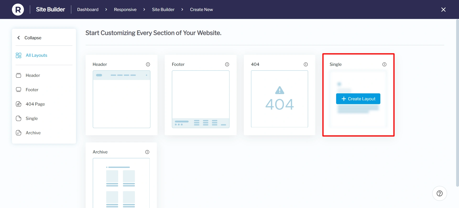
Once you click on it, the WordPress editor opens up, allowing you to start editing your post.
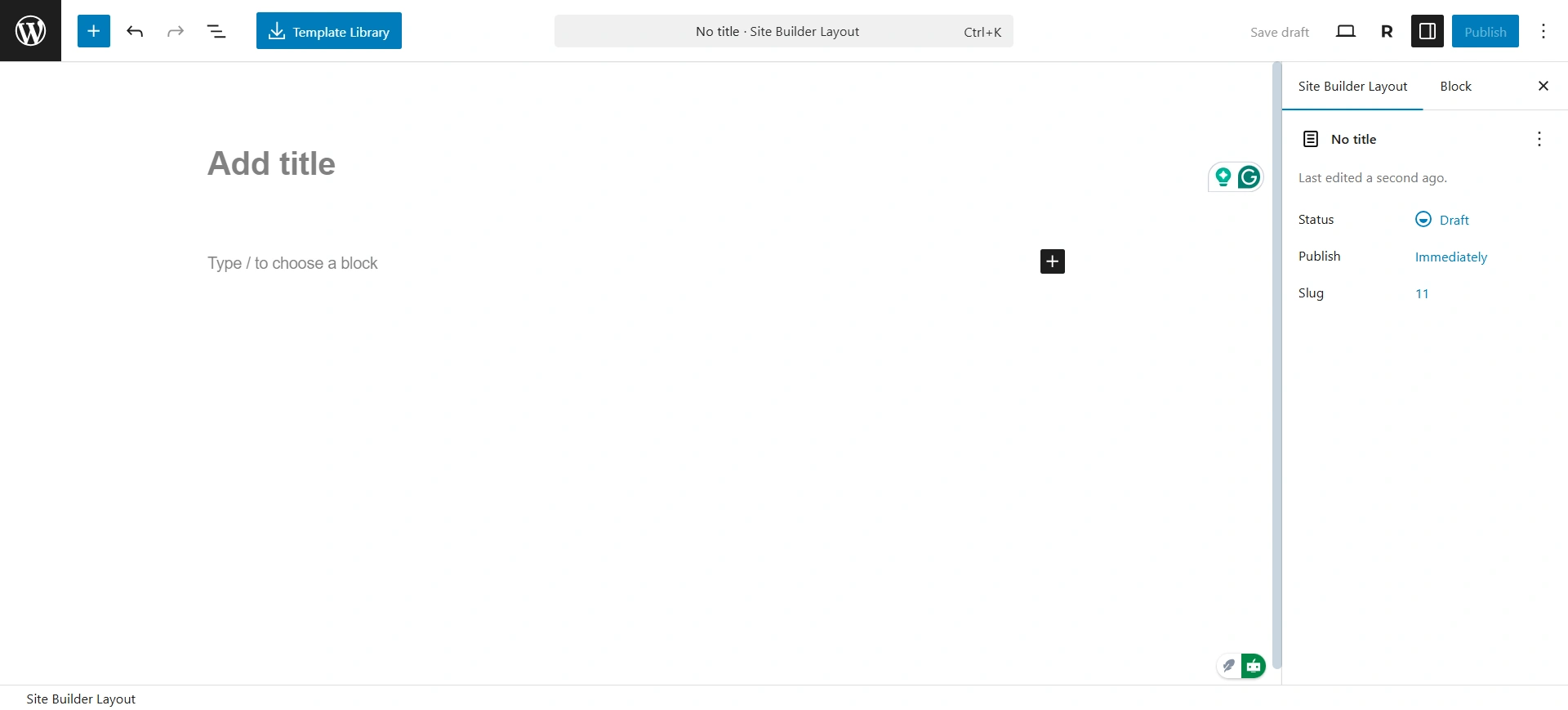
Here, you can add blocks to your single post. The editor includes basic dynamic blocks that can help you design the template. Some blocks that you use are.
- Title
- Date
- Author biography
- Content
- Featured Image
- Comments
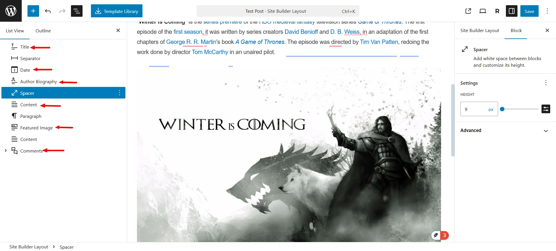
The blocks listed above are essential for creating a basic single post template. Using the WordPress block editor, you can easily add these blocks to display dynamic content within your single posts.
Note: If you’re using a different page builder, check whether it supports dynamic blocks or widgets in its free version.
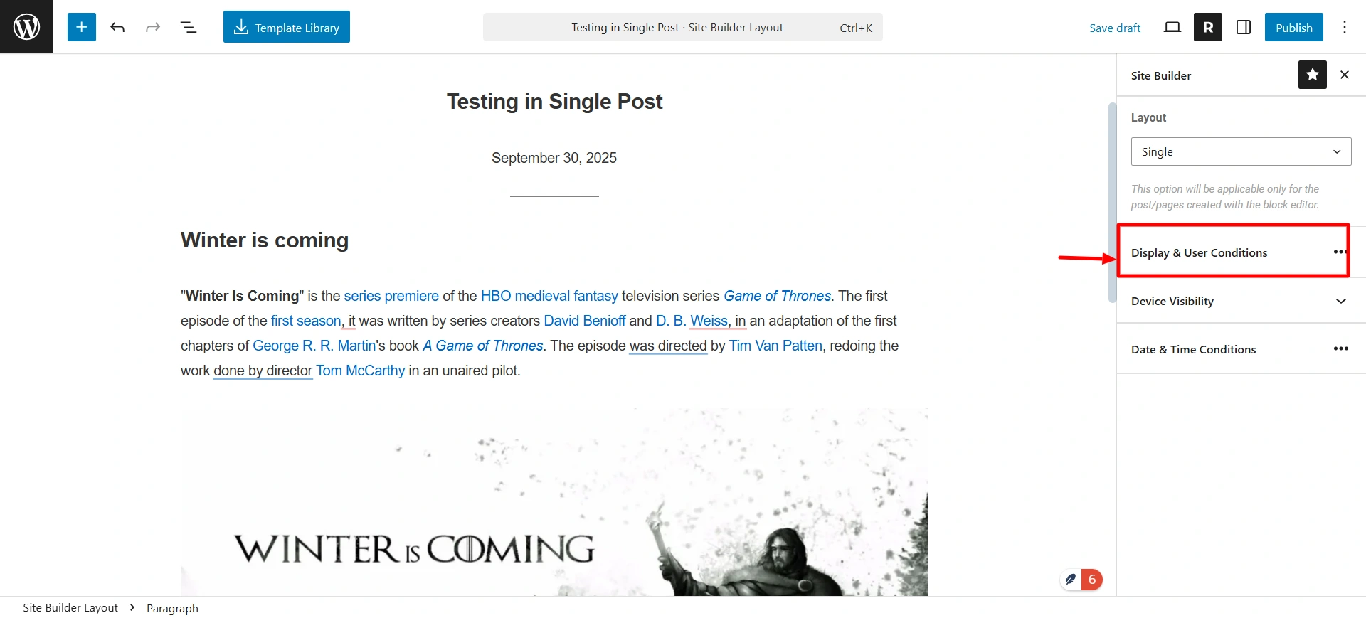
Once you are done with the template layout, it’s time to set the display condition for the template. Click on the Responisve icon in the top-right corner. It will show you the option for the display condition.
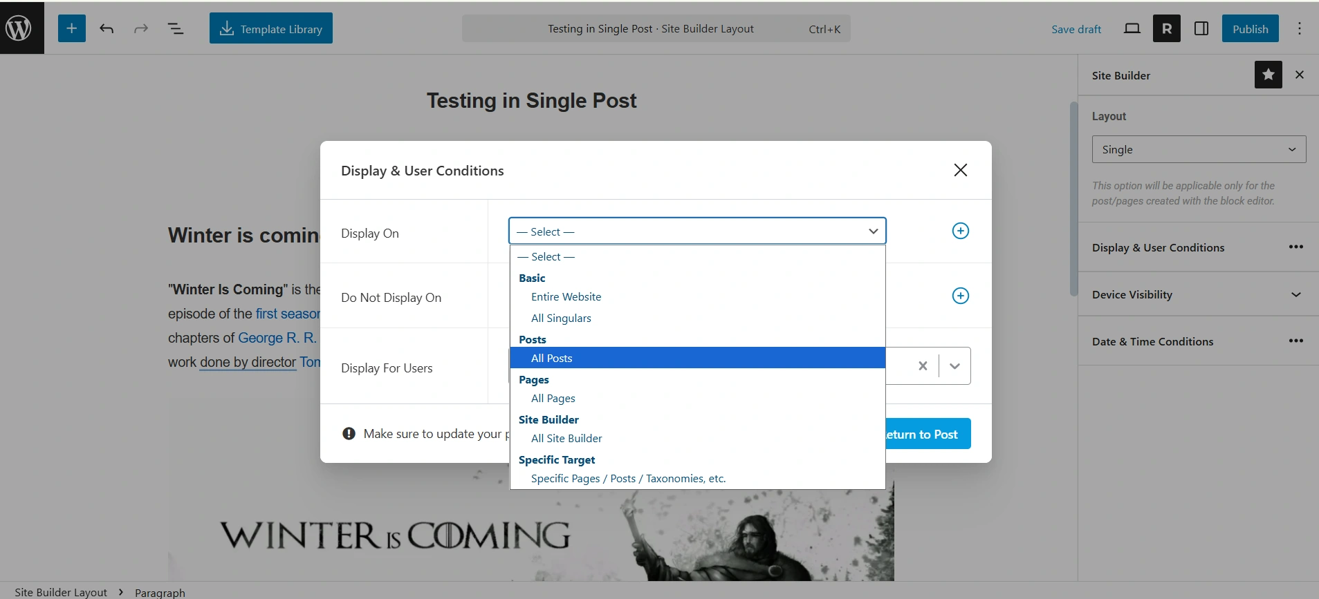
After clicking on it, you’ll see options to set the display conditions for your template. You can choose to display it on all posts, specific posts, or all singular pages, whichever suits your single post template best.
Once you’re done, click Publish to apply the changes.
Similarly, you can customize the Archive post layout.


