The sticky header is a powerful design element that helps to keep your header on top of the page even when you scroll to the bottom. This option not only makes navigation easier but also enhances user experience.
Given the increasing prevalence of mobile devices, website owners must use this feature to edit their websites, as it can help to navigate better.
That said, the Responsive theme by Cyberchimps allows you to easily create a sticky header for your WordPress website with just a few clicks. Let’s check it out.
Creating Sticky Header Using Cyberchimps Responsive Theme #
This document will guide you through the procedure for implementing a sticky header on your website using the responsive theme.
[For guidance on installing the theme, refer to this documentation- How to install Responsive theme.]
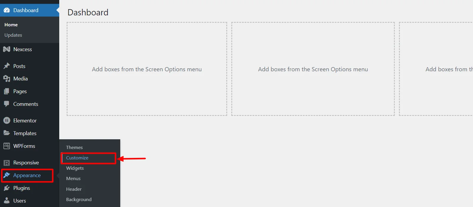
To implement the sticky header option, hover on Appearance and click on the Customize menu.
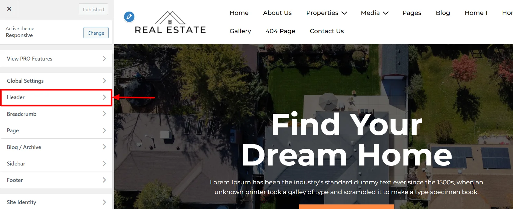
Next, select the Header menu.
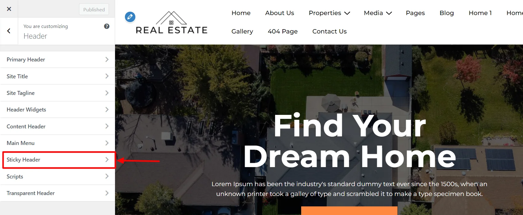
Next, click on the Sticky Header option.
Depending on your preferences, you can tick or untick the checkboxes for options like Enable Sticky Header, Shrink Logo On Scroll, Disable on Mobile Menu, and Different Logo For Sticky Header.
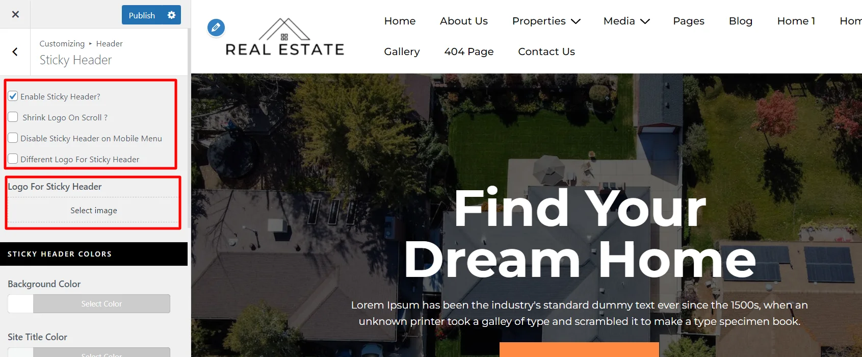
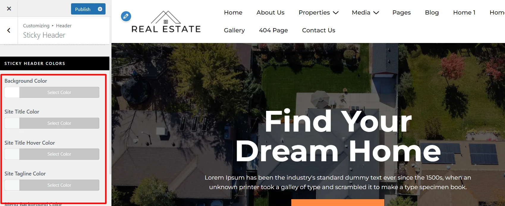
Another editing option is the Sticky Header Colors, under which you can change the background color, site title color, and tagline cover.
Following the above-mentioned steps, you can easily create or edit a sticky header using Responsive theme.


Leave a Reply