A great landing page generates immediate conversions by communicating clear value to its viewer in a way that is quick, simple and appealing. Conversely, a poorly-designed landing page won’t just fail to create conversions, but also potentially confuse or frustrate your potential customer, creating a poor first impression of your business.
To help you steer clear of the common pitfalls and create a landing page built for success, let’s look at some of the most common design mistakes that define an underperforming landing page as well as some bright examples of outstanding landing pages, which you may use as samples to follow:
Landing page design mistakes that you should avoid –
Weak opening line
Your landing page should grab the user’s attention right away by clearly showing what you offer and the benefits to the customer. Match your opening line to your call-to-action button to create a consistent through-line for your message. For example, if your call-to-action leads to a free trial of your services, the heading should prominently feature the words ‘free trial.’
Take a look at how not do it:
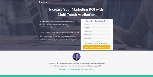
This heading leaves you with more questions than answers.
Are there marketing solutions which don’t aim to increase your ROI? What is multi-touch attribution and why do you want it? And most importantly, what does any of that have to do with the free consultation on offer?
The landing page exists to push that free consultation but not only does the heading make no mention of it, but the entire page also does nothing to tell the reader why the free consultation is of value or even what the consultation will consist of.
Monday.com’s landing page gets its opening line spot on:
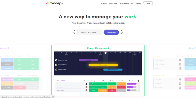
The call-to-action to ‘Get Started’ ties neatly into the theme of beginning a new way of working and this opening line sums up both what Monday.com offers and what their prospective customers are looking for in a single, simple line.
This is more than enough to get users scrolling down to learn more, which should always be a primary goal of your landing page’s opening line.
Annoying video or audio
Setting up a video or audio clip to automatically start playing when the user hits your landing page is easy enough to do, but just because can doesn’t mean you should.
More often than not this is simply going to annoy your visitor and encourage them to leave the page. Not only may they be at work or on public transport, where the sudden noise could embarrass them, but these clips will also slow down the loading of the page.
If you have a great video that is relevant to your landing page pitch then, by all means, embed it, but there is no reason to start loading or playing the clip until the users click it.
Pestering the user with pop-ups
Nobody is ever happy to see a pop-up, and the number of companies still using some form of pop-ups is baffling. A chatbot can be a useful tool for your customers, but does it really need to pop up on your landing page? If so, allow visitors more than a few paltry seconds to read the page before this distraction appears.
Similarly, it should be obvious that obscuring what the user was reading a moment ago with an overlaid banner will only cause annoyance.
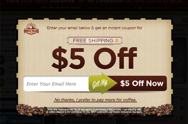
Full-screen pop-ups like this ad are fairly common and are especially irritating on an e-commerce site. The user was already browsing in order to make a purchasing decision and this is simply an interruption and obstacle to that process. This same deal could be displayed in equally prominent but far less obtrusive ways, such as simply incorporating it into product listings.
Ometrics shows how to use pop-ups that help rather than hinder the user:
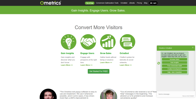
Visitors are given enough time to digest the landing page before the chatbot appears, and when it does it does not obscure the rest of the page. The initial prompt from the chatbot also helps by offering more information on points covered by the landing page, rather than a generic ‘How can I help you?’ message, which can be offputting.
An easily-ignored call-to-action button
Convincing your site visitor to click your call-to-action button is usually a primary goal of your landing page, so it is vital to ensure the button is displayed as prominently as possible. A small button tucked into the corner of the screen does not grab the viewer’s attention and might be missed altogether.
Understanding affordance and putting your understanding into practice is vital for optimizing the conversion rate of your call-to-action button.
Make sure your call-to-action button is large, centrally placed and ‘pops’ from the rest of the page with a contrasting color and 3D shading, as this visual shorthand identifies the button as a clickable element to the user. Many websites opt to use a color for their call-to-action button not used anywhere else in their color scheme to ensure it stands out.
Use your landing page’s text and images to draw the eye towards your call-to-action button to try to make it one of the first things the user sees.
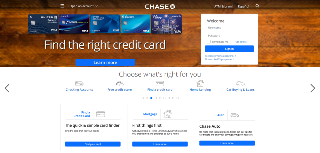
In this example, you can see that there are 5 buttons of an identical style, with one of the most prominent simply being a sign-in button for existing users. This does not attract the user’s eye immediately to any of the call-to-action buttons, and the user is expected to read the entire page to work out which call to action is relevant to them.
This landing page could be greatly improved simply by enlarging and changing the color of the first call-to-action button, and ideally changing the text to something less generic than ‘Learn More’, which is used twice elsewhere for different links.
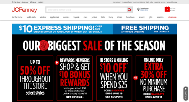
Visual clutter
Visual clutter is unappealing in any aspect of web design, and that goes double for your landing page. Not only is a block of text or cluster of images off-putting to your potential customer, but it will also fail to quickly communicate what you are offering. This information is critical to persuading your user to take the next step.
A good landing page immediately gets across what you want the user to do and why they should care with zero effort from its audience. The vast majority of customers simply aren’t going to bother working out what you are offering them if it isn’t clear straight away, and why should they have to?
Take a look at this example –
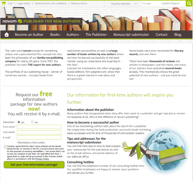
Put simply, there is just far too much text on the screen here. Few users are going to read something like this in its entirety, and the format does not lend itself well to skim reading, so in all likelihood, the visitor will simply leave having learned nothing about the business.
The top 4 paragraphs about the business belong on a different page entirely, as they bear no relation to the call-to-action, and similarly the sub-headings under each bullet point could also be removed or at least heavily shortened, and with an opt-in plugin the data fields and agreement checkbox could easily have been hidden behind the call-to-action button to further clean up the page.
No reason to trust you
With all the scams, get-rich-quick schemes and spam out there, it is no wonder internet users show a healthy degree of skepticism when it comes to online marketing, especially in the case of a business or brand they do not recognize.
Demonstrating that you are a trustworthy and credible organization is an important component of any landing page. There are a few ways to do this:
- Proof of results could come in the form of the number of businesses currently using your services, or any industry awards your company has received.
- Proof of satisfaction is arguably more important, as what customers really want to know is whether other customers were happy with your product or service.
Reviews and testimonials from genuine customers have a major impact on how seriously a potential customer will take your business, and a testimonial from a well-known individual or business can be even more effective.
A high-quality review plugin will ensure your customer reviews look genuine and are presented in keeping with your site’s overall style.
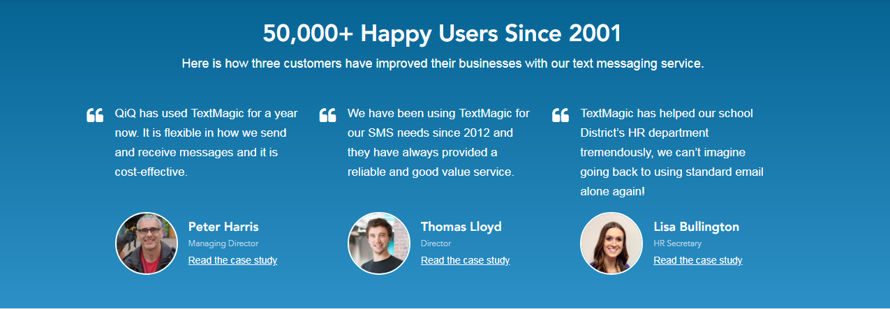
These testimonials are taken from TextMagic website and are great because the user has enough information to be able to check these are real people as well as real businesses, and because these customers are discussing specific problems they had which the business was able to solve.
No reason to act immediately
Allowing your customer to procrastinate is a real conversion killer. Without an incentive to take the next step straight away, even an interested customer may decide to do it later and forget about it.
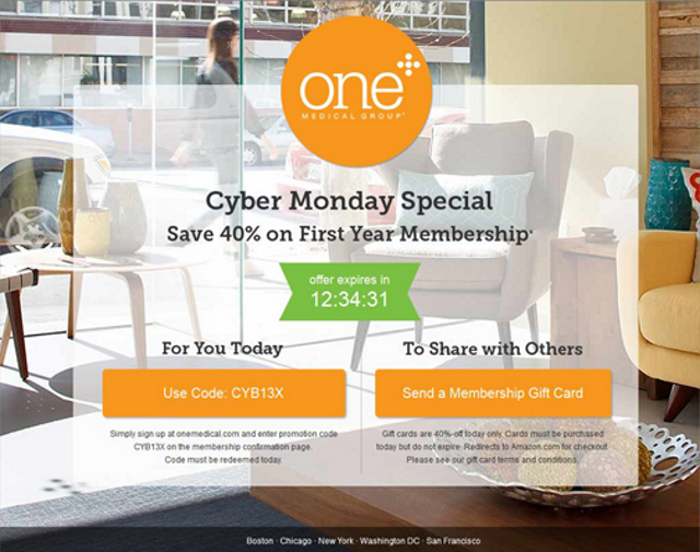
Limited-time offers are an obvious and effective route to go down as they create a sense of urgency and the fear of missing out if a customer waits too long. This method may not be appropriate for what you are offering, however, and you could instead take a less ‘pushy’ approach by simply emphasizing how quick and easy it is to take the next step to encourage users to sign up now.
No clear goal
Tying into keeping your design simple, it is equally important to stay focused on the particular goal you have in mind for each landing page. Including multiple calls-to-action on a landing page is confusing to the user in addition to creating visual distraction.
It is tempting to push as many offers as possible and think this is all added value for the user, but you are likely to induce choice paralysis, offering so many options that the user is unable to process all the information and becomes less likely to convert.
Focusing your landing page on a single lead magnet, product or service helps you keep the page simple with text to a minimum, and allows you to target more specific audiences.
One clear goal also makes it much easier to digest your analytics data and A/B testing results to optimize the page’s conversion rate. The more your page tries to do and the more it contains, the harder it is to identify what is working and what isn’t.
There are no less than 6 offers on this landing page. It is up to the user to work out which offers apply to them, and optimizing the conversion rate of each offer will be a nightmare when it comes to testing changes to this page.
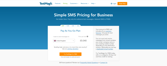
In this example from already above mentioned TextMagic company, the free signup offer is the only call-to-action and is given prominence over every other clickable element. This page has the goal of communicating a cheap and transparent pricing plan, and all text and clickable elements below the navigational header are focused entirely on this message.
Long, unnecessary lead-capture forms
A lengthy lead-capture form not only takes up space on the page, it is also discouraging to users. Not only are you creating work for them, you could also be worrying them by asking for information that you do not actually need. Users are more likely to complete a lead-capture form which respects their time and privacy concerns.
Keep lead-capture forms short, and if you need more than 3 fields, display the rest after a click-through.
Low-quality images
Put simply, low-quality images make your organization look low-rent. Hire a professional graphics designer or photographer to create a quality, high-resolution image that suits your brand.
Avoid stock images at all costs!
A stock photo usually looks generic, corny and above all lazy. This is not the first impression you want to give.
Do you think those three people actually work for this company, or just that somebody spent 5 minutes on Shutterstock? No stock image is exempt from this typically correct assumption.
If an image is not possible due to the nature of your organization, or simply budget, a bold color scheme of 2-3 strong colors can be equally appealing and attention-grabbing.
Including too many high-resolution images runs the risk of slowing down your landing page’s loading times as well as cluttering the screen, so consider minimizing their usage on your mobile landing page in particular, where the user’s connection or device capabilities may be less than ideal.
In summary, creating a landing page with a high conversion rate is mostly a matter of common sense. Like any other form of marketing, the goal is to effectively get across what your business can do for the user and the value of what they are being offered. Optimize every element of your landing page towards this target, and remove any that do not contribute towards this, and you will transform the conversion rate of your landing page.