Building a website can often seem overwhelming, time-consuming, and expensive. The Responsive Blocks plugin by Cyberchimps makes this process simpler.
With the Responsive Blocks plugin, you can design fast-loading and visually appealing websites effortlessly using just the default WordPress Block Editor, without needing any coding knowledge.
This document gives you an overview of how to use Responsive Blocks by Cyberchimps to build and customise your website.
What is Responsive Blocks?

The Responsive Blocks Plugin is a free plugin offered by Cyberchimps that offers over 50 blocks, designed for Gutenberg. It acts as an added functionality to the default Gutenberg Block Editor.
Moreover, it presents a neat and refined layout for your website and also ensures that your site is lightweight and fast.
This plugin is especially curated to help users design beautiful and high-functioning websites while avoiding the extra bloat from using third-party page builders.
The Responsive Blocks plugin helps your website stay fast, SEO optimised, and mobile-friendly. By using Gutenberg, you avoid the extra bloat from using third-party page builders.
This plugin works wonderfully when paired up with the Responsive Theme by Cyberchimps. It enables you to customise your site quickly and however you like. It offers multiple blog layouts, fonts and colours, a mega menu, and header and footer builders.
Notable features of Responsive Blocks
- Template Library: Using this feature, you can import 100+ beautifully designed Gutenberg templates to your site.
- Plain & Simple UI: The user interface of each block has been kept simple and easy to operate.
- Responsive Layout: These blocks are AMP optimized, considering AMP is one of the most important ranking factors for search engines.
- No Coding Knowledge Required: Create fantastic landing pages without a line of code. These blocks are designed for non-coders and coders alike.
- Easy Customization: The blocks are extremely easy to customize as per your requirements. You can create complex layouts in a very short time.
Installing the Responsive Blocks plugin
To install the Responsive Blocks plugin, click on Add Plugin under Plugins on your WordPress dashboard. Search for the Responsive Blocks plugin in the search bar.
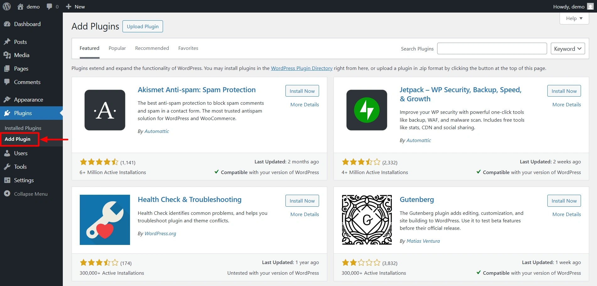
Click on Install Now. After the plugin is installed, activate it.

How to add a Responsive block?
If you click on the + icon, the Responsive blocks library opens up. You get 50+ Gutenberg blocks to play around with.
Responsive Blocks provides a live preview of your design on the left, along with a beginner-friendly sidebar on the right to customise the blocks.

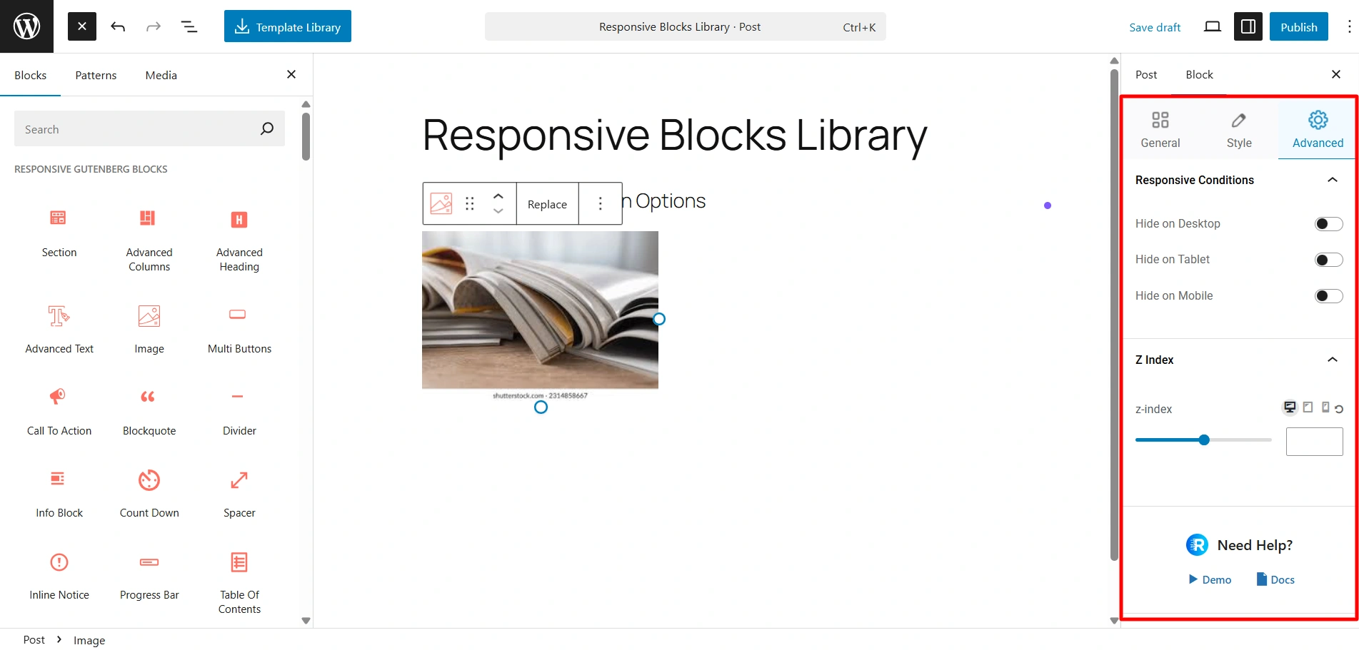
If you add the Image Block to a post, you see these customisation options on the right side. Here in the General settings, you can add your image, add alt text, set the alignment, and control the height and width of the image.

Here, in the Style settings, you can customise the colors, border styles, box shadows, and more.

There’s also the advanced tab that lets you add animations, decide block display conditions, adjust the Z-index, and configure additional CSS code.
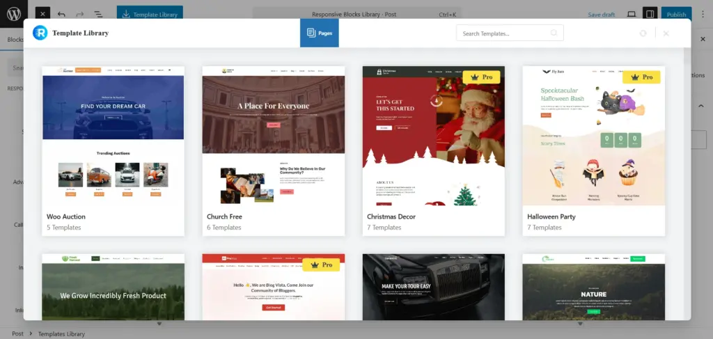
If you click on this Template Library, you get access to our 100+ pre-designed templates compatible with Gutenberg. You can easily import these templates and just start customising.
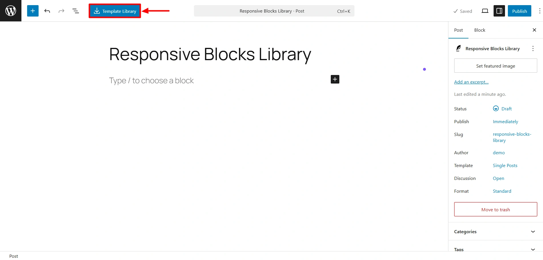
This is the Template library, using which you can import 100+ Gutenberg templates.
If you wish to check out specific settings related to each block, you can check out the documentation.
So what’s stopping you? Try out the Responsive Blocks plugin now for a faster, easier, and chill website-building experience.


