We are super excited to bring you a modern, responsive and faster than ever before Responsive 4.0.
Responsive 4.0 comes with major changes to conform with W3C HTML standards, simplified customization options, and improvements to the overall experience of new users.
Overtime as WP has evolved, there are some features that are no longer relevant or can be done using the new customizer and Gutenberg. Considering this, some of the older features in Responsive 3.x.x are removed in Responsive 4.0.0.
Some of these major changes may break your existing website’s design. To get back to your design, you may need to reconfigure some of the settings which will be covered here.
And like always our support team will be here to assist you. Create a ticket or contact us for help.
In this article, we look at the changes in Responsive 4.0.0, why we’re making them, how they may affect your website, and how to fix them.
Let’s get started:
Responsive theme HTML markup changes
A lot has changed in HTML, Javascript, and CSS. Today, HTML5 and CSS3 help us design websites that were either too difficult to do or simply impossible in the past.
The Responsive theme has tried to keep up with these changes.
Since its first release in 2012, Responsive has come a long way. Over these releases, markup and styles were added to the theme to add new customization features. And as with any software, this has gone out-of-date making it difficult to:
- Conform to the W3C HTML standards
- And, add new features to the Responsive theme
That’s why Responsive 4.0.0 comes with new and improved HTML markup and CSS styles. This will not only improve your website but also help us add new features to the theme.
How will this change affect your website?
Changes to HTML markup will break your website’s design if:
- You’re using a child theme with Responsive as the parent theme and have styles based on old HTML structure.
- Or, you have added custom styles/scripts to the Responsive theme
If you’re using the Responsive theme without any custom changes of your own, your website should continue to work as it was before. However, you may notice some minor (but good) changes to the design.
How to fix?
Child Theme issues:
If you’re using a child theme with Responsive as the parent theme and don’t want to make any changes to your website:
- Rollback to Responsive 3.x.x using the Responsive Add-ons plugin.
- Disable automatic updates of the Responsive theme.
- Stay with the Responsive 3.x.x version till you’re ready to update your child theme.
However, if you are willing to make changes to your child theme, we’ll shortly be publishing a migration guide. It’s best that you hire a WordPress developer to help you with this.
If you’ve added your own custom styles to the Responsive theme, we recommend that you remove these styles. And use the Responsive theme’s customization options to style your website.
Responsive theme navigation menu changes
Responsive 3.x.x supports 4 navigation menus.
- Top Menu – Appears before the site header
- Header Menu – Default navigation menu that appears next to the site branding
- Sub-header Menu – Appears after the site header
- Footer Menu – Appears in the site footer
Responsive 4.0.0 removes the Top Menu and the Sub-header Menu. It will continue to have the other two navigation menus:
- Header Menu – Same as before but with options to position before, after or in the site header
- Footer Menu – Same as before
We are making these changes to better comply with accessibility standards, and make Responsive lightweight and easy to use.
How will this change affect your website?
This will affect your website only if you’re currently using either the Top or the Sub-header menu.
How to fix?
If your current menu’s location is set to the Top Menu or Sub-header Menu:
- Set your current menu’s location to the Header Menu.
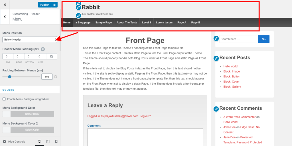
- Go to Appearance > Customizer > Menu.
- Set the Header Menu position to “Above Header” to make it appear above the site header, or “Below Header” To make it appear below the site header.
If you use both the Top Menu & Header Menu, your Top Menu will not appear on your website. To make the Top Menu appear:
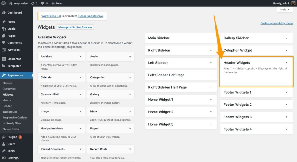
- Go to Appearance > Widgets.
- Add the ‘Navigation Menu’ widget to the Header sidebar.
- Select your previous Top Menu in the widget to make it appear on your website.
Responsive theme page template changes
After Responsive 4.0.0, following page templates will no longer be supported and will be removed completely in the future releases:
- Blog full post
- Blog 3 Column
- Blog Excerpt Summary
- Content/Sidebar
- Content/Sidebar Half
- Sidebar/Content
- Sidebar/Content Half
- Landing Page
- Sitemap
Responsive 4.0.0 has all the customizer options to design blog, single post or page templates. This makes these templates obsolete.
How will this change affect your website?
Pages on your website using any of the above page templates will now start showing with the default page template.
How to fix?
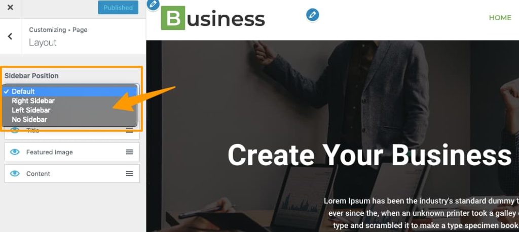
You can change the default page layout from the customizer options. To do that:
- Go to Appearance > Customize.
- Make changes to the default page layout from Page > Layout.
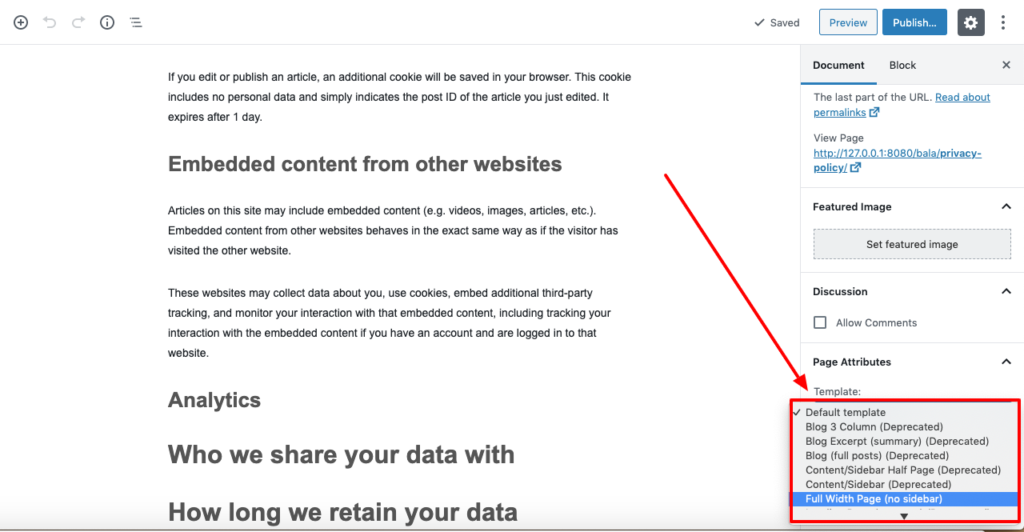
The ‘Full Width Page (no sidebar)’ page template will be available in Responsive 4.0.0 as well. This template is useful to design landing pages using the new Block Editor introduced in WordPress 5.0.
To apply the ‘Full Width Page (no sidebar)’ template for a page.
- Edit the page.
- Set the page template to ‘Full Width Page (no sidebar)’ from Page Settings > Page Attributes > Template.
- Save the page.
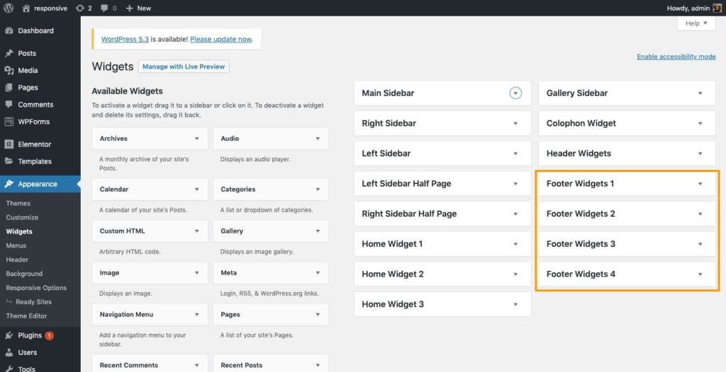
Responsive theme widget area changes
After Responsive 4.0.0, following widget areas will no longer be supported and will be removed in the future releases:
- Left Sidebar
- Left Sidebar Half Page
- Right Sidebar
- Right Sidebar Half Page
- Gallery Sidebar
- Colophon Widget
- Footer Widget
The ‘Top Widget’ sidebar is renamed to ‘Header Widgets’.
The footer gets four new widget areas — Footer Widgets 1 to Footer Widgets 4. You can use the below widget areas to create a fat footer design.
How will this change affect your website?
Any widgets you’ve added to the above-removed widget areas will not be visible on your website.
How to fix?
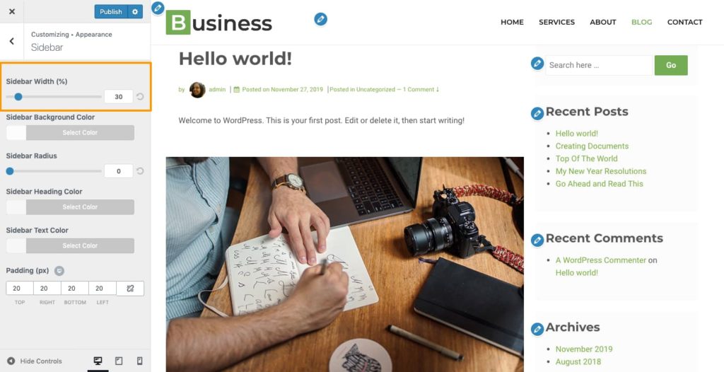
Move these widgets to the ‘Main Sidebar’ widget area from Appearance > Widgets.
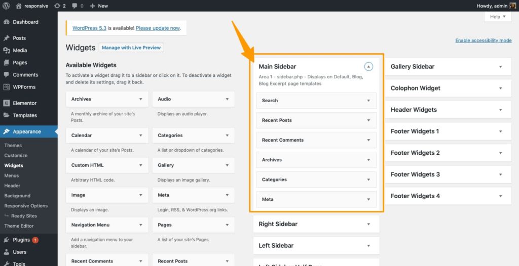
You can also customize the position and width of the Sidebar from Appearance > Customize.
Theme rollback moves to Responsive Starter Templates plugin
According to the WordPress.org Theme Handbook, a theme should not add any critical functionality.
We always strive to conform 100% with WordPress theme guidelines. This helps us keep the theme’s code at the highest quality. It also ensures that you get continuous access to the Responsive theme’s fixes and updates.
That’s why we’re moving the theme’s Rollback feature to the Responsive Starter Templates plugin.
How will this change affect your website?
This change will not affect your website in any way.
However, if you have auto-updates enabled on your website, you’ll not be able to roll back to a previous version from Responsive 4.0.0.
How to get the rollback feature?
The rollback feature will now be available via the Responsive Starter Templates plugin. Here’s how you can install the plugin:
- Download the Responsive Starter Templates plugin.
- Go to your website’s WordPress Admin Dashboard > Plugins > Add New
- Upload, install and activate the Responsive Add-ons plugin.
You should now be able to rollback the Responsive theme from the Appearance > Themes > Responsive theme popup.
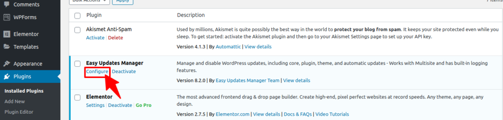
How to stop auto-upgrades for the Responsive theme?
The easiest way to do this is by installing and activating the Disable Updates Manager plugin.
After activating the plugin, follow the below instructions:
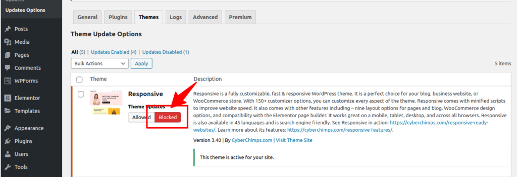
Go to Admin Dashboard > Plugins > Click on “Configure” under Easy updates manager
On the next page go to “Themes” and switch theme updates to “Blocked” for the Responsive theme.
Excited about Responsive 4.0.0?
We are. And you must be too.
Use this article as a guide to help you migrate smoothly to Responsive 4.0.0. The major changes coming to Responsive 4.0.0 are:
- Responsive theme HTML markup changes
- Responsive theme navigation menu changes
- Responsive theme page template changes
- Responsive theme widget area changes
- Theme rollback moves to Responsive Add-ons
Finally, in case you need any help, we’ll be here. Create a ticket or contact us for help.
46 Comments on “Responsive 4.0 is live. Here’s what’s new.”
Dear Cyberchimps, the Responsive Add-ons plugin is not known in the WP dashboard, when I ask for a new plugin. When is it available?
Please search for “Responsive Ready Sites Importer” from your WordPress Plugin Area to find the plugin from wordpress.org
How do you Disable automatic updates of the Responsive theme. (only)?
Please check this link https://cyberchimps.com/responsive-4/#How_to_stop_auto-upgrades_for_the_Responsive_theme
Where exactly is the rollback feature in the Responsive Add-ons plugin (which I see named as Responsive Ready Sites Importer)?
Or is there a separate plugin which isn’t linked here?
NOTE: your article, refers to “Download the Responsive Add-ons plugin.” but the link is to a Wordpress article. You need to edit this article for clarity.
Thank you, We have made the changes. You can download the “Responsive Add-ons plugins” here: https://en-za.wordpress.org/plugins/responsive-add-ons/
Really glad to see these updates are being made to Responsive Theme. Just a few comments/questions though:
1. It’s very confusing when you call your plugin “Responsive Add-Ons” but then refer to “Responsive Ready Sites Importer”. Are they really the same?
2. I installed and activated “Responsive Ready Sites Importer”, but I don’t see where there is a rollback option. How would I roll back there if I needed to?
3. I have a child theme, and my updates don’t ever come automatically. I didn’t see any code in my wp-config.php file regarding updates. Is the child theme somehow keeping auto updates from happening? I prefer to handle my own updates, so if that’s the case, that’s great! I just don’t want to be caught unawares and have the new Responsive Theme 4.0 be installed automatically before I’m ready.
4. How long after the 4.0 version will you be supporting 3.X versions?
5. A general comment…December is a rough time for businesses to be handling a major overhaul like this with the holidays and lots of traffic and business being done. Any way the rollout could be after the new year to avoid glitches at the holiday?
Sorry for so many questions. Thank you!
Hey Carol,
So sorry for the delayed response.
Once again, very sorry for late response, please check and let me know if you need any further clarifications.
Not really impressed when you say’f you are willing to make changes to your child theme, we’ll shortly be publishing a migration guide.’ The new release is here already – shouldn’t the migration guide be released at the same time. It’s not really professional to release an ‘upgrade’ which could possibly break someone’s site and your only option is to roll back to a previous release. For years I was very happy with your theme, but over the last 6 months various changes have taken place which have affected my site. We were encouraged to use child themes as these were supposed to be unaffected by news versions of the parent theme.I pity anyone who had their site developed by a web-designer and thought that was the end of it, they obviously will have to keep paying out to keep their site working and up-to-date.
Hey Ian, The migration guide will be provided before the release. Responsive 4.0.0 is not launched yet. Please be assured, the guide will be provided before the launch. If you want to continue using 3.40 version, we would advise you to stop auto-updates and continue with the same version. We are glad you have trusted us so far and we plan to deliver a better experience to you! Our support team will always be here to assist you.
Wouldn’t it have been easier on everyone to just create Responsive2 and let people switch when they wanted, rather than have roll-backs and blocks?
Hey Mark, we understand the hesitation, but these changes are made to improve your site performance. The code of the existing theme is updated to comply with W3C standards. We have also simplified the design options to make it easy for you to manage all settings from the customizer.
The team is making a major error if you think that your existing client base (50,000 installations?) will in future rely completely on your integrated Customizer. I have based many sites on Responsive because it provides a solid and flexible basis for Child Themes that can be customized in much more detail – for example with context-sensitive CSS and modified templates for special cases. Please make sure that when your Migration Guide appears it has a COMPREHENSIVE list of element names that have changed. It would be a nightmare to have to chase down every CSS selector that has been changed and corrupted a live site design. The correct procedure would be to offer the new version as an alternative that is not backwards-compatible, rather than assuming to over-write and break live sites. WordPress itself does not force major version upgrades.
Hey Richard,
I can understand the hesitation, but we have made the changes to follow the theme guidelines given by WordPress.
https://make.wordpress.org/themes/2015/04/22/details-on-the-new-theme-settings-customizer-guideline/
We have created a migration guide that includes CSS changes required in child themes.
https://docs.cyberchimps.com/responsive/upgrading-to-4.0.0
Please check the beta version on your test site and let us know if you face any issues.
For templates, we have ensured that default settings are selected in the customizer to avoid rework of manually updating the layouts.
Feel free to contact us for any queries in migration.
Would it be possible to have a link to download Responsive 4.0.0 now for people who would like to test it?
Hey, We have added link for beta release in the top, please test the beta release for your site and share your feedback with us.
Any update on the release date for Responsive 4?
Hey Jock, We released a beta version yesterday, the link is given at the top of this article. Please test it for your site and share your feedback with us.
So tell e how do I test it? Do not want to wreck my site.
You need to have a staging or a test site which is a replica of your existing live website. On this site, you can take the zip from the beta link and upload it. Test your website to ensure everything is working fine. Please let us know if you face any issues while testing.
Hey Joe, we would suggest testing the migration steps on your test site first and after testing you can deploy the changes on life. We understand the hesitation, but all these changes are made to improve the theme quality and features.
Hello, in the artical you spoke about the release in the beginning av december of Responsive 4.0.0.. now it hav past the first half of december… Is it a date set when the release of Responsive 4.0.0 will be?
Hey, we will be launching it by the end of December or by early January. We will be sharing the beta version shortly for you to try and test.
I agree with Mark:
Wouldn’t it have been easier on everyone to just create Responsive2 and let people switch when they wanted, rather than have roll-backs and blocks?
Hi Gunnila,
These changes have been made to comply with latest WordPress theme standards and improve W3C compliance.
It would be really great if you could answer CarolH’s questions from Dec 4.
Hey Danny, we have responded to Carol’s questions. Sorry for the delay.
I agree with Ian Dale fully. I’ve been happy with the theme but for the last six months I have seen how any attempt at individual creativity is being eroded, so that everybody is forced to use the Customizer which is not satisfactory at all. Does this mean that any CSS in child theme will be ignored? I also agree that December is a very bad time for any major updates/upgrades in view of the holidays and suchlike. This is very badly thought out and inconsiderate.
The compatibility with Customizer is for WordPress standards compatibility. All theme settings have to be moved to Customizer. Please refer to https://make.wordpress.org/themes/2015/04/22/details-on-the-new-theme-settings-customizer-guideline/. The child theme can still continue with Custom CSS. Some HTML structure has to be changed to make it W3C compliant. Please refer to migration guide. We will be releasing after the holiday period is over. You can try the beta releases to check your site is working fine with the new theme coming up.
Thanks for the beta version download.
We have a lot of years of edited templates and a lot of custom css styles using a child theme so we were very worried about what to expect with the update.
It went a lot smoother than expected. We followed your guidelines and it took about 15-20 minutes to get everything configured. Most of that time was just finding the settings we needed to change in the customizer.
We were so nervous for all this time for nothing. The changes that you made to the theme were definitely needed. Nice improvements. Thanks!
Thanks for your feedback :) We are glad you had smooth website transition.
Is the migration guide ready yet?
Hey Mark, the migration guide is updated in the documentation
Please take a look and feel free to ask any queries.
Hi, I’m excited about the better performance, but hesitating to migrate too: I’ve got a site with qTranslator pages and a language switch widget. Will it work and will I find it in te widget area?
What to do with all the subpages that are placed under Achtergronden (Dutch)?
Hey Aly,
Sorry to get back to you so late! In order to answer your question more accurately we might need more details. Can you drop us an email at [email protected] with your website URL?
Thanks!
This is great!
After upgrading from some late (2019) Responsive version 3.X to 4.0.4, my web application’s launch time went from about 3.5 – 5 seconds (cold) to 1.7 seconds (cold).
Warm it is now 1.0 seconds. I don’t have an exactly time for the warm time for 3.x, but I think it was about 2.5 seconds.
Good to know that your website loading time has decreased!
Hi to everyone at Cyberchimps! Many thanks for this guide to upgrading to Responsive 4.0.x, I found it a useful way to prepare for the upgrade.
I’m having a little trouble with my ‘header image’ though, which is now appearing much smaller than before.
My image (accessed through Appearance >Customize >Extras >header image) is 960 x 200 pixels but appears at around one-third of this size in the top left-hand corner of the page.
Do you have any ideas about how I might restore my header image to its ver. 3.40 appearance?
Hi Richard,
Sorry to get back to you so late. If you are still struggling with this, try selecting the Header Layout as Vertical in Appearance -> Customize -> Header -> Primary Header and then select Header Alignment as Center.
how do I edit the featured-image and featured-content div when selecting enable custom page on the responsive theme. Essentially I am working to have one image center as it was once set up.
https://www.youtube.com/watch?v=BiNS4CYRDdM <– an older video of what i am trying to accomplish again.
Hi Shawn,
Sorry to get back to you so late. If you are still struggling with this, try going to Appearance -> Customizer -> Homepage settings -> Enable custom front page.
Let us know if this works!
Thanks.
Hi,
I previously had two horizontal menus at the top of my home page. I’ve read the guide to add the top menu to the header widgets but when i do this the menu becomes vertical on the top of the page. How do I switch it to a horizontal menu, going across the screen left to right?
Thanks,
Peter
Hi Peter,
Sorry to get back to you so late. If you are you struggling with this please ready our details documentation here to learn how to set up a menu – https://docs.cyberchimps.com/responsive/customizer-settings#main-menu
Let un know if this helps!
I recently updated from 1.9 (I know…) to 4.x. I see that the FitVids jQuery plugin was removed. Now, my embedded videos are no longer responsive. How can I make videos responsive again?
Thanks,
Hi Steve,
You can try re-insalling the plugin manually.
My website didn’t work with 4.0, so I had to replace my backup. It still works well with 3.40/classic wp-editor. I thinkk there is a problem with q-translate which i recently updated through github. So it all works. Is there a safety issue with the older repsonsive theme? Is it still safe to continue with responsive 3.40?