
Summary
The article explains how to create a custom header and footer in WordPress. It shows how to use Elementor or theme settings to build and assign header and footer layouts.
It also covers basic design options like menus, logos, and style settings for a personalized site layout.
Do you want to build custom headers and footers to improve the UX of your website?
The secret to an excellent user experience lies in the site’s most basic elements, which are the header and the footer. These elements are the first and the last things your website users would see, which significantly influence UX.
When you build custom headers and footers, you directly enhance user experience by creating consistent sitewide branding, providing clear navigation, and placing important information in a prominent location.
To make this task easy, let me introduce you all to the Responsive Plus site builder feature, which lets you easily build custom headers and footers to add to your pages.
So read along and understand why you should build custom headers and footers for your website and watch how visitors turn into customers.
- Why Headers and Footers Matter for WordPress UX
- What Makes a Good Header in WordPress UX?
- What Makes a Good Footer in WordPress UX?
- How to Build a Custom Header Using Responsive Site Builder
- How to Build A Custom Footer Using Responsive Site Builder
- Best Practices To Build Custom Headers & Footers in WordPress UX
- FAQ
- Conclusion
Responsive Starter Templates is the best plugin to import Website Templates – Get it for free.
Why Headers and Footers Matter for WordPress UX

A header and a footer are elements for the top and the bottom of your website that are not only important from an aesthetic view, but also for functionality.
A custom header might include a unique layout with a prominent call-to-action (CTA) or a search bar. A custom footer includes a combination of contact information, social links, and navigation menus.
Here are the reasons why you should build custom headers and footers:
1. Establish Brand Identity
The header, which is the first thing that your website user sees, features your logo and brand colours, instantly conveying your brand identity. The footer maintains this with consistent design.
2. Guide User Navigation
They help navigate to various pages of your website. The main navigation menu directs users to important sections, while the footer provides an opportunity for users to explore additional alternative content.
3. Improve Site Credibility
A nicely designed header and footer helps instill trust in the website or business in the eyes of the users and indicate that your site is well-maintained and credible.
4. Increase User Engagement
A good header ensures that navigation options are always accessible and facilitates easy browsing. It also increases engagement opportunities through links to social media, media display, or more.
5. Provide Essential Information
Your site’s header and footer are pools of information. They include links to pages of your site, search bars for quick access, and much more. The footer includes elements such as contact details, feedback forms, legal notices, and copyright information.
6. Enhance mobile usability
When designed to be responsive, headers and footers adjust to smaller screens, like those of a smartphone, improving UX.
What Makes a Good Header in WordPress UX?
A good header acts as a map of your website. When you build custom headers and footers, you should focus on them being clean, minimal, and always accessible.
Key Elements

- Logo: The header should clearly display the logo of your business and should also link back to the homepage.
- Navigation Menu: It includes a menu that displays clear links to each page of the website, such as “Home”, “About”, and so on.
- Clear CTA: A header includes a prominent button or a link that enables visitors to take a specific action, such as “Shop Now” or more.
- Search Bar: An important feature for content-rich sites, which enables users to quickly locate specific articles, products, or services.
- Sticky Header: A header that stays at the top of the screen even after scrolling is called a sticky header.
Best Practices
- Keep it simple and minimal: Adopt a clean and minimal layout that avoids clutter.
- Consistent header: The header should remain uniform across all pages to maintain brand identity
- Responsive design: The header should be responsive and able to adapt to all kinds of devices.

Now, at some point, we’ve all seen this popular header. Would you use this site if the header were confusing and unclear? No right? All of the best practices on this site have been implemented, which helps its UX.
What Makes a Good Footer in WordPress UX?
A well-designed footer is not just for aesthetic purposes. It is a strategic area that acts as a valuable hub of information and makes an impression.
Key Elements

- Secondary navigation: The footer provides access to the links of less critical pages, such as Privacy Policy, FAQs, and so on.
- Contact info: It mentions your business address, phone numbers, and social links, which help you communicate easily.
- Opt-In: Displays a form for newsletter signups or other lead magnets.
- Copyright: This is the copyright notice, along with legal disclaimers that a website requires.
- Social icons: These are the links to your business’s social media profiles.
Best Practices
- Organise using columns: To display a minimal and clear header, you must use a multi-column layout to group different sections of the footer, making it easy to read.
- Maintain readability: Use an appropriate font style, font colour, and a legible font size for website visitors to be able to read. You should ensure contrast between the background of the header and the font colour.
- Responsive design: The footer, like the header, should also look and function perfectly on both desktop and mobile devices. You must make sure to use a responsive design to build your footer with appropriately sized links and icons.

In the same way, do you think this site would be as popular as it is if the footer were confusing?
How to Build a Custom Header Using Responsive Site Builder
Now that we know the importance of a header and footer on our website, let’s learn how to create one.
The Responsive Site Builder is a powerful tool that integrates with the Responsive Theme. It enables you to create custom headers and footers without having technical skills.
Why Use Responsive Site Builder?
The Responsive Site Builder is a tool to help you effectively create headers and footers. The following are the reasons why you should use it:
- Drag-and-Drop function: You can drag and drop elements to your pages, making it beginner-friendly.
- Responsive Theme Integration: As it is a built-in feature of the Responsive Theme, you don’t have to install extra plugins.
- Optimised for performance and UX: It uses clean and minimal code, preventing your site from slowing down.
Step-by-Step Guide To Add a Custom Header for Different Pages
The first step is to install the Responsive Theme by Cyberchimps by navigating to Appearances > Themes > Add Themes.
You also need to install the Responsive Plus – Starter Templates Plugin by navigating to Plugins > Add Plugins.
I have also installed the Baker starter template using the Responsive Plus – Starter Templates plugin. For this, you can navigate to the Responsive Dashboard > Templates > search for the Baker template > Import Site.
Now, let’s begin. Click on the Responsive dashboard.

Scroll down to find the Site Builder feature on the dashboard and switch it on.

Now, click on Site Builder.

It will open to the Site Builder dashboard. Next, click on the Header Layout > Create Layout.

You can choose to create your custom header in the Gutenberg Block Editor as well as Elementor. Here I’ve chosen to make it using Elementor Page Builder. So click on Edit with Elementor.

Next, click on the + to add a layout to your header design.

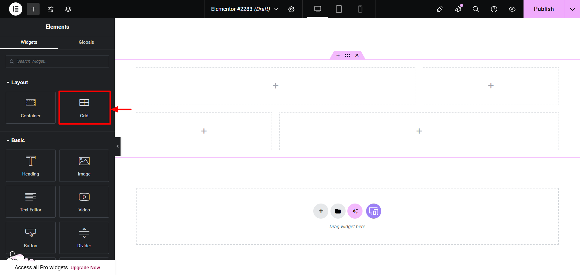
Choose the Flexbox. Alternatively, you can also use the grid format. It totally depends on what your needs are.
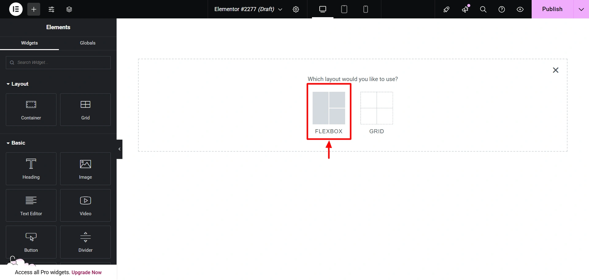
Select this layout.

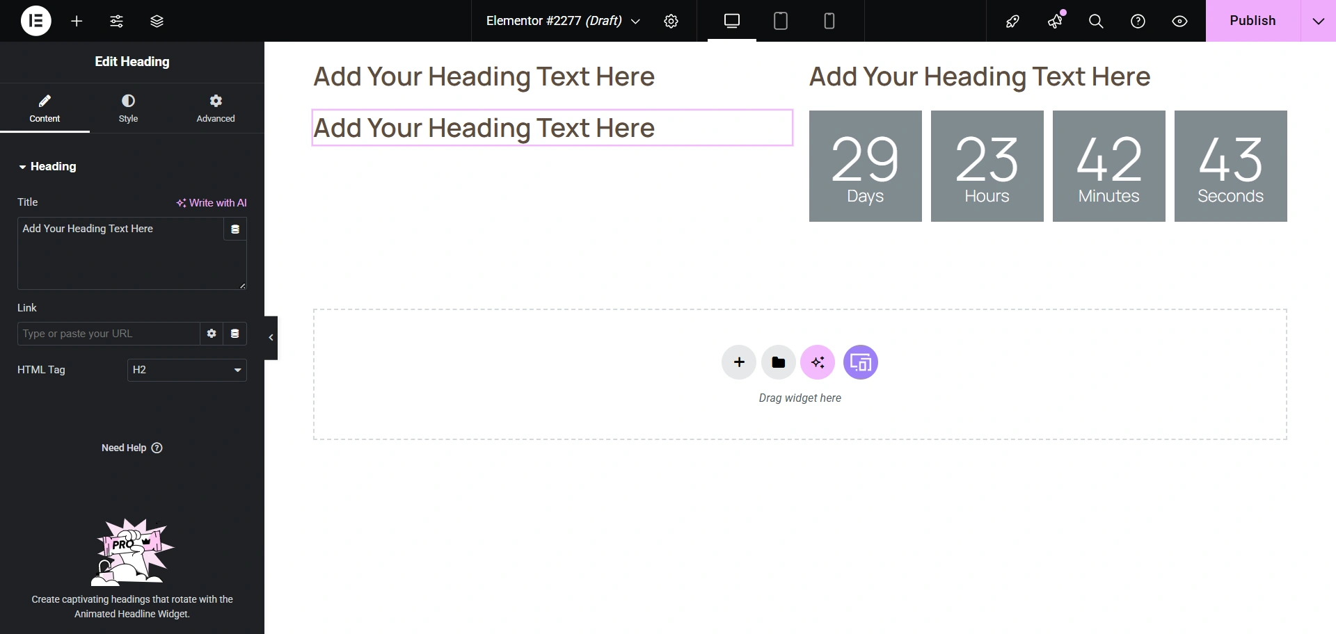
Now, let’s add the Heading Widget.
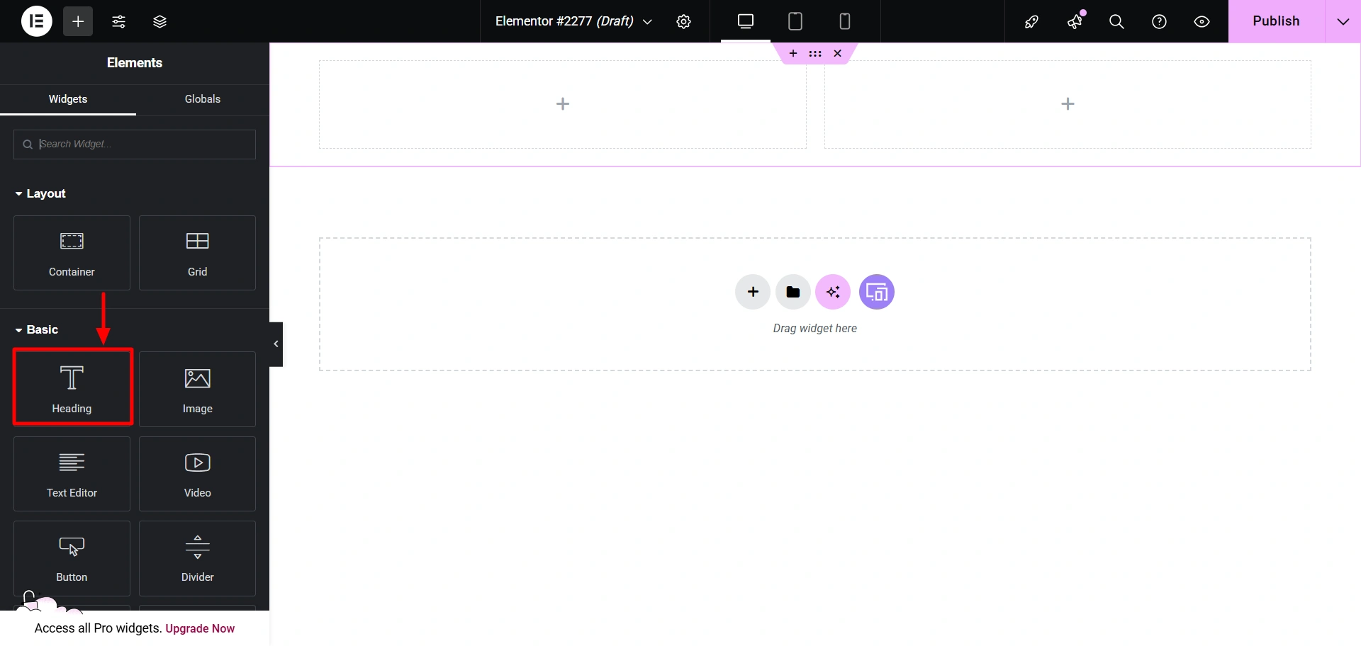
I have added it like this. You can add it however you like.

Now, I will add the Countdown widget from the Responsive Addons for Elementor plugin by Cyberchimps.
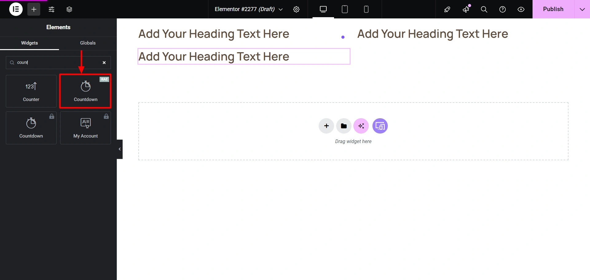
It would look like this.
Now you can add your content to it and change the style if you want.
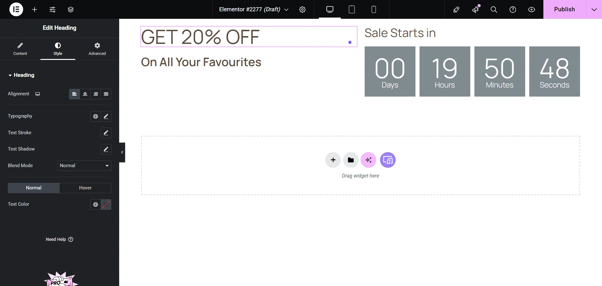
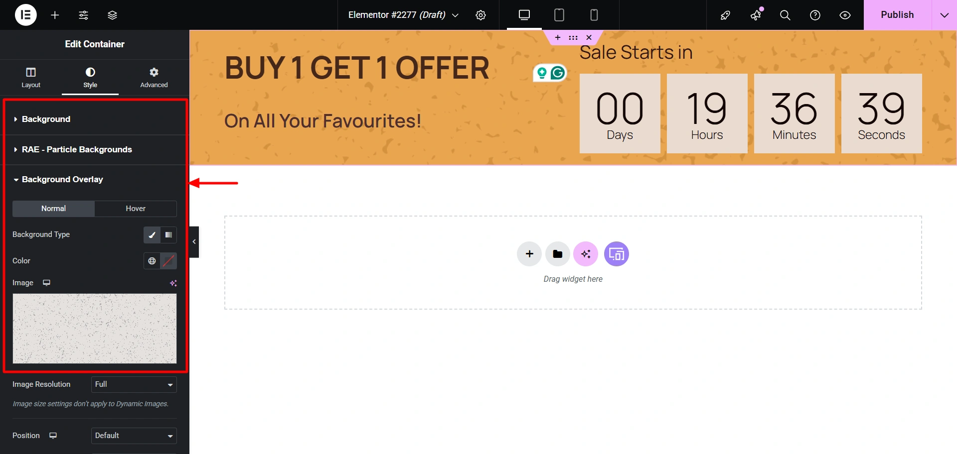
I have also customised the text and colors in the Style tab. You can add background colours and background overlays using the respective settings.
Finally, when you’re done, hit Publish.

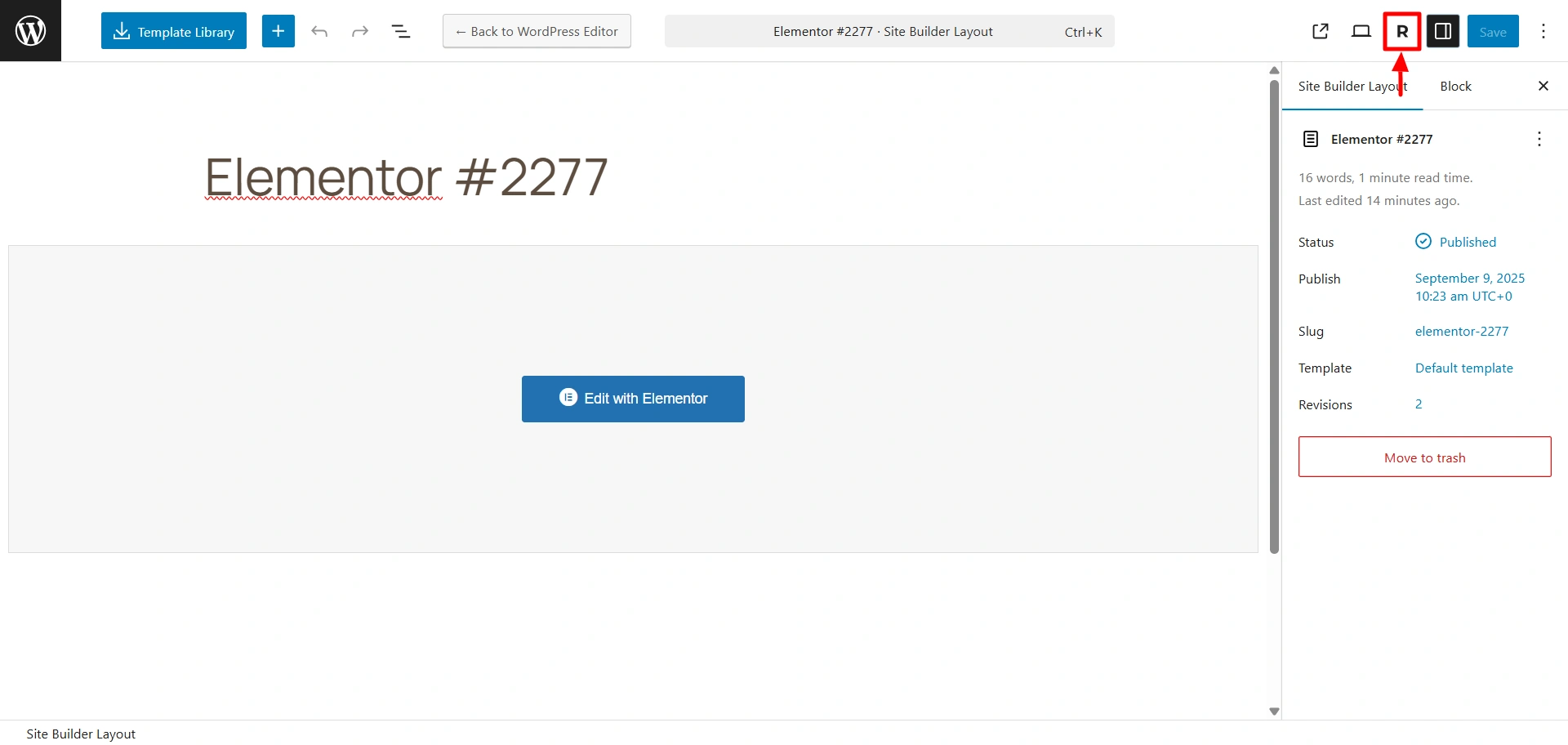
Now, if you go to the Site Builder dashboard. You’ll be able to see your design. Click on Edit.

Click on the R button, to open the settings where you can assign this header to specific pages.
Next, click on Display & User Conditions.

Select which pages you want to assign it to.

There you go! You can now view it on your website.

Wasn’t it easy to build a custom header for your website? Go ahead and create your own.
How to Build A Custom Footer Using Responsive Site Builder
Now that we have learnt how to build a custom header, let’s learn how to build a footer using the same method.
Step-by-Step Guide To Add a Custom Footer for Different Pages
In the Site Builder Dashboard, click on Create New in the Footer Layouts.

I’m now going to add this layout. Follow the same steps for building the header.

Drag and drop the Heading Widget wherever you want to add a heading.

I’ve also added the Social Icons Widget to my layout. Also, add your social media links to them

Later, I added a few other widgets from the Responsive Addons for Elementor plugin to the layout. I have added my content to the sections.
Using the settings panel on the left, I also customised the background colours, fonts, and added a particle background, and this is what I created.

Now hit Publish to publish your changes.
Add the footer to whichever pages you want by following the same steps as we did for the header.
Finally, you will see your footer now added to your website.

This is how you build custom headers and footers for your website to optimise the UX of your website.
Best Practices To Build Custom Headers & Footers in WordPress UX
Wanting to build headers and footers is a great start, but it is good to keep certain best practices in mind, which would ensure that they effectively improve your WordPress site’s user experience.
- Mobile-first design: Use a mobile-optimised design for headers and footers to guarantee an excellent experience for the majority of users who nowadays make use of mobiles to visit websites.
- Accessibility: They should have legible text and font sizes and an appropriate color contrast
- Test regularly: Make sure that you regularly test the performance of your custom header and footer. Make use of A/B testing to find out the best-performing header and footer to enhance user engagement.
- Improve Loading Speed: You must reduce the number of elements in your header and footer to improve the speed of your website. Slow-loading websites are not appreciated if you want to improve the UX of your website.
If you focus on these points, you can not only create visually appealing designs but also highly functional and efficient designs for all users.
FAQ
The header is the first thing that a website visitor comes across when they first open a site. It is positioned at the top of the page. It acts as the primary navigation and branding area. The footer is located at the bottom of the page and includes secondary information such as contact details, legal disclaimers, and social media links.
Hell yeah! With the Responsive Site Builder, you can easily create sticky headers that remain visible even when you scroll up and down and transparent headers that seamlessly blend with the background of the pages.
The Responsive Site Builder uses a drag-and-drop function so you can easily add a “Button” to your header template by dragging and dropping it. You can then move ahead and customise its text, colour, link, and style.
Yes! To use different footers for different pages, you can assign different footer templates to distinct pages, posts, or categories on your website. Do so by using the Responsive Site builder’s “display conditions” feature in the Responsive Site Builder.
No! The site’s performance won’t be affected if done properly. Using a performance-optimised tool like the Responsive Site Builder to build custom headers and footers, customising headers and footers will not negatively impact your site’s speed. The key is to avoid using multiple heavy, unoptimised plugins for this process.
Conclusion
Now, we know the importance of having custom headers and footers in enhancing UX. It helps visitors navigate your site and strengthens your brand identity.
Use the Responsive Site Builder tool to simplify the process and build custom headers and footers that are aesthetic as well as efficient. It is totally beginner-friendly and requires no special skills or coding knowledge.
So take control of your website’s UX today and start creating a better experience for your website users to turn them into customers.
If you like this article, consider reading it.
- Build Author Website in Minutes with Book Author Starter Template.
- How to Launch a Successful Affiliate Campaign for Your WordPress Website
- How to Create a WordPress Dropdown Menu in 15 Minutes for your Website
Grab the Responsive theme today and build your own book treasure.