Images are an essential component of any website. They help to capture the reader’s attention, increase engagement, and surpass any language barriers with your content.
Use the Image block form to add visually appealing images to your website. This block provides a simple and easy-to-use interface for aligning and customizing images.
The block has multi-functional features to create beautiful content layouts for your images.
How to Use the Image Block in Responsive Blocks Addons #
Remember that the following instructions are tailored to users who have already installed the Responsive Blocks plugin on the WordPress platform.
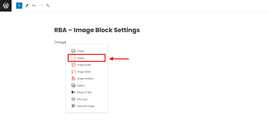
You can add the image block to the editor by typing “/image” and selecting the RBA Image block from the suggestions.
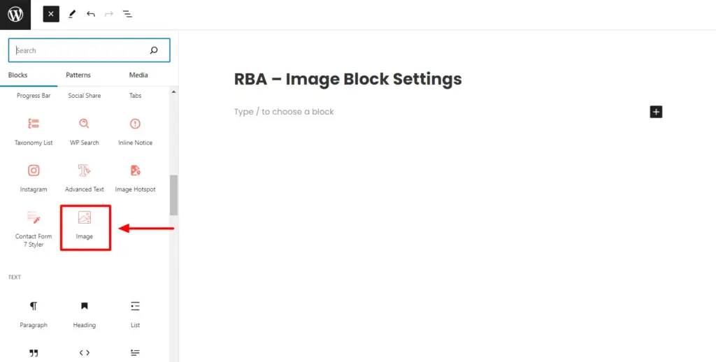
Or you can directly drag the image block on the editor using the Responsive Gutenberg Blocks library tab.
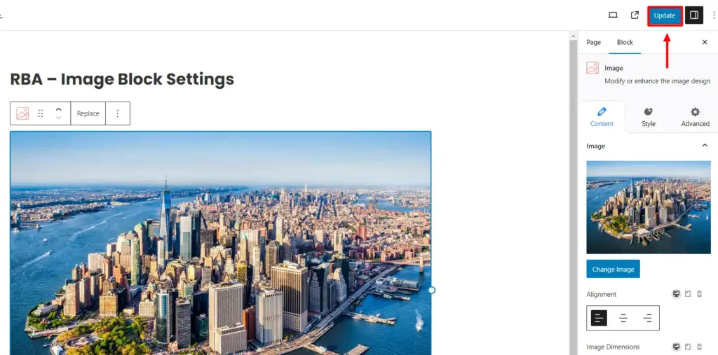
This brings up the Image block settings to upload an image.
You have three options to add images: upload from the desktop, choose from the media library, or insert via URL.
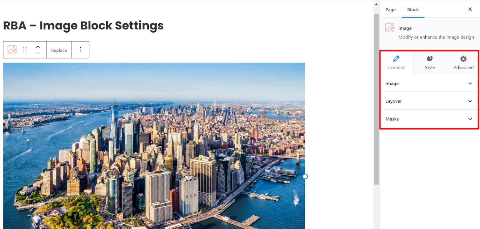
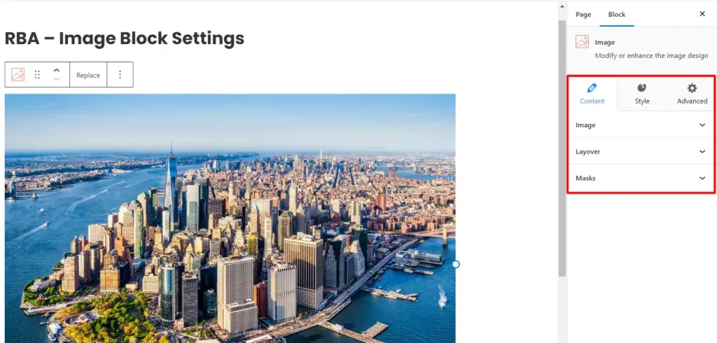
Once you have uploaded the image, you can begin customization using the Block settings.
Content Settings in Image Block #
Responsive Blocks provides you with multiple formatting settings to easily customize the contents of your Image block.
Image #
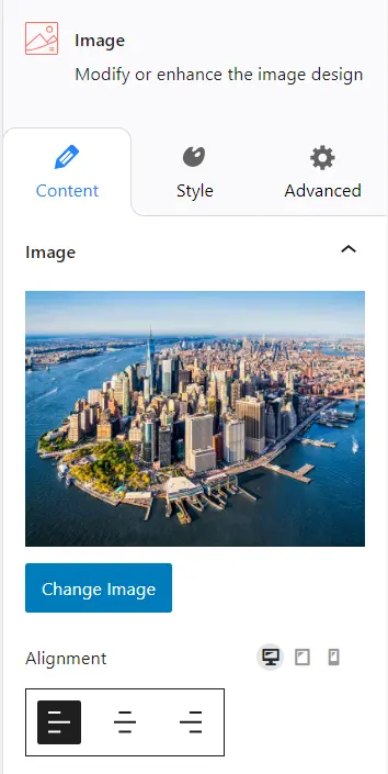
Under the image settings, you get various options like:
- Change Image: You can use this to replace your content with a new image.
- Alignment: Choose this to align your image to the left, center, or right in the editor.
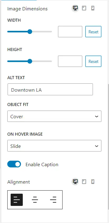
- Width: Allows you to adjust the width of your image.
- Height: Allows you to adjust the height of your image.
- ALT Text: Enter alt text for your images in this field.
- Object Fit: Allows you to control how the image behaves within its designated space on the webpage. You can choose from options like Default, Fill, Contain, and Cover.
- Default: The image has its original size, and the container adjusts accordingly.
- Fill: The image will stretch to fill the container with an improper ratio.
- Contain: The entire image will be visible within the container, maintaining its aspect ratio.
- Cover: The image will cover the entire container and possibly crop parts of the image to maintain the container’s aspect ratio.
- On Hover Image: You can decide how your image behaves when a visitor hovers over it. Choose from animation settings like Static, Zoom-In, Slide, Grey Scale, and Blur.
- Enable Caption: Enable the caption setting to write text below the image.
Layover #
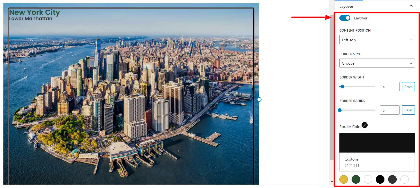
- Layover: Toggle the button to place an additional bordered layer inside the image.
- Content Position: This determines the position of content placed inside the layover. You can choose the position for your content from the following options: top left, top center, top right, center left, center, center right, bottom left, bottom center, and bottom right.
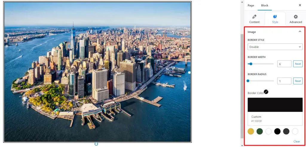
- Border Style: You can customize the appearance of the border inside the image. You can choose from options like solid, dashed, dotted, double, groove, ridge, inset, and outset.
- Border Width: Use the slider to decide how thick or thin the border should be.
- Border Radius: Use the slider to adjust the roundness of the corners of your border.
- Border Color: Allows you to set the color of the border.
- Border Distance From Edge: Use the slider to adjust the space between the border and the edge of the image.
Mask #
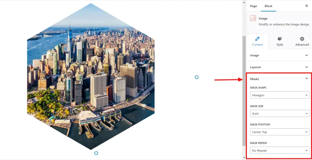
- Mask Shape: This allows you to choose a specific shape or pattern to use as a mask for the image. You have the option to select from a variety of shapes like circle, square, hexagon, rounded, or blob shapes to give your image a unique visual style.
- Mask Size: Use this setting to control the size of the mask applied to the image.
- Mask Position: Use this to determine where the mask should be located within its container. Choose from options like top left, top center, top right, center left, center, center right, bottom left, bottom center, and bottom right.
- Mask Repeat: Use this to control how the masked image is repeated. You can choose to repeat the mask from the X-axis or Y-axis.
Style Settings in Image Block #
Border Style #
Border Style: Determines the style of the border around the image to provide a frame-like effect. You can choose styles like solid, dashed, dotted, double, groove, ridge, inset, and outset.
You also get options to customization options such as border width, border radius, and border color.
Margins #
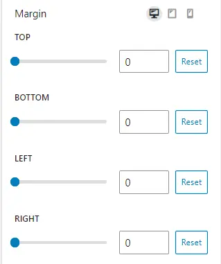
Use the sliders to adjust the space around the image to create a buffer between the image and surrounding elements on a webpage.
Box Shadow #
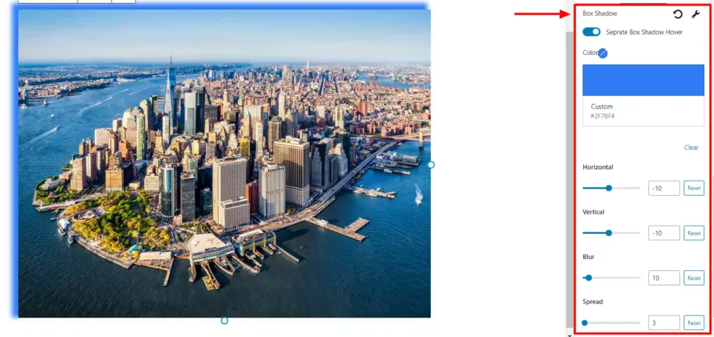
- Box Shadow: Toggle the button to add a shadow effect around the image. It helps create a sense of depth, making the image appear slightly elevated from the background.
- Color: Allows you to choose the color of the shadow.
- Horizontal/Vertical: These settings control the position of the shadow. Use the sliders to position your shadows as per your preferences.
- Blur: You can adjust the amount of blurring applied to the shadow.
- Spread: This slider controls the size of the shadow. Adjust it as per your preference.
Heading #
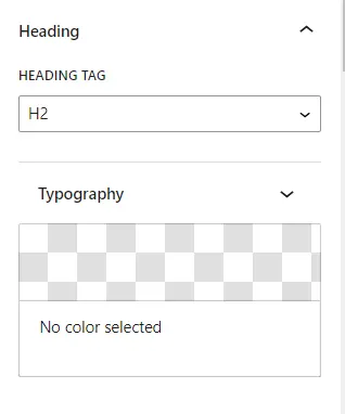
- Heading Tag: Allows you to select the type of header you want on your image.
- Typography: Provides you options to customize the style, arrangement, and appearance of text.
- Font Style: Allows you to choose from different font styles for the text, such as normal, italic, or bold.
- Font Size: Enables you to adjust the size of the text.
- Text Color: Determines the color of the text on the image.
- Text Alignment: Specifies how the text should be aligned(left, center, right).
- Typography Color: You can select the color of the text.
After customizing your Image block, click Update to save your changes.
Your Image is posted on your website!
Get Responsive Blocks Addon plugin for your website today!


Leave a Reply