Contact Form 7 is a widely used WordPress plugin that helps us easily create contact forms for websites. However, very few default styling options exist in these forms and may not always align with your website’s overall design.
The Responsive Block Addon offers Contact Form 7 Styler, a tool that can be used to customize the default form as per your preference. It has a user-friendly interface and a wide range of styling options that allow you to customize the appearance and style of your forms.
Using this block, you can transform your forms into visually appealing elements that meet your website’s theme and enhance the user experience.
How to Use the Contact Form 7 Styler? #
Install the Responsive Blocks Addon to use the Contact Form 7 styler and other multi-functional blocks.
The Contact Form 7 Styler has extensive formatting options to customize your forms. However, the styler provides only customization and needs the Contact Form 7 plugin installed for it to work.
You can install Contact Form 7 plugin from the WordPress directory.
In your WordPress dashboard, open the page where you want to add the form.
From the Responsive Blocks library, select the Contact Form 7 Styler widget to create a form styler on the editor.
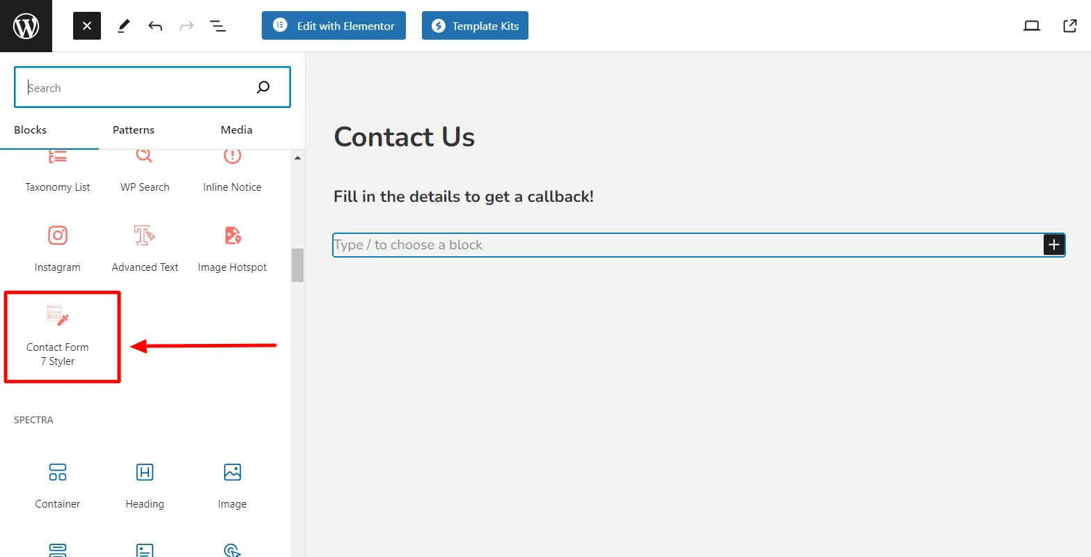
From the dropdown menu, select the form you want to customize. (You can add forms using Contact Form 7 dashboard).
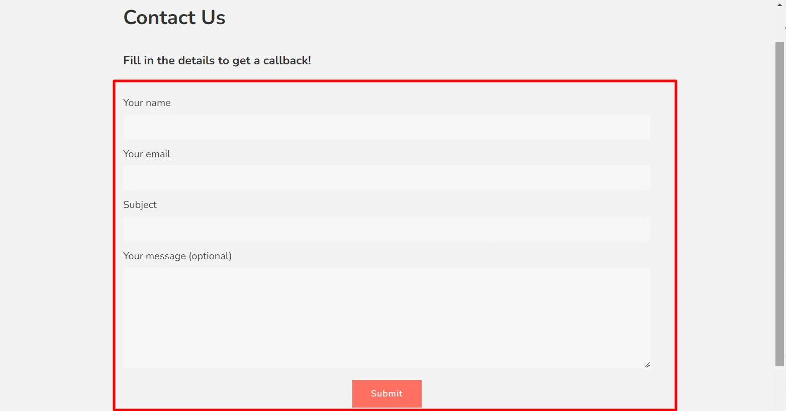
The form is added to the editor.
Customization Options Under Content Tab #
Using the Content tab, you can format multiple elements on the form. Let’s have a look.
1. Contact Form #
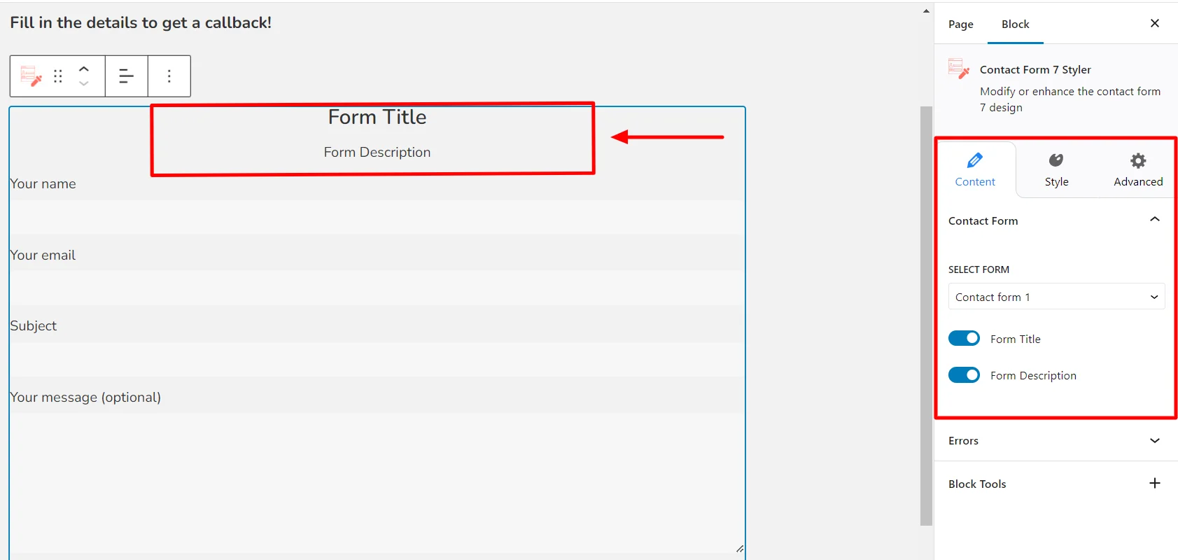
- Select Form: This option allows you to select the form you want to customize.
- Form Title: Use the toggle on/off button to add or remove the form title.
- Form Description: Use the toggle on/off button to add or remove the form description.
2. Errors #
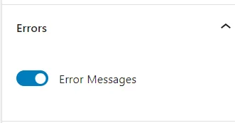
To show or hide error messages, simply use the toggle button that turns them on or off.
Customization Options Under Style Tab #
Click on the Styles tab to begin customizing the form.
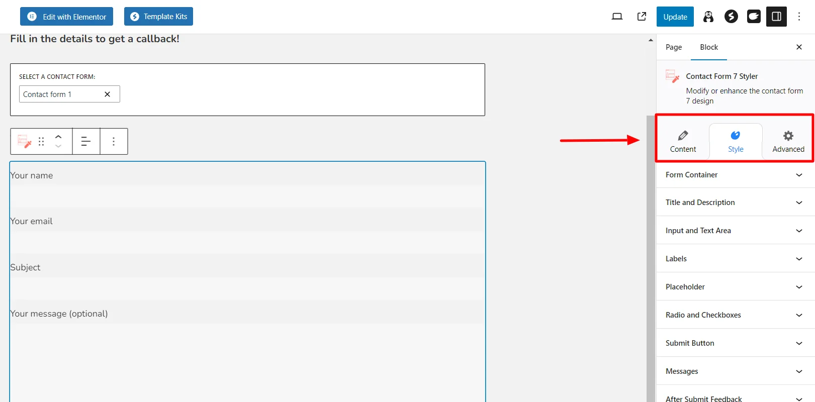
Responsive Block Addon offers the following customization options for your forms:
1. Form Container #
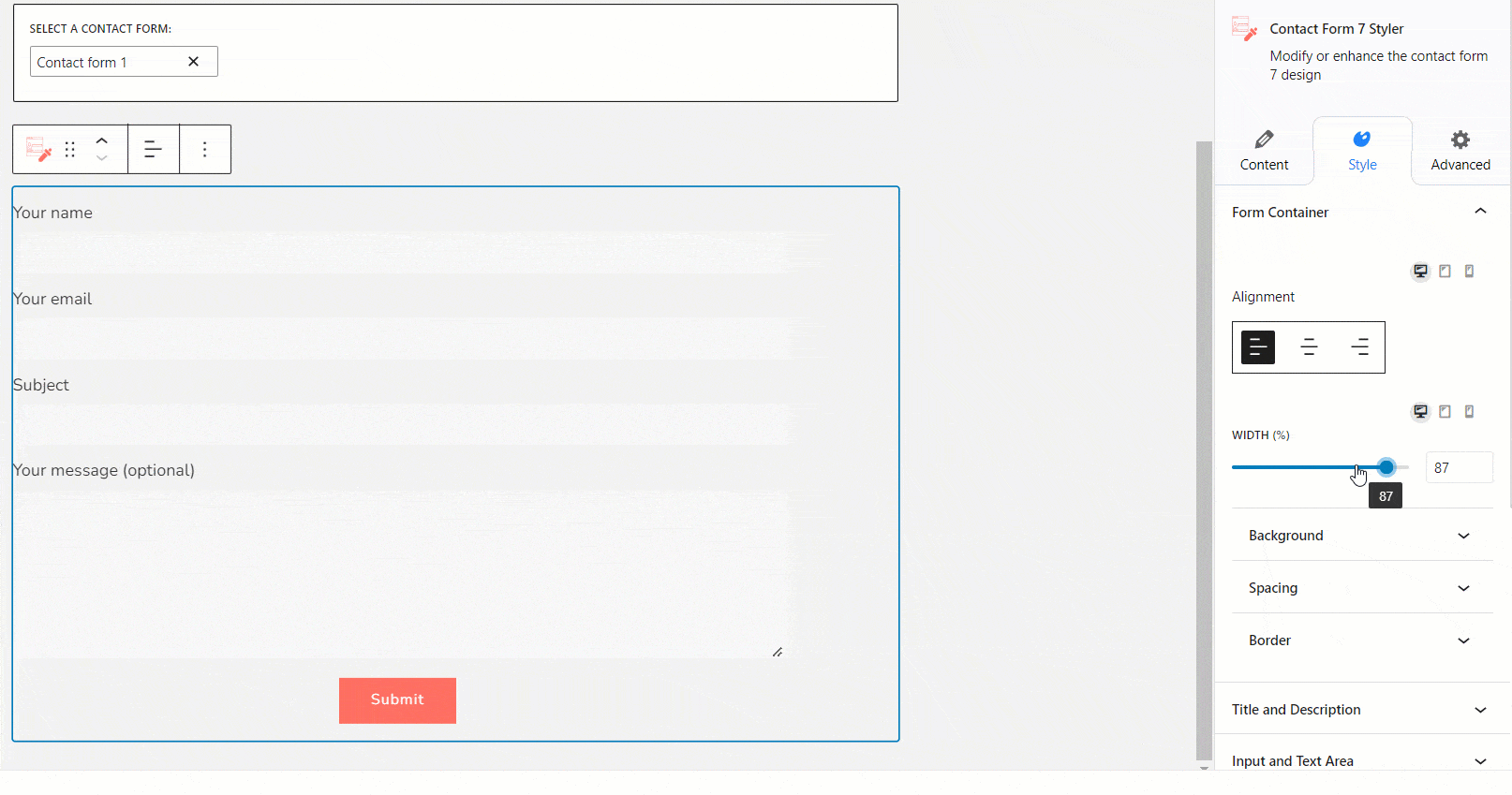
- Alignment: Use this function to align the form (left, center, or right) according to your desired design.
- Width: Use the slider to customize the width of your form.
In the Background tab, you can customize the background settings for the form container.
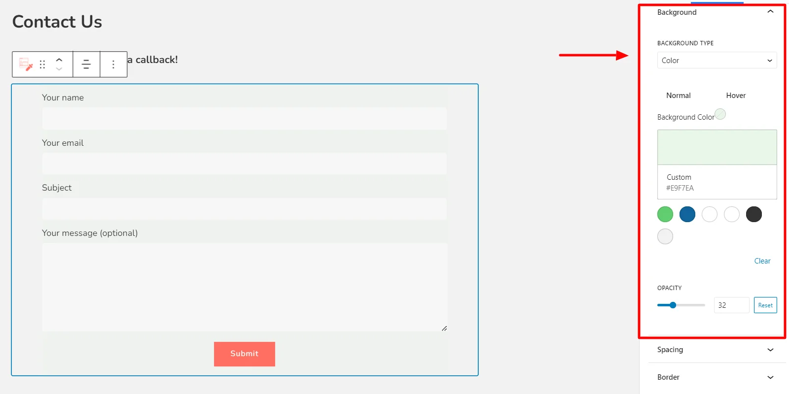
- Background Type: Select the type of background you want for your container. You can choose to have color, gradient, or none.
- Background Color: Select the color for your background container. You can choose from the suggested theme colors or use the color palette to get the desired results.
- Opacity: Use the slider to select the transparency of your background, ranging from completely transparent (0%) to completely opaque (100%).
Under the Spacing tab, you can customize the padding and spacing for your forms.
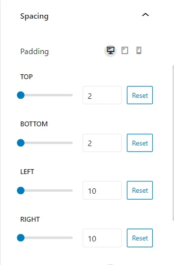
- Padding: Use the sliders to change the inner spacing between the border of the content and the container. You can give custom padding from the Top, Bottom, Left, and Right.
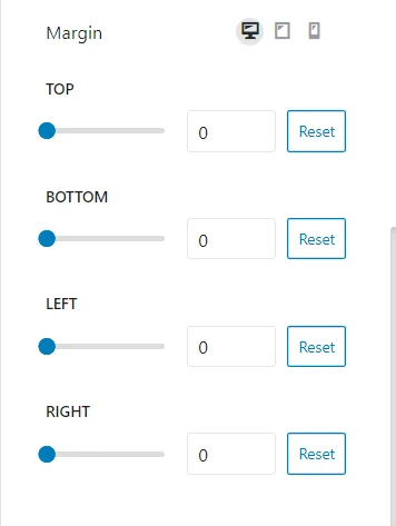
- Margins: Use the sliders to change the outer spacing between the border of the content and the container. Create custom padding using the Top, Bottom, Left, and Right slider options.
The border tab provides options to customize the border of the container.
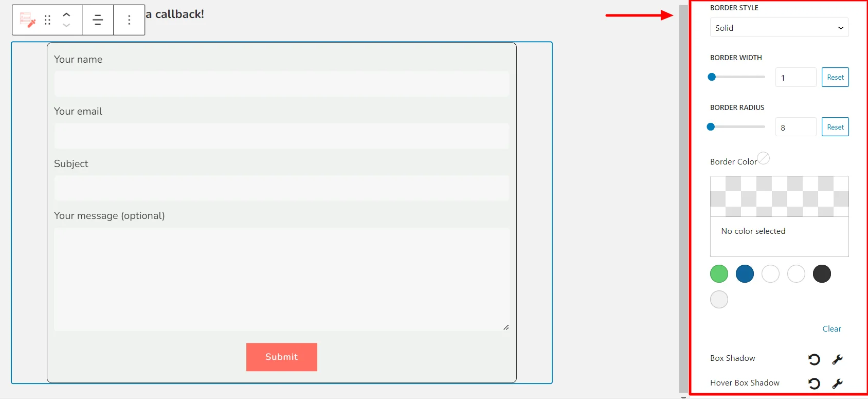
- Border Style: Choose different appearances for the borderline styles, such as solid, dotted, dashed, double, and more.
- Border Width: Use the slider to customize the thickness of the borderline.
- Border Radius: Use the slider to change the roundedness of the corners of the container.
- Border Color: Select the border line color using the theme colors or the color palette.
2. Title and Description #
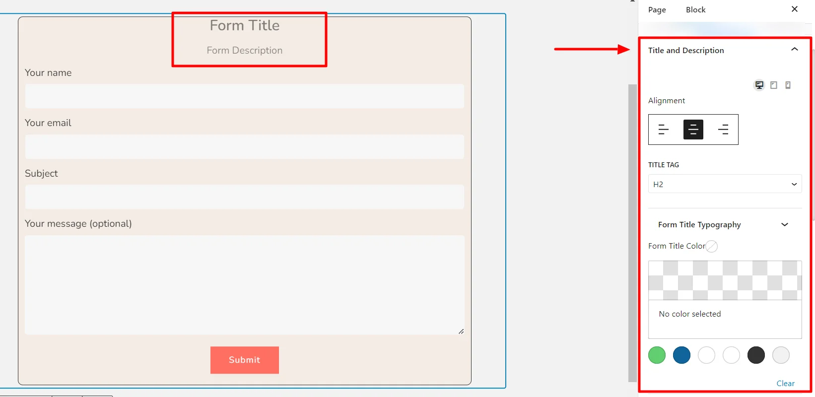
- Alignment: Use this option to align the title and description to the left, center, or right.
- Title Tag: Select the type of heading tag you want to use. The tags range from H1 to H6.
- Form Title Typography: Provides options to customize title typography settings like font family, font size, font weight, line height, and line spacing.
- Form Title Color: Get a color palette to select the title color.
- Form Description Typography: Provides options to customize description typography settings like font family, font size, font weight, line height, and line spacing.
- Form Description Color: Get a color palette to select the description color.
3. Input and Text Area
#
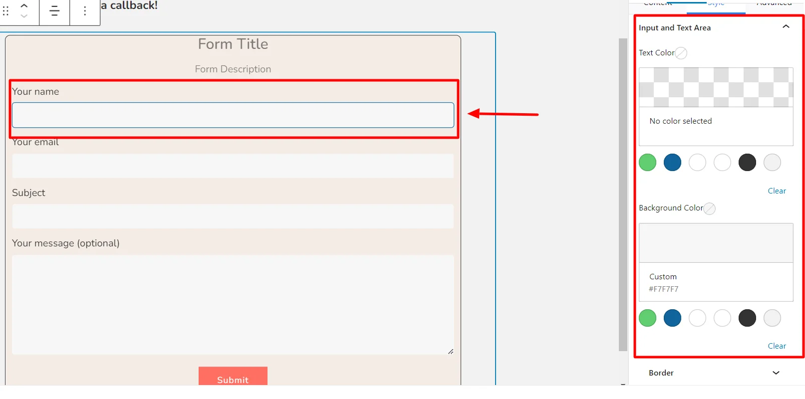
- Text Color: Customize the text color settings in the input bar.
- Background Color: Customize the background color of the input bar.
4. Labels #
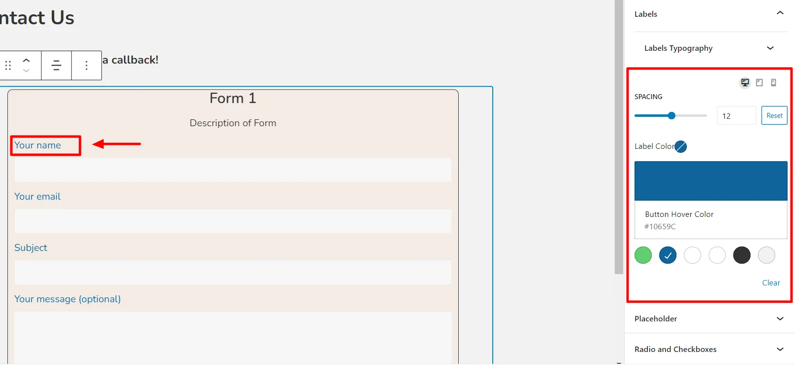
- Label Typography: You can customize label typography settings like font family, font size, font weight, line height, and line spacing.
- Label Color: Use the color palette to select the label color.
5. Placeholder #
Placeholder text is a hint or information that appears within an input field to guide the user on what information to enter.
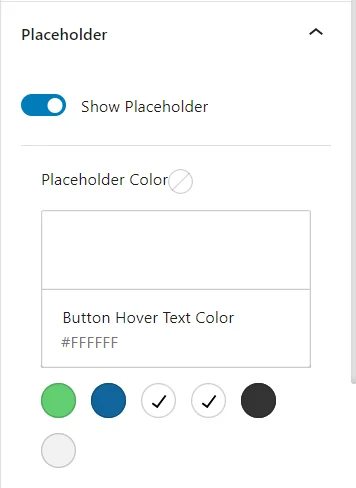
Use the placeholder tab to customize the placeholder color.
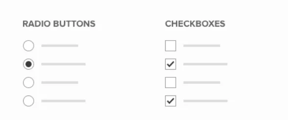
6. Radio and Checkbox #
Radio buttons are used to present a group of exclusive options to the user. With radio buttons, only one option can be selected at a time.
A checkbox is a small box that can be selected to indicate completion of a task.
Under this bar, you can choose formatting options for radio buttons and checkboxes from your inputs.
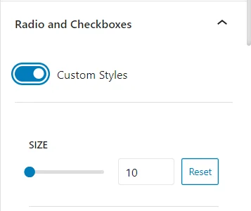
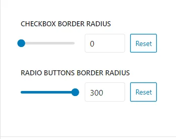
Use this option to customize the size, typography, color, checkbox border-radius, radio button border-radius, and border color.
7. Submit Button #
The submit button of a form is an element that allows users to submit the form’s data to the server.
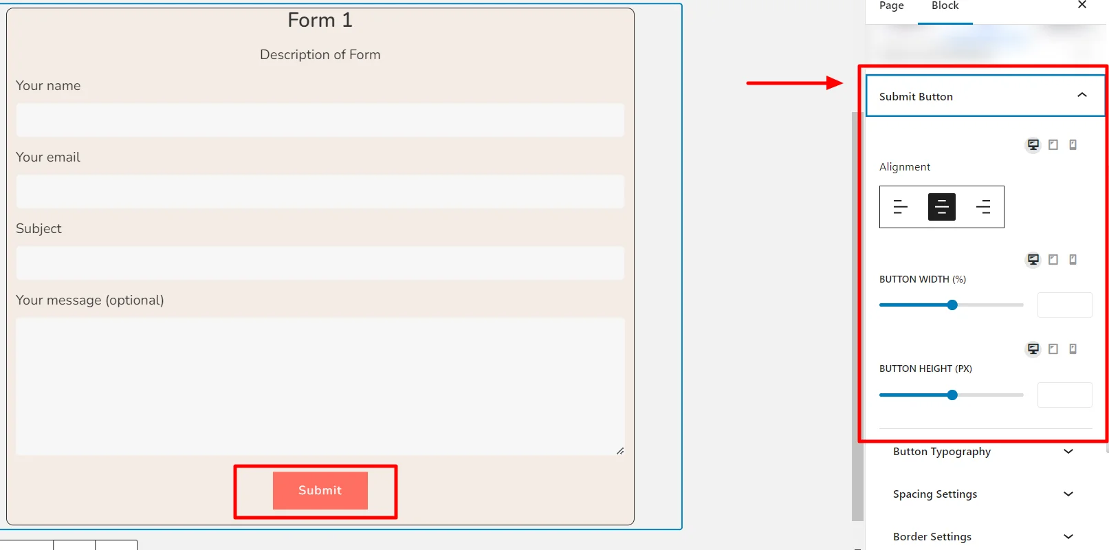
- Button Alignment: Select the positioning of the submit button to various alignment options, including left, center, and right, within the form.
- Button Width: Use the slider to customize the width of the submit button on your form.
- Button Height: Use the slider to customize the height of the submit button.
Additionally, you have formatting options for Button Typography, Spacing settings, Border settings, and Color settings to help you customize the Submit button.
8. Messages #
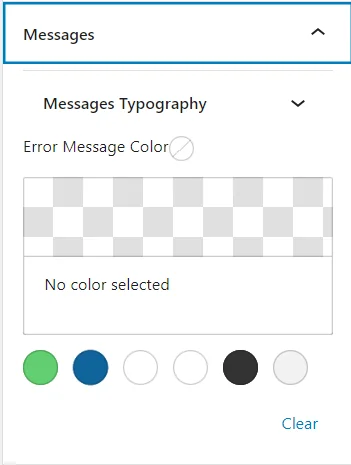
The messages tab allows you to format the message typography and color within the forms.
9. After Submit Feedback #
This tab provides you with settings to customize the typography and color of the Success and Error messages.
Finally, after customizing your form, click Update.
Your form is now updated as per your preferences.
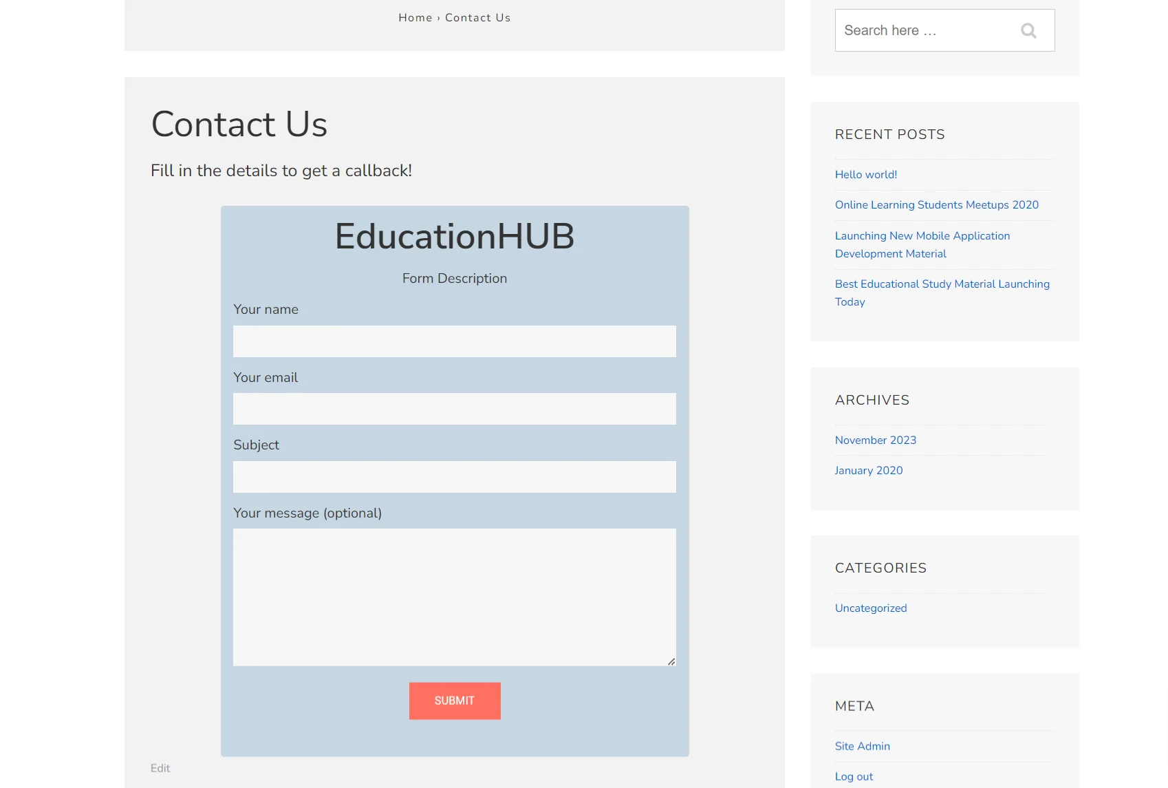
Congratulations, you have successfully added a customized form to your website!
Get Responsive Blocks Addon Plugin for Your Website Today!


Leave a Reply