
Summary
The article explains what a responsive site builder is. It defines the tool as one that helps create websites that automatically adapt to different screen sizes.
It also covers key features and why responsiveness matters for usability and SEO.
Are you looking to create a header or a footer for a particular page? Well, Site Builder is what you need.
Responsive Site Builder is a powerful visual template editor launched in the 6.2.2 version of Cyberchimps Responsive Theme. It’s included with the Responsive Plus plugin v3.3.0, and gives you complete control over your website’s layout without writing a single line of code.
You can easily create custom headers, footers, single post layouts, archive designs, and even unique 404 pages, that too all from one place.
You can easily build, edit, and manage all your templates directly from the Site Builder dashboard. With its advanced display conditions and scheduling options, you can create a variety of layouts for your website.
In this article, we’ll explore the various features of the Responsive theme Site builder and provide examples on how to use it.
Without further delay, let’s get into the article.
Responsive Starter Templates is the best plugin to import Website Templates – Get it for free.
Getting Set Up
Before you can start building custom layouts, you’ll need:
- Responsive Theme (free from Cyberchimps)
- Responsive Plus Plugin that unlocks Site Builder)
- Make sure both the theme and the plugin are updated to their latest versions.
Activation Steps
Once you’ve installed the Responsive theme and the Responsive Plus plugin, follow these steps to enable the site builder functionality.
In your WordPress Dashboard, click on the Responsive menu. Find Site Builder in the modules list and toggle Enable to activate it.

You’ll now see Site Builder in the Responsive menu.

Pro Tip: If you don’t see the option, double-check that both the theme and plugin are updated.
Exploring the Site Builder Interface
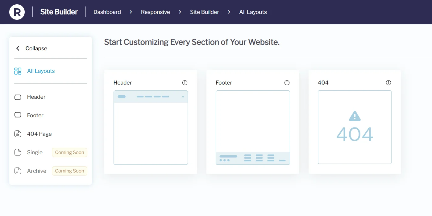
Once activated, you can access Site Builder from your dashboard under Responsive > Site Builder.
Dashboard Layout
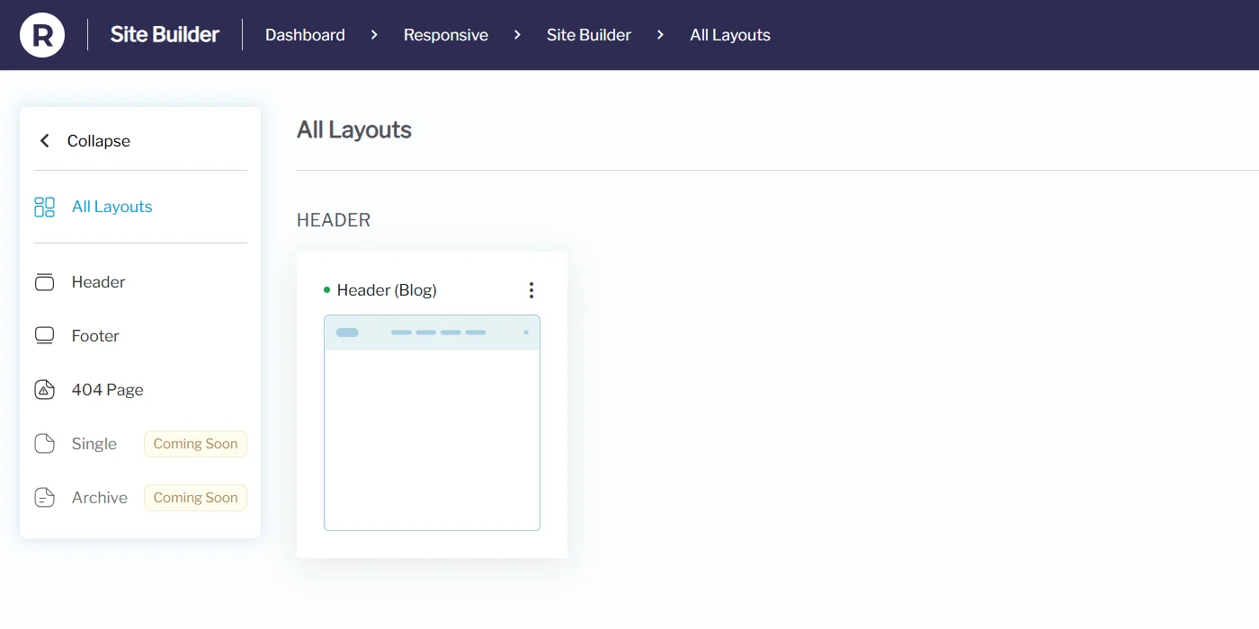
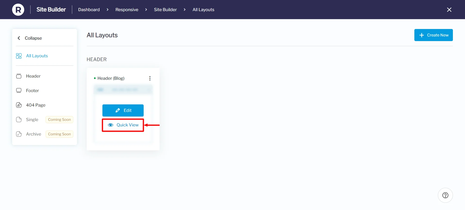
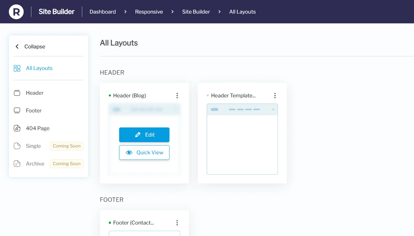
All Layouts View – Shows all your custom layouts in card format: Header, Footer, Single Post, Archive, 404 Page, etc.
Quick Actions on Hover:
- Quick View – View how the layout looks before publishing.
- Edit – Open the layout editor to make changes.

Creating Custom Layouts
Here’s how to create your first custom layout in the Responsive Site Builder.
Step-by-Step Flow
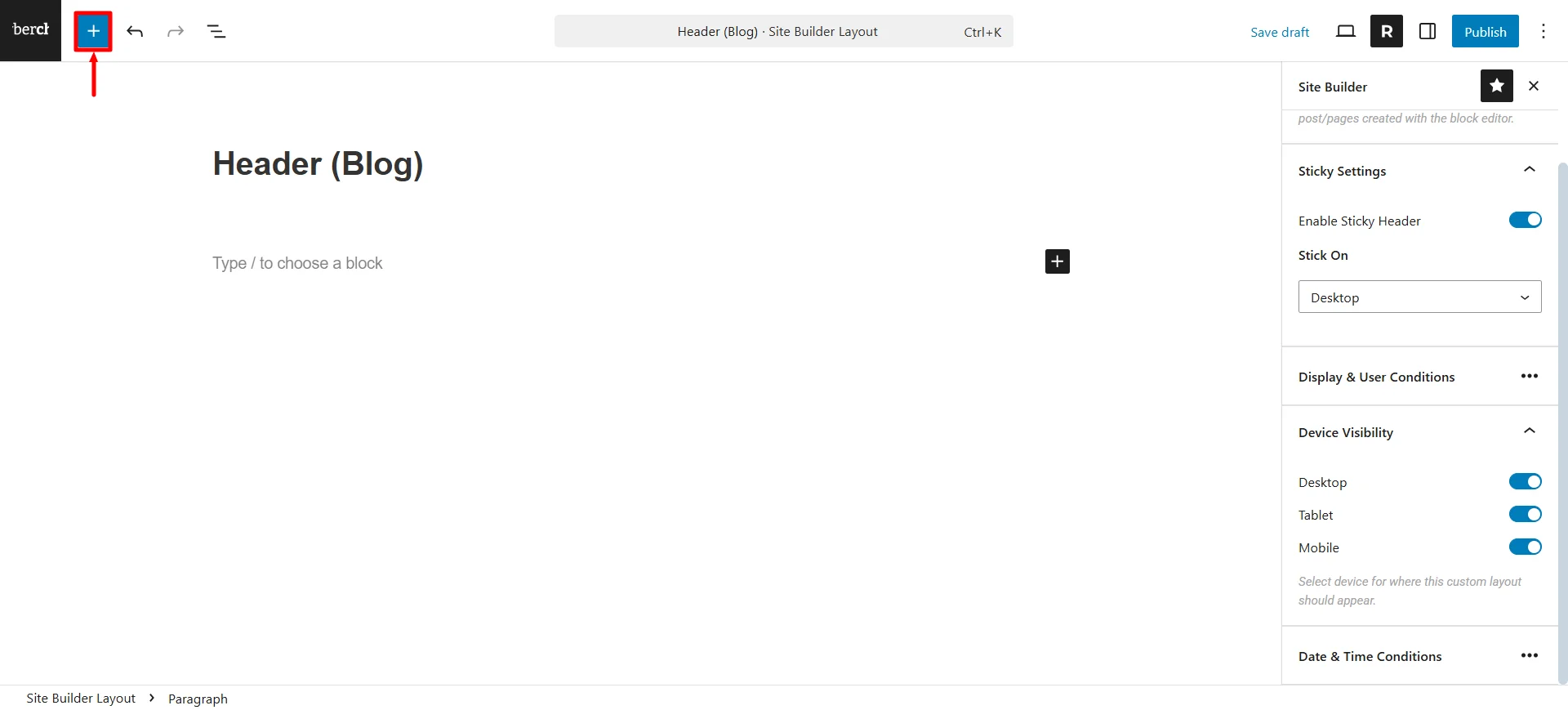
From the Site Builder dashboard, choose the type of layout you want to create (e.g., Header) and click Create Layout.

The Block Editor will open, where you can start customizing your header layout.

You can start creating your header, footer, 404 page, single and even archive pages. Also, if you are new to WordPress Block Editor, you can make use of the patterns by clicking on the + icon.
Click on Patterns and choose the Headers option.

You get basic patterns like the ones shown in the image below.

Once you’ve chosen the pattern, you can make some color changes to the layout.
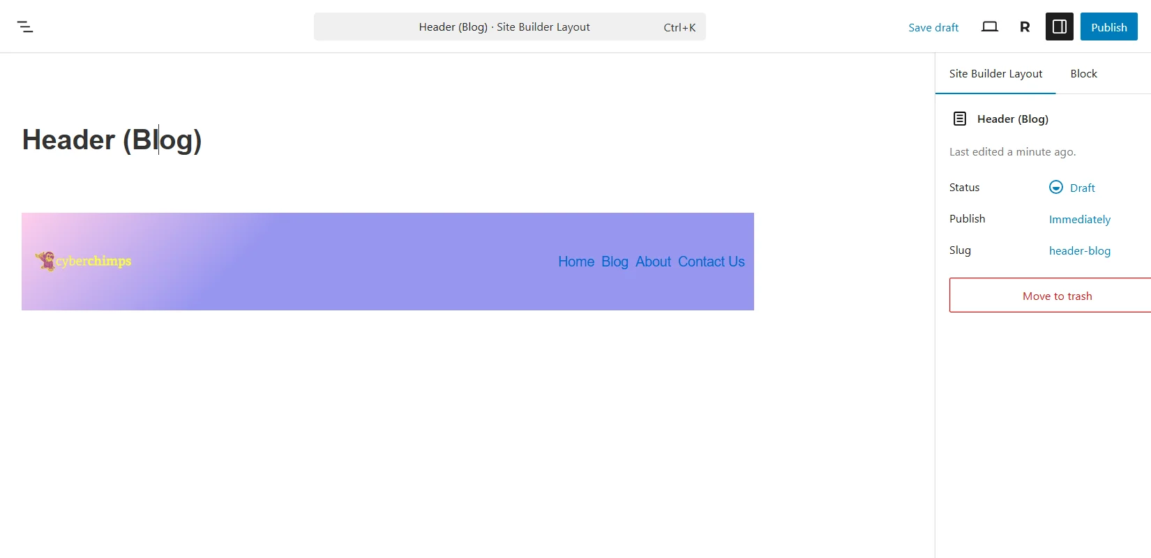
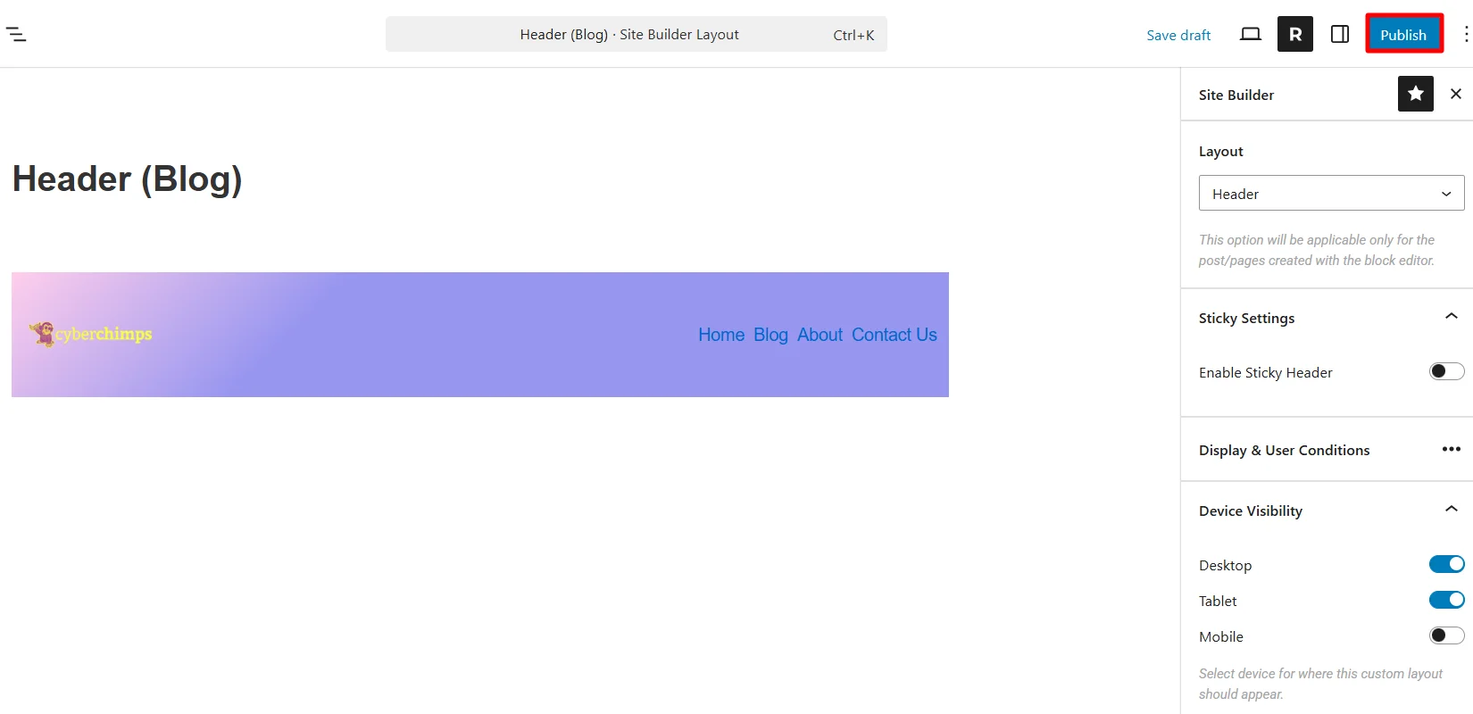
Next, click on the “R” icon to open the site builder settings.
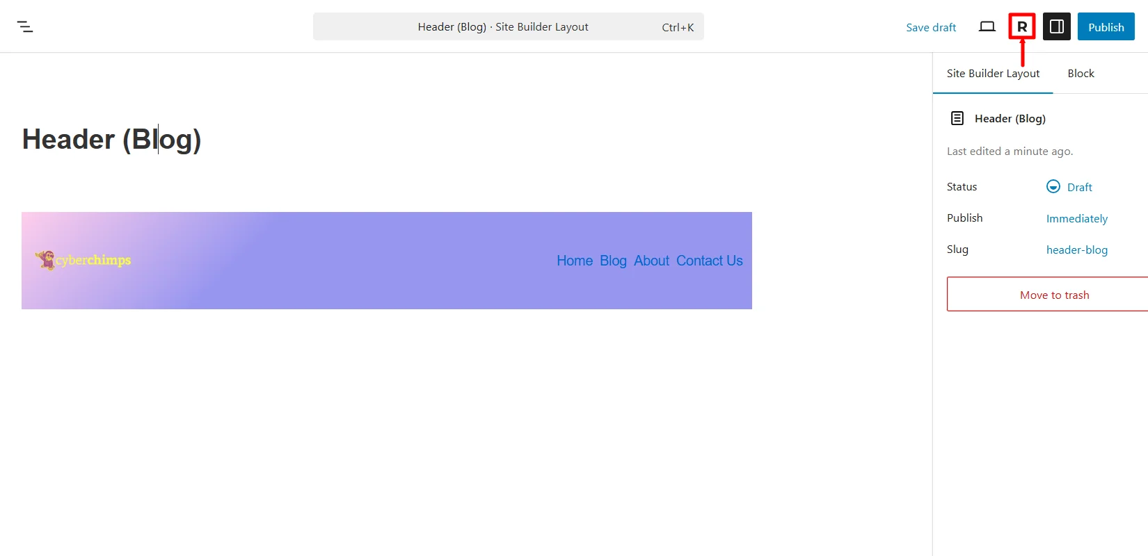
In case you want to change the header layout to any other layout, you can do so by clicking on the dropdown under the Layout tab.

If you want the header to be sticky, you can enable it by using the toggle ON button under the Sticky Settings.

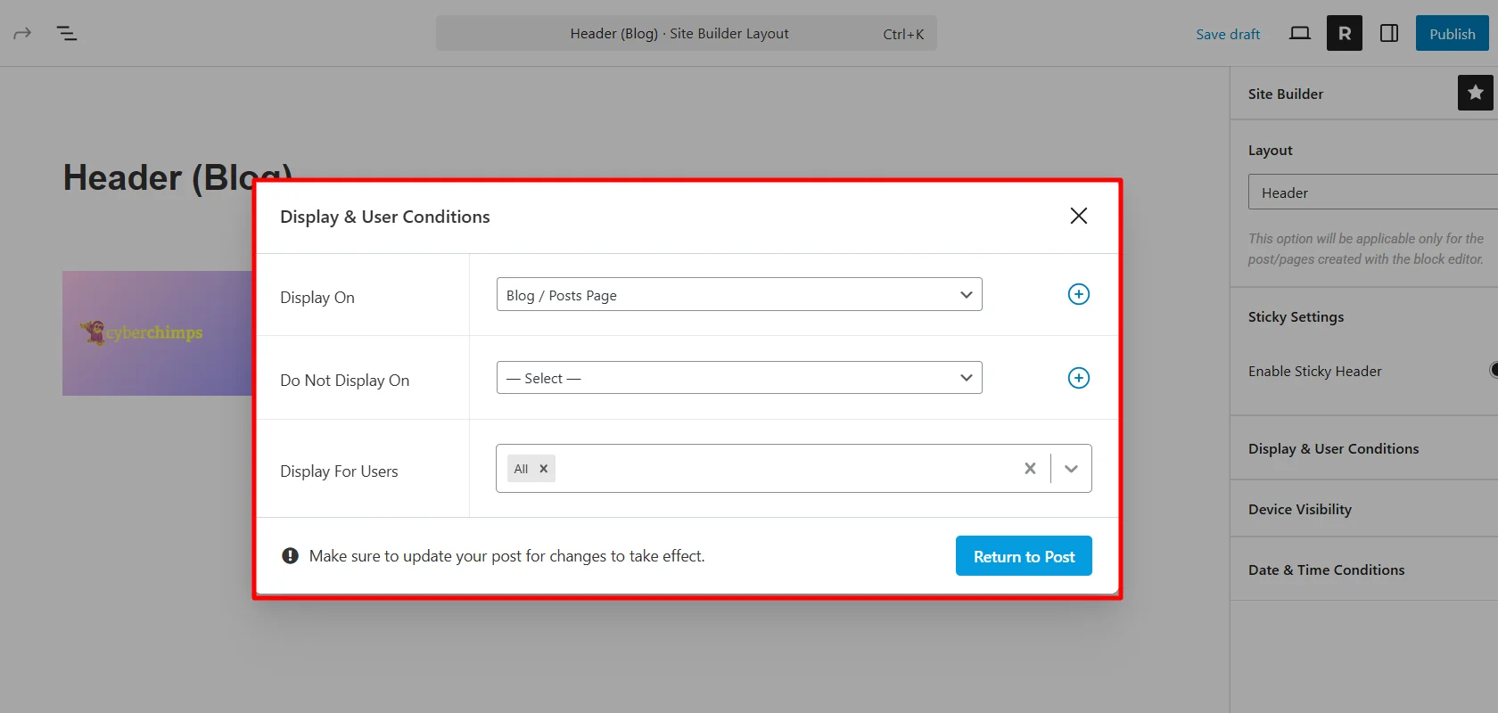
Under the Display & User Conditions settings, you get various options to choose where you want to display your header. For tutorial purposes, I’m choosing the Blog Page. Next, click on Return to Post.
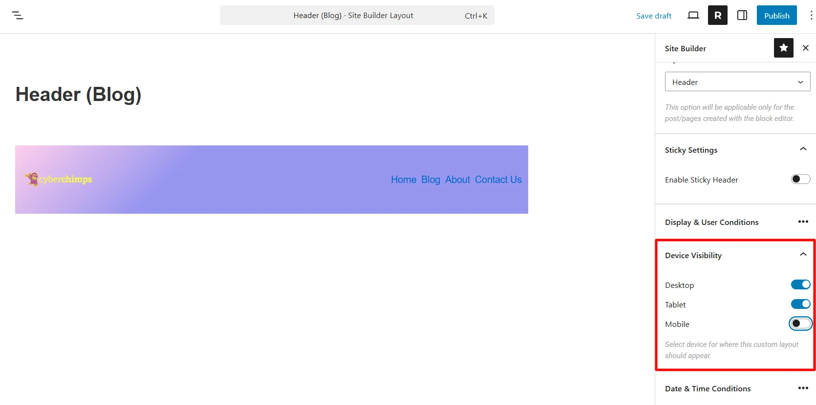
From the device visibility setting, choose which devices need to show this header.
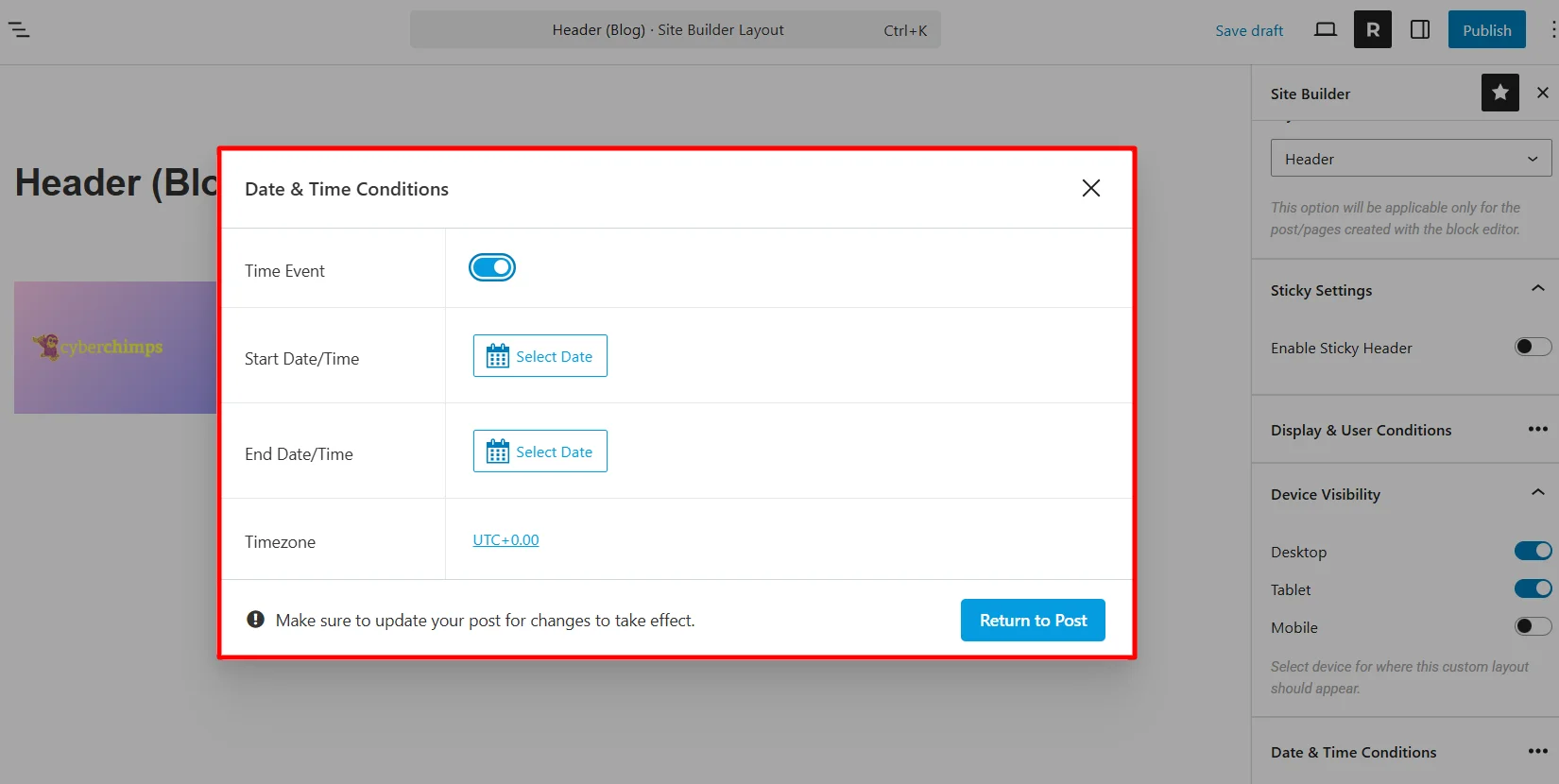
Next, select the date and time for the event if the header you’re making is for an offer or sale page.
Once you’ve set up the template, you can now publish it.
Once published, check that it will apply to the blog page. (Blog page is an example I have taken. You can take any page for your website and check for that particular website if there are changes.)
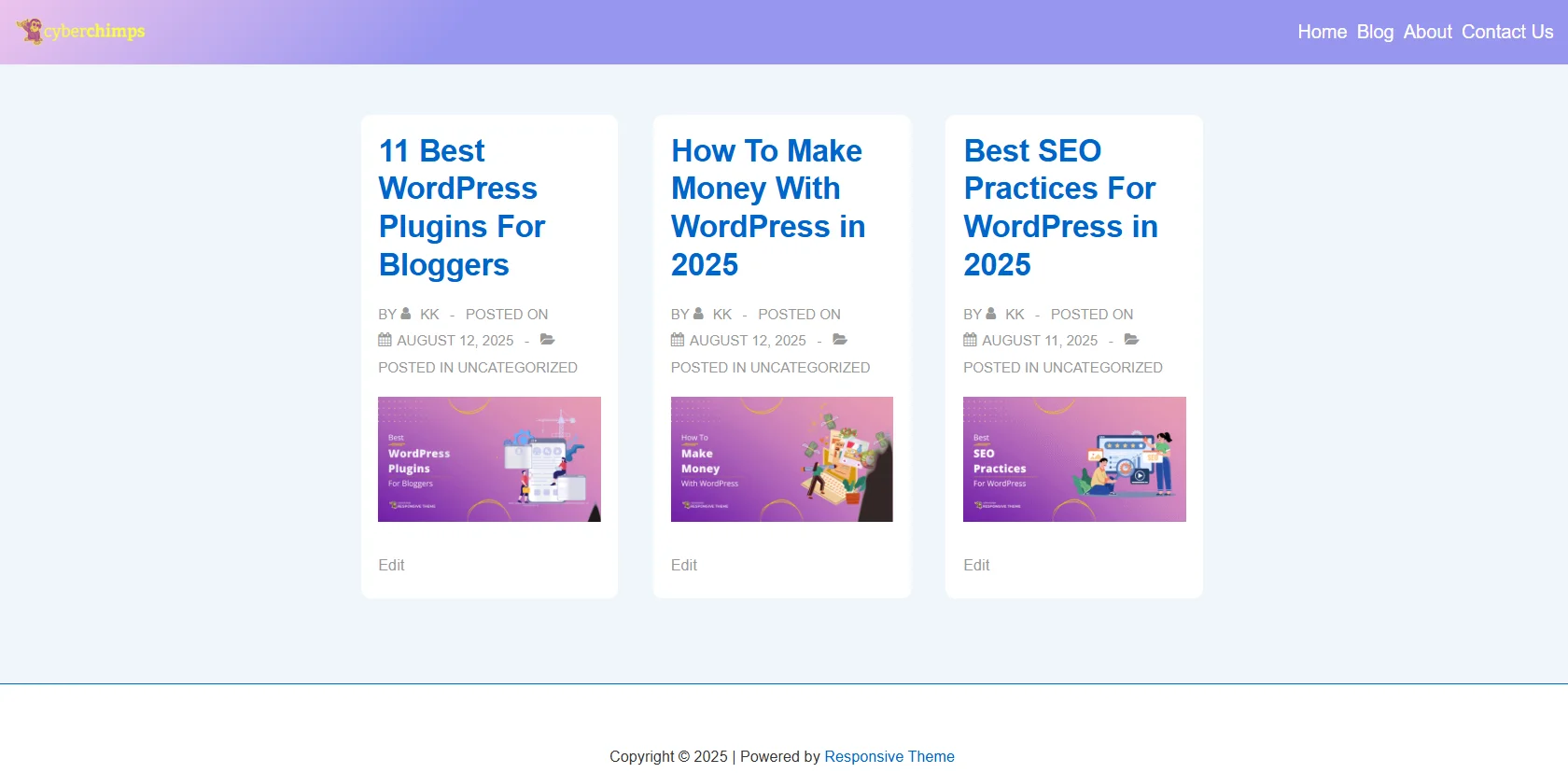
Other headers look basic, like the default header you’ve for your website.
Also, the published layout will be visible in the Site Builder dashboard.
Similarly, you can create layouts for the Header, Footer, and 404 pages. You’ll be able to similarly create layouts for Single Pages, and Archive pages in the next version.
Display Conditions
Control exactly where and to whom your layout appears.
- Display On – Choose specific pages, posts, categories, or the entire site.
- Do Not Display On – Exclude pages where the layout shouldn’t appear.
- User Roles – Show different layouts to logged-in users, guests, or specific roles.
- Device Targeting – Limit layouts to certain devices.
Schedule Visibility
Plan layouts for events or promotions.
- Set Start Date and End Date for automatic activation.
- Perfect for flash sales, seasonal campaigns, or A/B testing designs.
Editing Existing Layouts
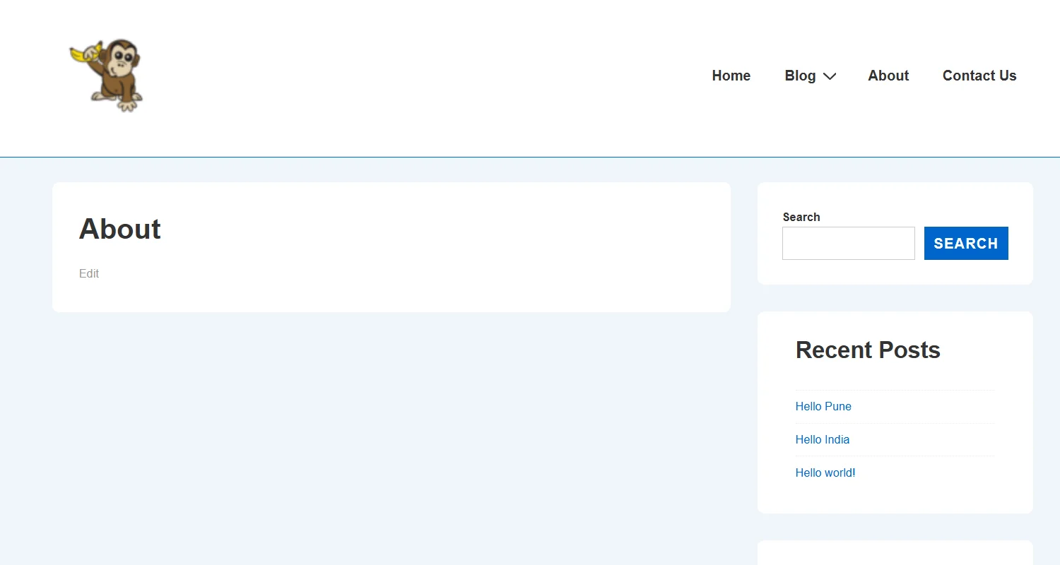
Go to All Layouts.

Hover over the layout you want to change.
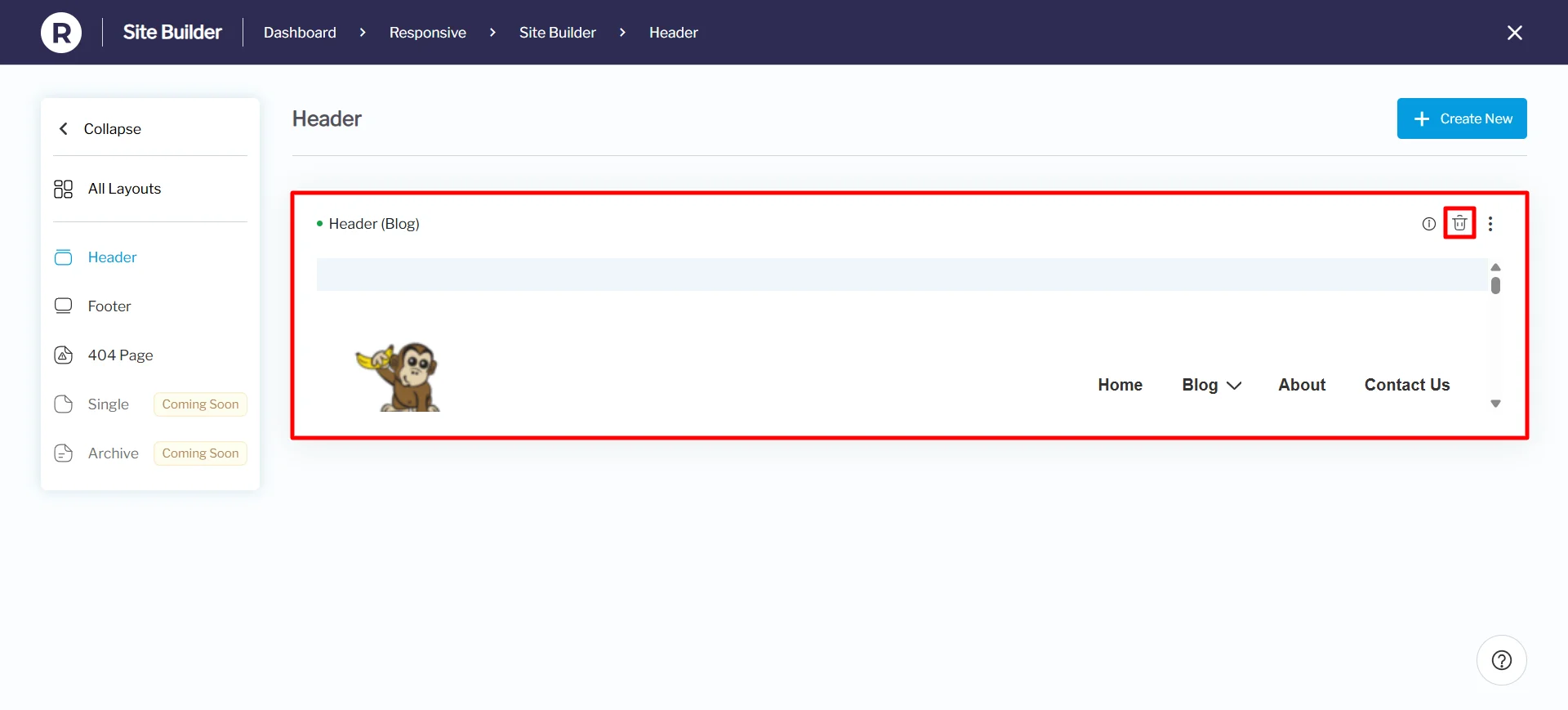
Select the Quick View to view your layout easily.
Under the Quick View settings, you can see the layout preview even before clicking the edit button. You can also delete the layout from the Quick View settings.
Here’s an image of how it will look:
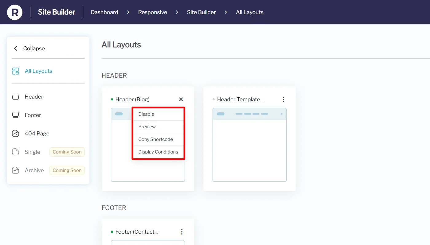
Moving back to All Layouts, each card contains a menu that contains:
- Disable: You can disable this particular layout and enable it when required.
- Preview: See exactly how your custom layout will look on the front end before publishing it
- Copy Shortcode: Generate a shortcode so you can insert it anywhere on your site, such as in posts or pages.
- Display Conditions: Control where the layout should appear on the website, based on rules like page type, user role, or device.
If no layouts have been created yet, the site builder will display default placeholders, inviting you to create new ones.
To edit an existing layout, head to All Layouts in the Site Builder dashboard. From there, hover on the card you want to edit and click on the Edit option.
Save changes, and your new design will go live instantly.
Templates You Can Create and Customize
With Responsive Site Builder, you can build and manage multiple types of layouts:
1. Header Layouts
- Fully custom layouts
- Sticky and shrink-on-scroll options
- Add navigation menus, logo, search bar, CTAs
2. Footer Layouts
- Multi-column designs
- Add widgets, social icons, copyright text
- Include quick navigation or contact info
3. 404 Error Page Layouts
- Create branded error pages
- Add helpful links, search bars, or fun messages to keep users engaged
4. Single Page/Post Layout
- Customize how blog posts or pages appear
- Adjust title, featured image, metadata, and content arrangement
5. Archive Pages
- Design category, tag, or author archive layouts
- Control grid style, pagination, and filters
Key Benefits of Responsive Site Builder
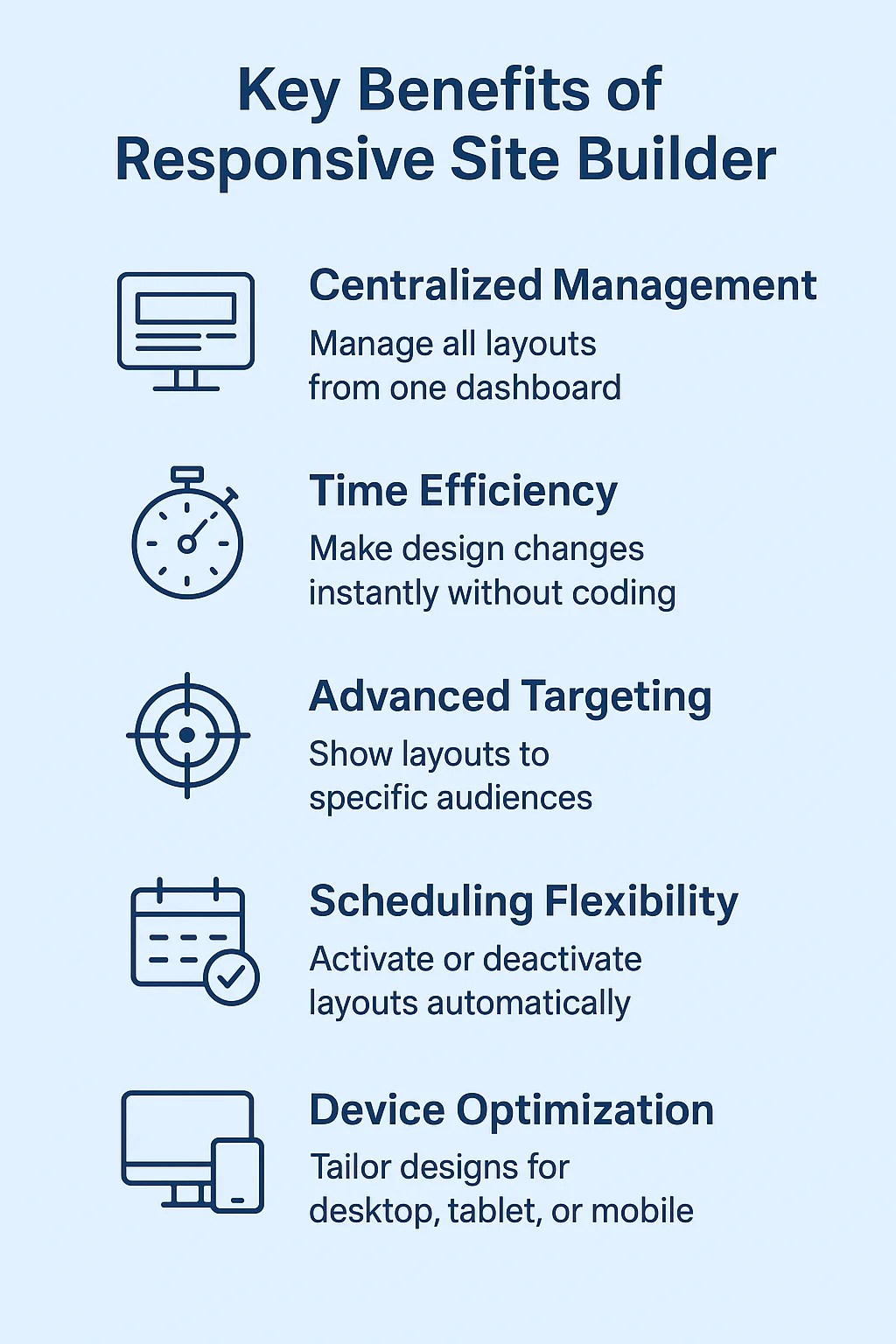
- Centralized Management – Control all site layouts from one dashboard.
- Time Efficiency – Make design changes instantly without coding.
- Advanced Targeting – Use display conditions to show layouts to specific audiences.
- Scheduling Flexibility – Activate or deactivate layouts automatically.
- Device Optimization – Tailor designs for desktop, tablet, or mobile.
Best Use Cases & Pro Tips
- Custom Branding
- Create unique headers for product categories to highlight offers.
- Seasonal Promotions
- Schedule special banners during sales without manual intervention.
- Role-Based Personalization
- Show different layouts to logged-in customers and guests.
- A/B Testing
- Test different layouts to see which converts better.
- Emergency Updates
- Instantly replace headers or footers for urgent announcements.
Troubleshooting Tips
- Layouts not showing?
- Check your display conditions.
- Preview shows 404?
- Go to Settings → Permalinks → Save Changes twice.
- Clear your cache and reload.
- Changes not updating?
- Disable Site Builder, re-enable, and refresh.
Conclusion
The Responsive Site Builder is designed to simplify how you build and manage your WordPress website. With no coding required, you can create and customize headers, footers, 404 pages, single pages, and layouts effortlessly.
By centralizing all design controls in one dashboard, you save time and ensure your site stays consistent. Updates become faster, smoother, and more efficient across your entire website.
Advanced options like targeting and scheduling give you flexibility to deliver the right content to the right audience. This not only improves user experience but also helps boost engagement.
If you want a tool that is easy to use but still very powerful, the Responsive Site Builder is a great option. It lets you build your site faster, keep things simple, and make your website grow with ease.
If you’ve liked reading this article, check out our other similar articles:
- How to White Label Responsive WordPress Theme – Easy Steps
- How to Build a Custom Header/Footer in Elementor For Your Website
- How to Add Custom Fonts in WordPress – The Only Methods You Need
Want to get more premium features like Site Builder? Grab the Responsive theme now!