If you are looking for a way to display ‘breaking news’, ‘Special Offers’ or anything newsworthy, you should definitely implement a Content Ticker on your website.
REA Content Ticker helps you to design a beautiful ticker and gives you the freedom to display ‘Dynamic’ or ‘Custom’ contents as your headlines.
Besides, REA Content Ticker also gives you the flexibility to add nice transition effects & add personalized styling to all the features. Thanks to this Responsive Elementor Addons element, you can now put the focus on the ‘Headline’ of your contents & make it totally eye-catching to your site visitors.
How to Activate Content Ticker #
Find the ‘REA Content Ticker‘ element from the Search option under the ‘ELEMENTS‘ tab. Simply just Drag & Drop the ‘REA Content Ticker’ into the ‘Drag widget here‘ or the ‘+’ section.
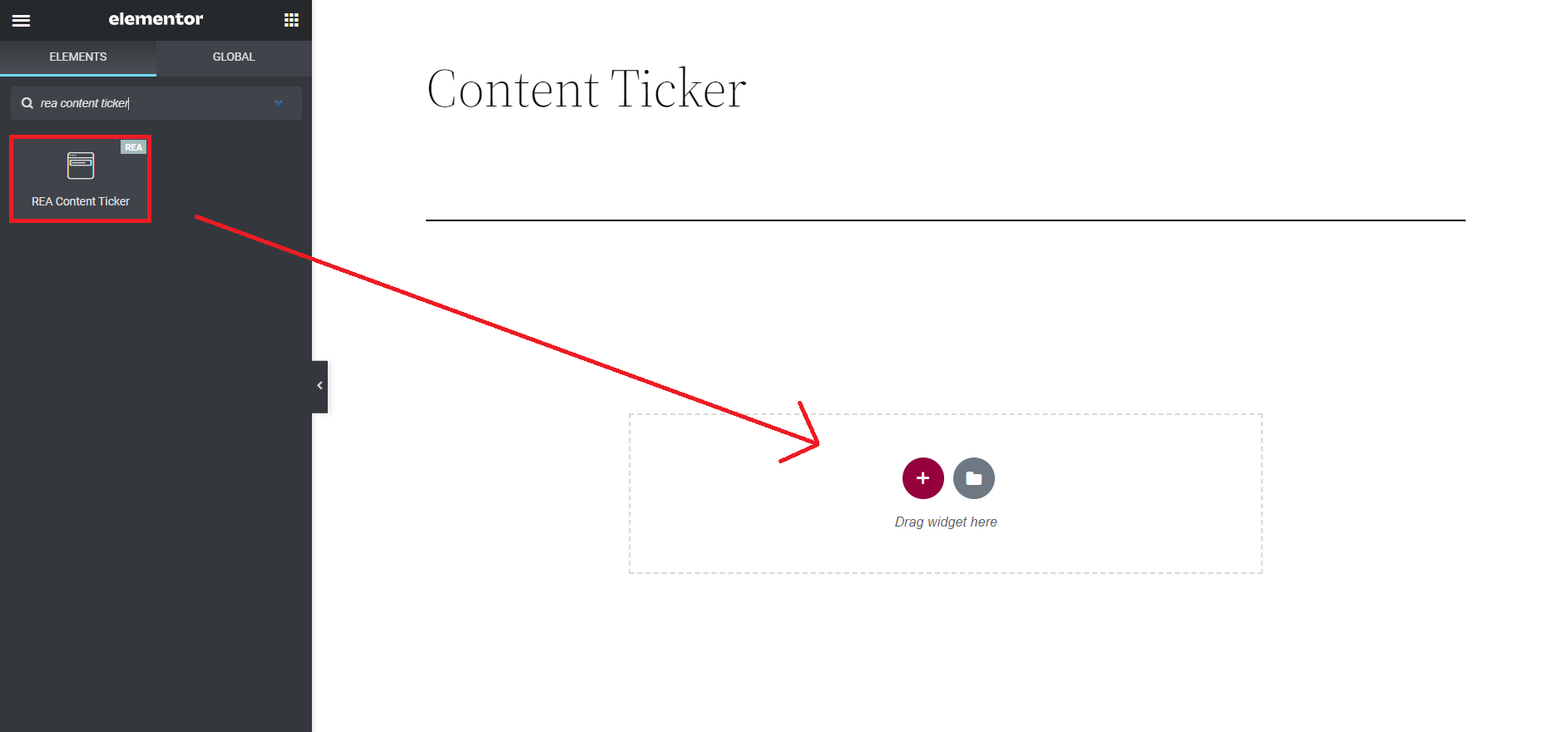
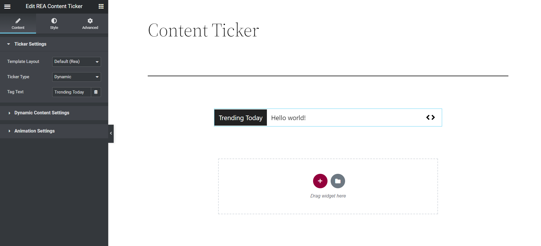
After you are successfully done with this step, this is how the element is going to look like.
Content #
Ticker Settings #
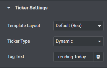
- Template Layout- The Default layout is selected.
- Ticker Type- You can use the dropdown menu to choose a ‘Ticker Type’. You can either select ‘Dynamic’ or ‘Custom’ Ticker type. You will be able to configure the ‘Ticker’ based on your chosen type.
- Tag Text- You can also change the headline of your Content Ticker by modifying the ‘Tag Text’ field.
Dynamic Content Settings #
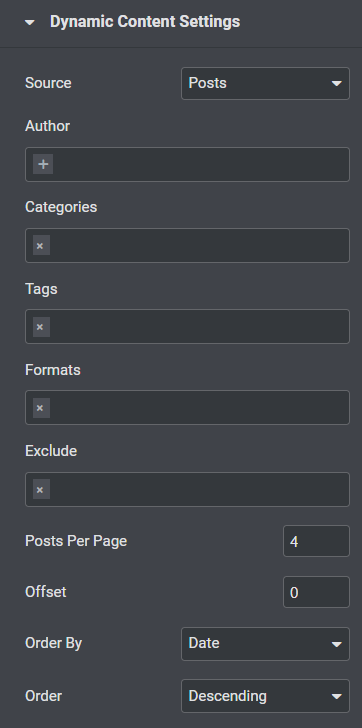
- Source- You can choose a source from which your content will be generated. You can select any of these 3 as your source: Posts, Pages or Manual Selection.
- Author, Categories, Tags, Formats- You have the flexibility to show only certain posts based on the tags, authors, categories & format.
- Exclude- You can even exclude certain posts or pages.
- Posts Per Page- You can set the number of contents which you want to display on your Content Ticker.
- Offset- You can select the offset by entering the value.
- Order By & Order- You can sort out the content by modifying ‘Order’ & ‘Order By’ options.
Custom Content Settings #
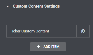
With Custom Content, you can easily insert your own content and insert a link to them if you wish to. When you move the mouse over the content, you will be able to view the link. Simply click on ‘+ Add Item’ button to insert more custom content.
Animation Settings #
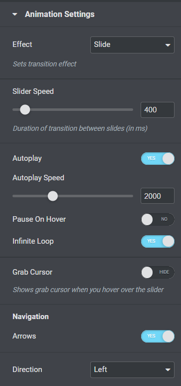
- Effect- You can the transition effect on how the contents will be displayed on your site. By default, it is set to the ‘Slide’ effect.
- Slider Speed- Adjust the duration of transition between slides
- Autoplay- You can use the toggle to enable or disable ‘Autoplay’
- Autoplay Speed- Adjust the speed of autoplay by using the slider in ms
- Pause on hover- You can use the toggle to enable or disable ‘Pause on Hover’
- Infinite Loop- You can use the toggle to enable or disable ‘Infinite Loop’
- Grab Cursor- You can use the toggle to enable or disable ‘Grab Cursor’
- Navigation Arrows- You can use the toggle to enable or disable ‘Arrows’
- Direction- Use the dropdown menu right at the bottom to change the direction of your effect.
Style #
Ticker Content #
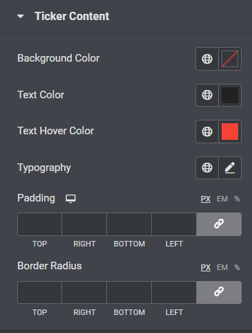
- Background Color- From the color picker, choose the background color for your ticker
- Text Color- From the color picker, choose the color of text for your ticker content
- Text Hover Color- From the color picker, choose the color of text for your ticker content when you hover.
- Typography- From the pencil icon, click to open the font option panel to choose the family, weight, transform, style, decoration, line height, and letter spacing options
- Padding- Enter a chosen value in the fields based on px, em, or %
- Border Radius- Enter a chosen value in the fields based on px, em, or %
Tag Style #
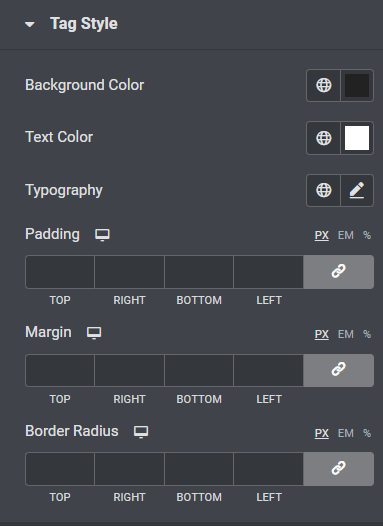
- Background Color- From the color picker, choose the background color
- Text Color- From the color picker, choose the color of text
- Typography- From the pencil icon, click to open the font option panel to choose the family, weight, transform, style, decoration, line height, and letter spacing options
- Padding- Enter a chosen value in the fields based on px, em, or %
- Margin– Enter a chosen value in the fields based on px, em, or %
- Border Radius- Enter a chosen value in the fields based on px, em, or %
Arrows #
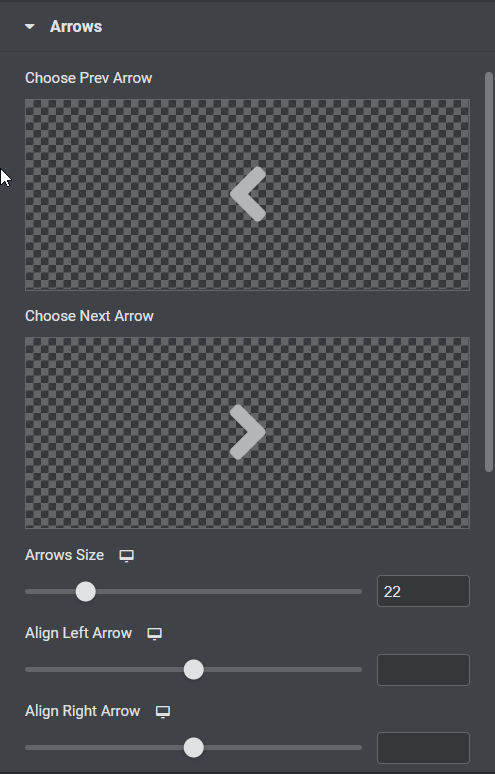
- Choose Prev/Next Arrow- Upload your icons or choose icons from the library for prev and next arrow
- Arrows Size- Use the slider to adjust the size of the arrows
- Normal/Hover- Choose the appearance of the arrows on normal and hover states
- Background Color- From the color picker, choose the background color
- Color- From the color picker, choose the color of the arrows
- Border Type- From the dropdown menu select between solid, double, dotted, dashed, or grooved
- Border Radius- Enter a chosen value in the fields based on px, em, or %
- Padding- Enter a chosen value in the fields based on px, em, or %


