The Responsive Addons for Elementor product upsells widget allows you to add cross-sells of complementary products to help increase average order value and provide personalized recommendations to your customers.
How to Add the RAE Product Upsells Widget?
To add the Elementor Product Upsells widget on your product page, follow these simple steps:
- Go to WordPress Dashboard > Pages > Add New Page.

- Click the Edit with Elementor button to add the Product Upsells widget.

- Search by RAE Upsells and use the widget that has the RAE Badge.
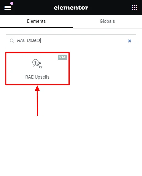
- Drag and drop the RAE Upsells widget onto your product page.
How to Customize the RAE Product Upsells Widget?
The RAE product Upsells widget allows you to customize the content and style of the widget. Upon adding the product stock widget, it allows you to edit the following parts:
Content
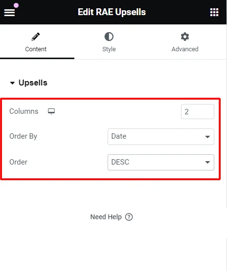
Under the widget content options, you can edit the following:
- Columns: Select the number of columns to display for the upsells.
- Order By: Display the order and category of the content based on data, title, price, popularity, rating, random or menu order.
- Order: Select an order of display among ascending (ASC) or descending (DESC) for the upsells.
Style
Under the widget styling options, you can edit the following:
Products

- Columns Gap: Adjust the horizontal spacing between columns of products.
- Rows Gap: Adjust the vertical spacing between rows of products.
- Alignment: Set the alignment of the products within their container (left, center, right).
- Image:
- Border Type: Define the border style around each product image (solid, dashed, dotted, etc.).
- Border Radius: Adjust the product image border radius to round the corners.
- Spacing: Set the spacing between the product image and its border.
- Title:
- Color: Set the color of the product title text.
- Typography: Adjust the font family, size, weight, style and other typographic settings for product titles.
- Spacing: Control the spacing around the product title.

- Rating:
- Star Color: Sets the color of the filled stars in product ratings for reviewed products.
- Empty Star Color: Set the color of the unfilled stars in product ratings.
- Star Size: Adjust the size of the star icons in the ratings.
- Spacing: Control the spacing around the rating stars.
- Price:
- Color: Set the color of the product price text.
- Typography: Adjust the font style, size, weight, and other typographic settings for the product price.
- Regular Price:
- Color: Set the color of the regular price text (usually shown when a discount is applied).
- Typography: Adjust the font style, size, weight, and other typographic settings for the regular price.

- Button:
- Text Color: Set the color of the text on the button in normal and hover states.
- Background Color: Change the background color of the button in normal and hover states.
- Border Color: Define the border color of the button in normal and hover states.
- Typography: Adjusts the font style, size, weight, and other typographic settings for button text. (Can be adjusted only if the button is in normal state)
- Border Type: Defines the style of the button border (solid, dashed, dotted, etc.).
- Border Radius: Adjust the border-radius to round the corners of the button for a softer look.
- Text Padding: Sets the inside spacing between texts in the button.
- Spacing: Adjust the spacing of the button.
- Automatically Align Buttons: Toggle for automatic alignment of the button.
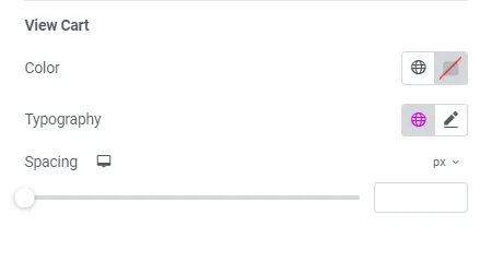
- View Cart:
- Color: Change the color of the “View Cart” button.
- Typography: Adjust the font style, size, weight, and other typographic settings for the “View Cart” button.
- Spacing: Control the spacing around the “View Cart” button.
Box
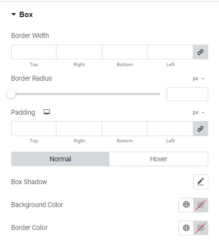
- Border Width: Set the width of the border around each product box.
- Border Radius: Adjust the border-radius to round the corners of the product box.
- Padding: Adjust the inner spacing of the product box.
- Box Shadow: Add a shadow effect around the product box for depth.
- Background Color: Set the background color of the product box.
- Border Color: Define the color of the border around the product box.
Sale Flash
Sale Flash: Toggle to show a flash sale of products that will further allow you to edit:
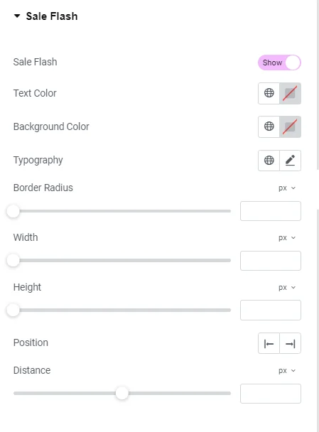
- Text Color: Change the content color within the sale flash texts.
- Background Color: Changes the background color of the sale flash label.
- Typography: Adjusts the font style, size, weight, and other typographic settings for the sale flash text.
- Border Radius: Adjusts the border-radius to round the corners of the sale flash label for a softer look.
- Width: Set the width of the sale flash label.
- Height: Set the height of the sale flash label.
- Position: Determine the position of the sale flash label on the product image.
- Distance: Set the distance of the sale flash label from the edges of the product image.
Heading
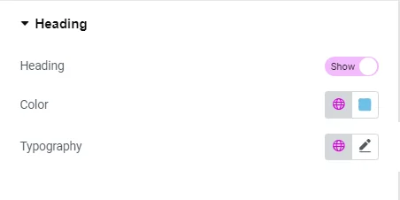
- Heading: Customize the heading text of the product section.
- Color: Change the color of the heading text.
- Typography: Adjust the font style, size, weight, and other typographic settings for the heading.


