Build Faster Websites with Free Responsive WordPress Theme!
Create Your Website in Minutes with Cyberchimps Responsive WordPress Theme, No Coding Skills Required!
Lightning Fast WordPress Theme
- Responsive Theme loads completely in less than 100 kb.
- Lightweight theme with optimized CSS & JS delivery for best load times.
- Coded in pure JS with no jQuery dependency to avoid render blocking.
- Inbuilt Performance tune ups to remove unnecessary code for optimal speed.
Responsive Theme Features
Cyberchimps Responsive Theme goes beyond builders and options. We’ve also developed a suite of exclusive plugins that come bundled with your purchase, adding an extra layer of flexibility. This means the possibilities with the Cyberchimps Responsive Theme are limitless.
Advanced Typography Options
Use beautiful Google fonts stored locally and customize font-weights, sizes, and styles to engage readers. Easily change the font size, weight, style and so on to customize the look and feel of your website.
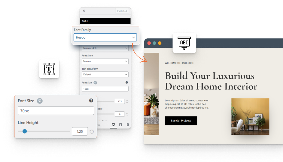
Google Fonts
Give your website a unique character. Choose from hundreds of free Google fonts to make your text content, headings and other elements stand out.
System Fonts
Love Arial font, or Georgia? Use system fonts & make your website even faster. Responsive WordPress theme offers local typography fonts that load instantly.
Style Options
Change every aspect of typography fonts – size, font weight, font style, letter-spacing, line height, text decoration and text transform.
Colors & Backgrounds
Customize the background color, text color, link color, and button color of each element on your site to make it visually appealing.
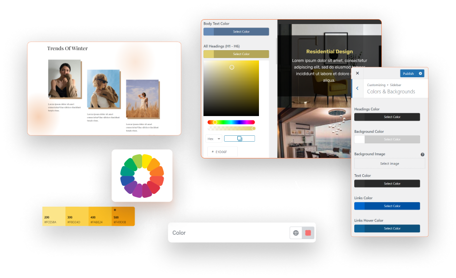

Unlimited Colors
With just a few clicks, you are able to change your website colors such as the text, links and the website background colors.
Color Pallette
Already have the color combinations selected for your website? Add them in the global color pallette to change colors sitewide from a single panel.
Predefined Color Palettes
Confused choosing the best colors? Responsive theme’s predefined color palettes help you choose the right color scheme for your website.
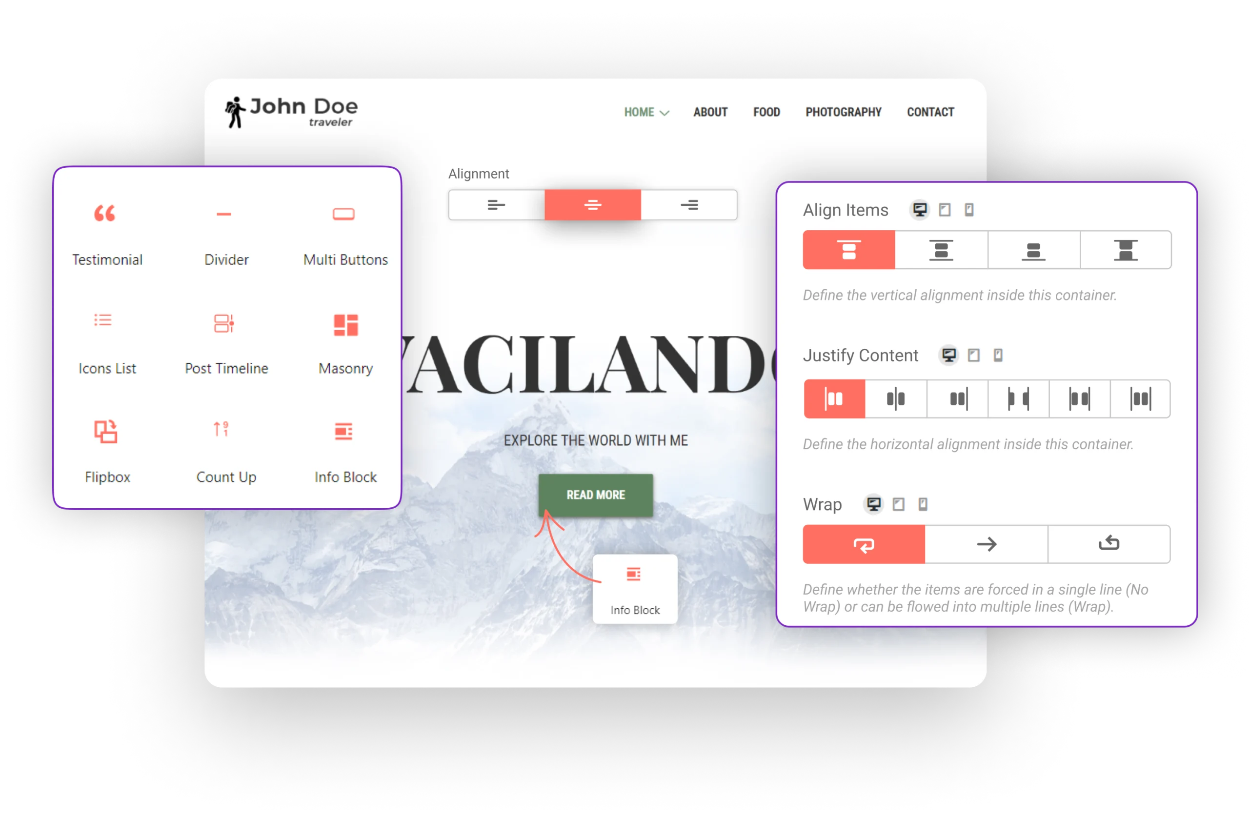
Customizable Page Layouts
Take charge of your website’s look and feel with complete control over the web page layouts. Customize the site container, pages, products, and archive templates to create a website that stands out confidently. Be in charge of how your website represents your brand and captivates your audience with an impeccable design.
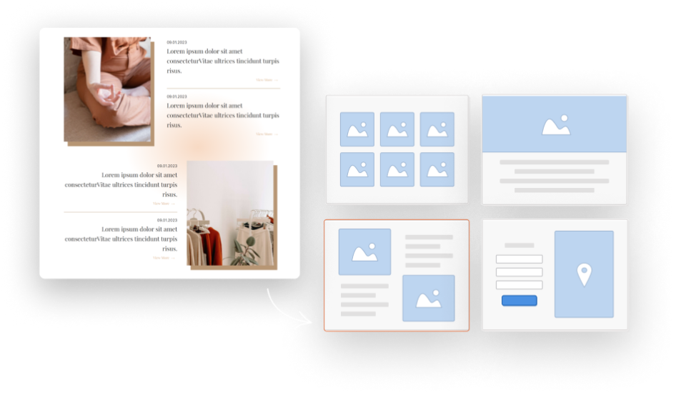
Site Layouts
Make site-wide changes to your website to make it look unique. You can change header & footer, sidebar layouts, container widths, and widget areas.
Page Layouts
Control the look of each page on your website by making page-level changes. Choose from different sidebar positions, and showcase your posts in a list or a grid.
Blog Layouts
Determine the way you want your blog posts to appear to the visitors. Choose the order in which the post’s title, meta, featured image & content appear.
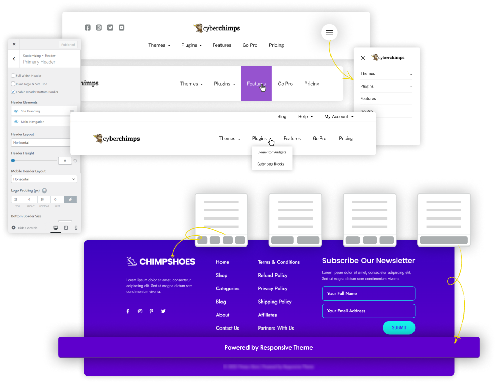
Website Header and Footer
Cyberchimps Responsive WordPress Theme offers various options to customize your website header and footer layouts, making them more attractive. You don’t need extra plugins or a CSS developer to create a WordPress sticky header, transparent header, and mobile hamburger menu.
Sticky Headers
Responsive Theme offers different types of header options for controlling menus in the form of sticky header, navigation bar menus and transparent header for your WordPress website.
Stacked Mobile Menu
Transform user experience by displaying mobile menus in vertically stacked format. This allows your users more time to explore your website and know more about your business.
Multi Column Footers
Create multi-column footers, add your social links and copyright text, and improve the website experience by adding a scroll to the top button in the footer.
Get Started with Cyberchimps Responsive Theme.
Responsive Theme comes with all the features, functionalities and plugins you need to launch your WordPress Business website.
SEO Optimized Theme
Improve your website’s ranking with the powerful SEO-optimized code of the Responsive Theme. Our cutting-edge technology ensures that your website is ahead of the competition and stands out in search results. Download our free WordPress Theme and take your website to the next level!
Best HTML/CSS Practise
Make search engine bots love your website. Responsive is coded with not just valid, but best practice HTML/CSS to help search bots crawl your site easily.
Schema Markup
Responsive Theme includes valid schema.org microdata, which provides basic website schema attributes to help search engines better understand the website.
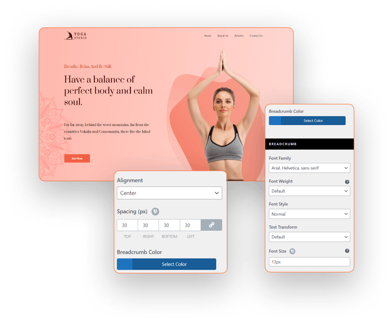
Breadcrumbs
Breadcrumbs are an essential navigation tool that significantly improves user experience and SEO. By providing links at the top of pages, they help users easily navigate the website and find relevant information.
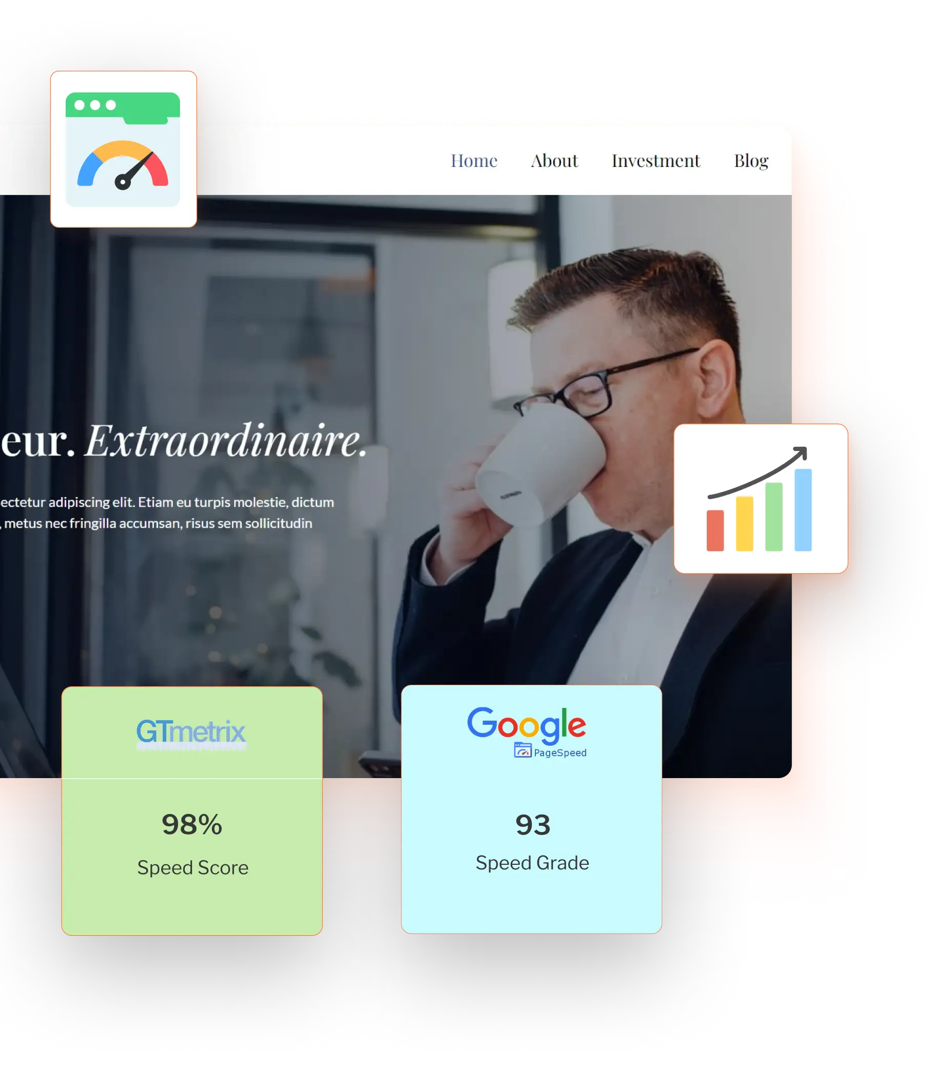
Speed and Performance
Cyberchimps Responsive Theme enables fast-loading WordPress websites with superfast code execution that loads your website within a second.
Under 100KB
Responsive Theme requires less than 100 kb of resources as compared to 130KB required by the other WordPress themes.
Optimized Code for Faster Loading
Cyberchimps Responsive Theme code is written with the utmost care to ensure that it aligns with the coding standards set out by the WordPress Theme Codex to ensure maximum usability.
Live Customizer Settings
You can make changes to your website using the Responsive Theme live customizer without having to interrupt your workflow in the process.
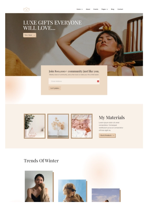
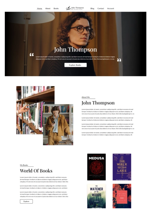
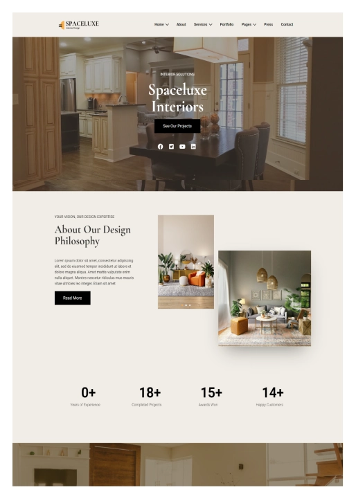
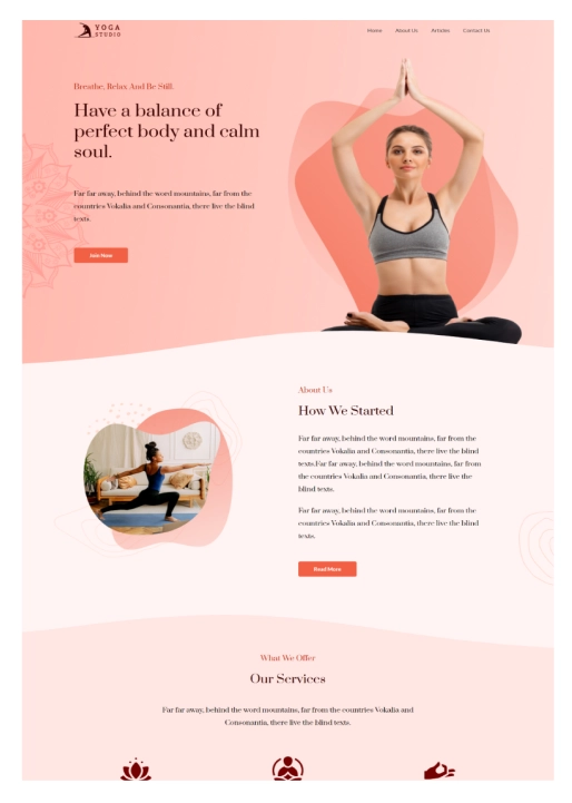
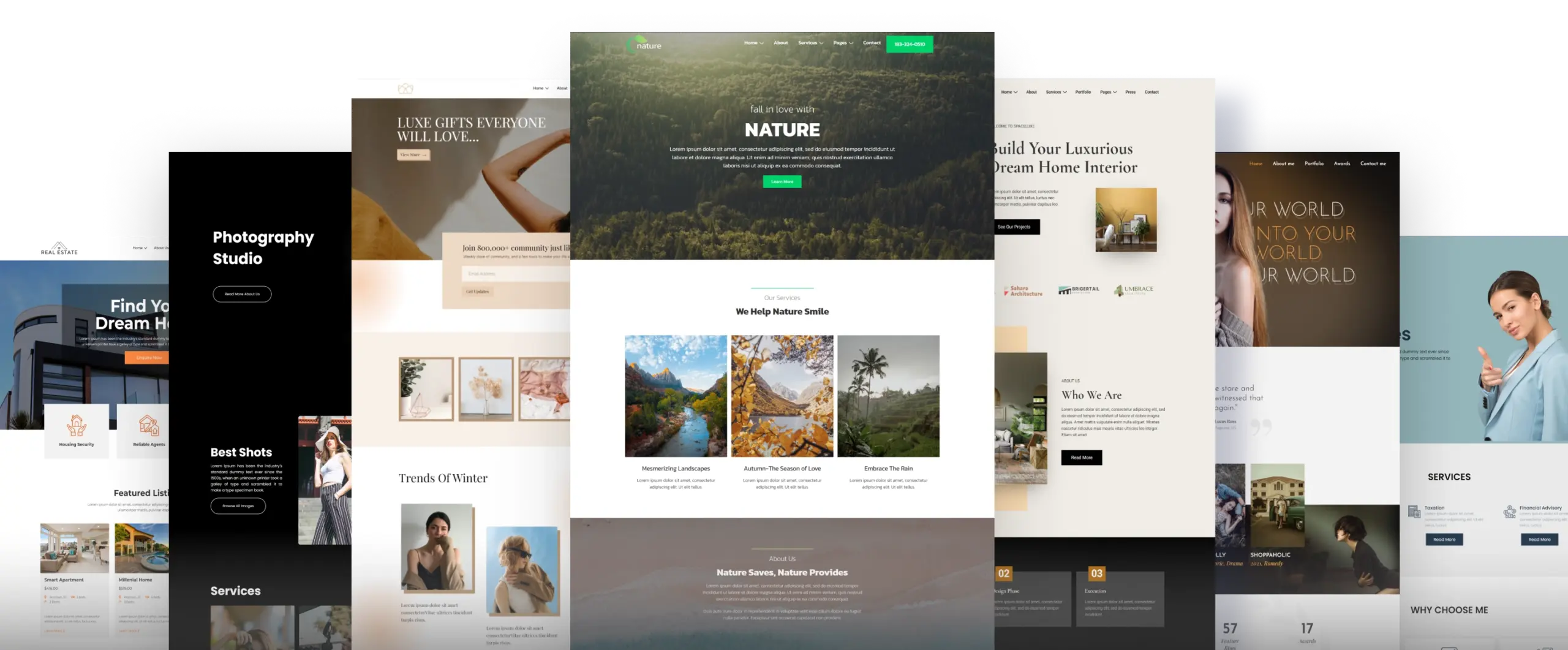
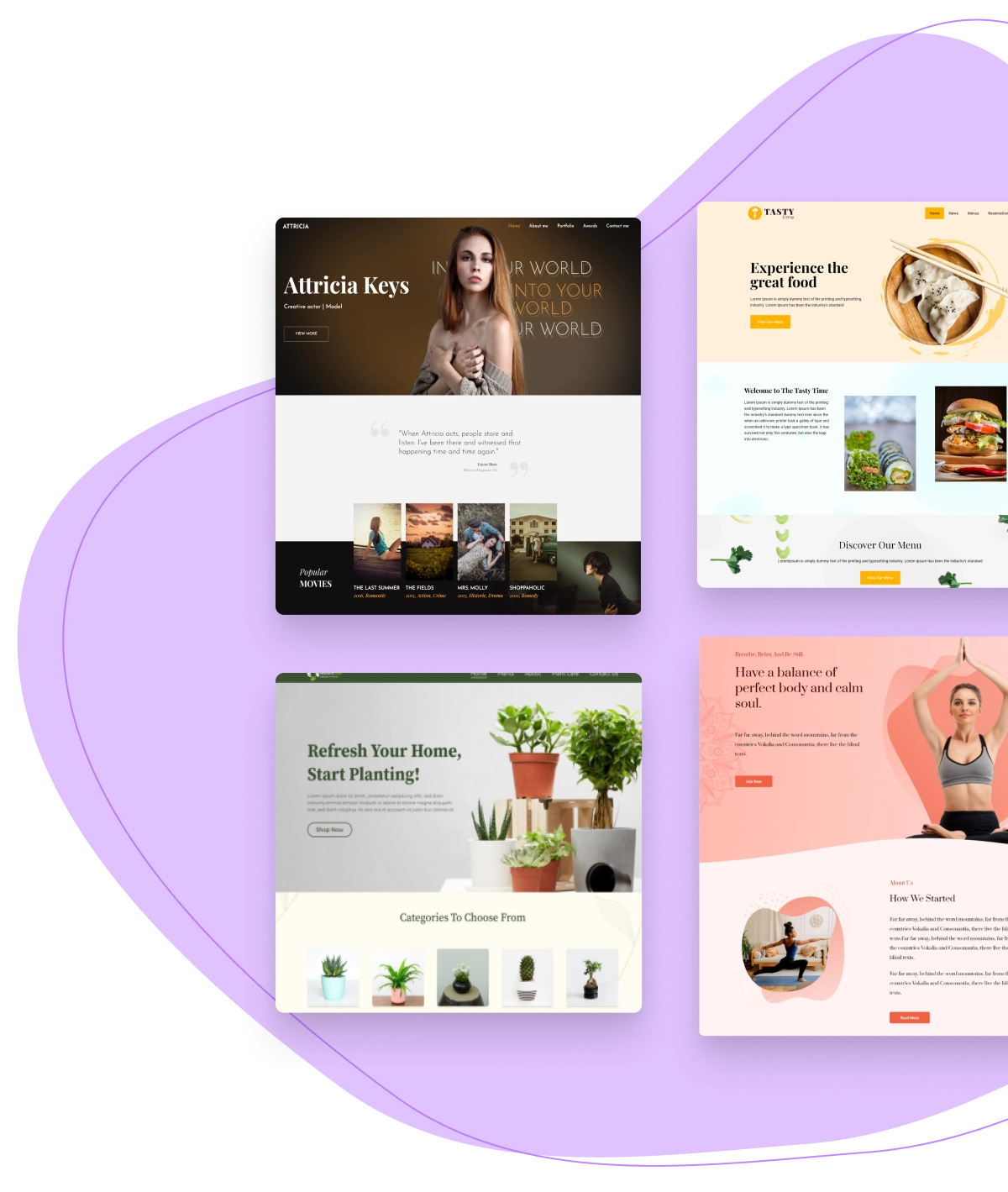
Import Websites with 150+ WordPress Starter Templates
Eliminate time consuming website design process from scratch. Responsive WordPress Theme offers a wide library of professionally built Starter Templates that you can import and launch your website in just a few clicks!
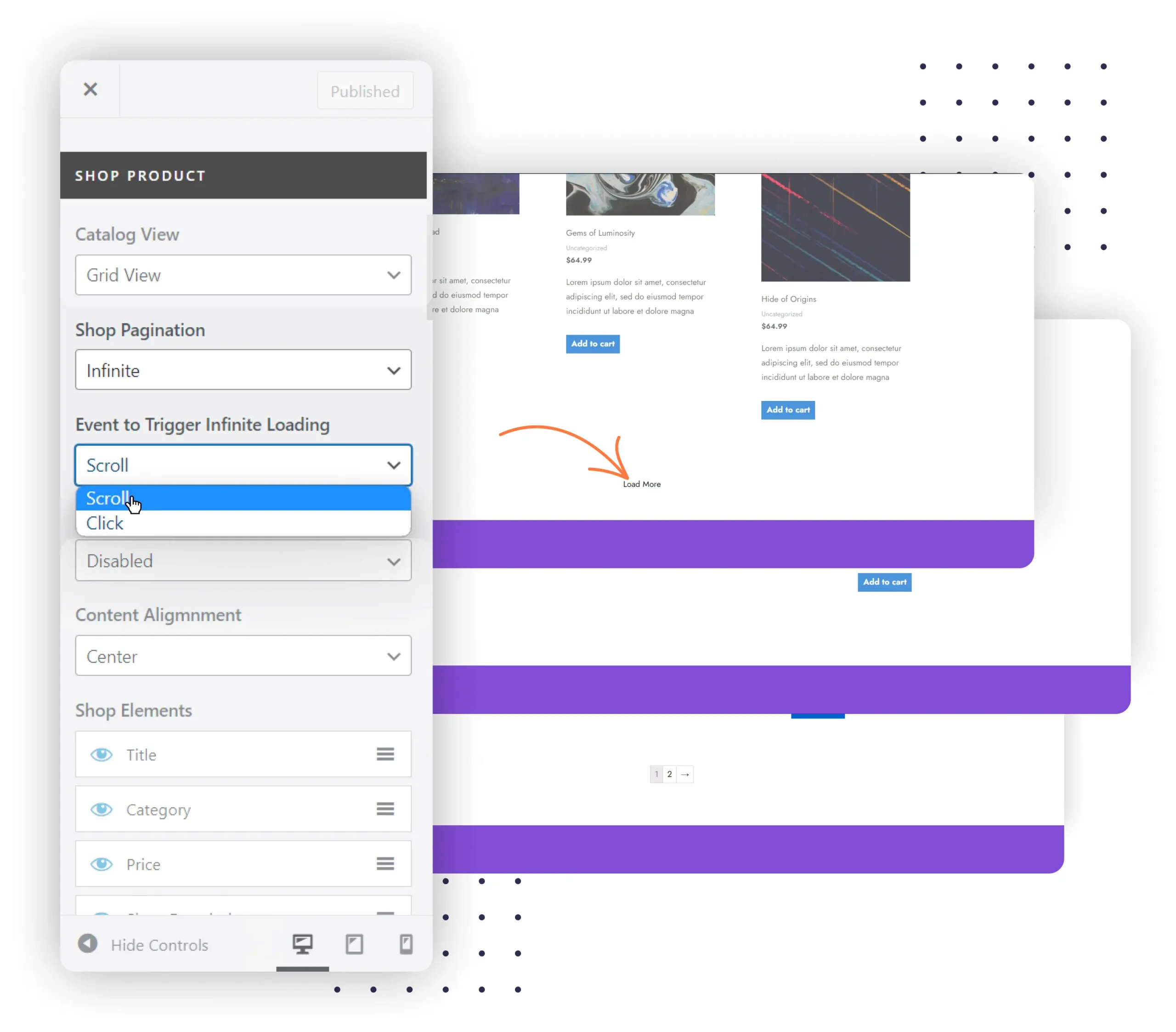
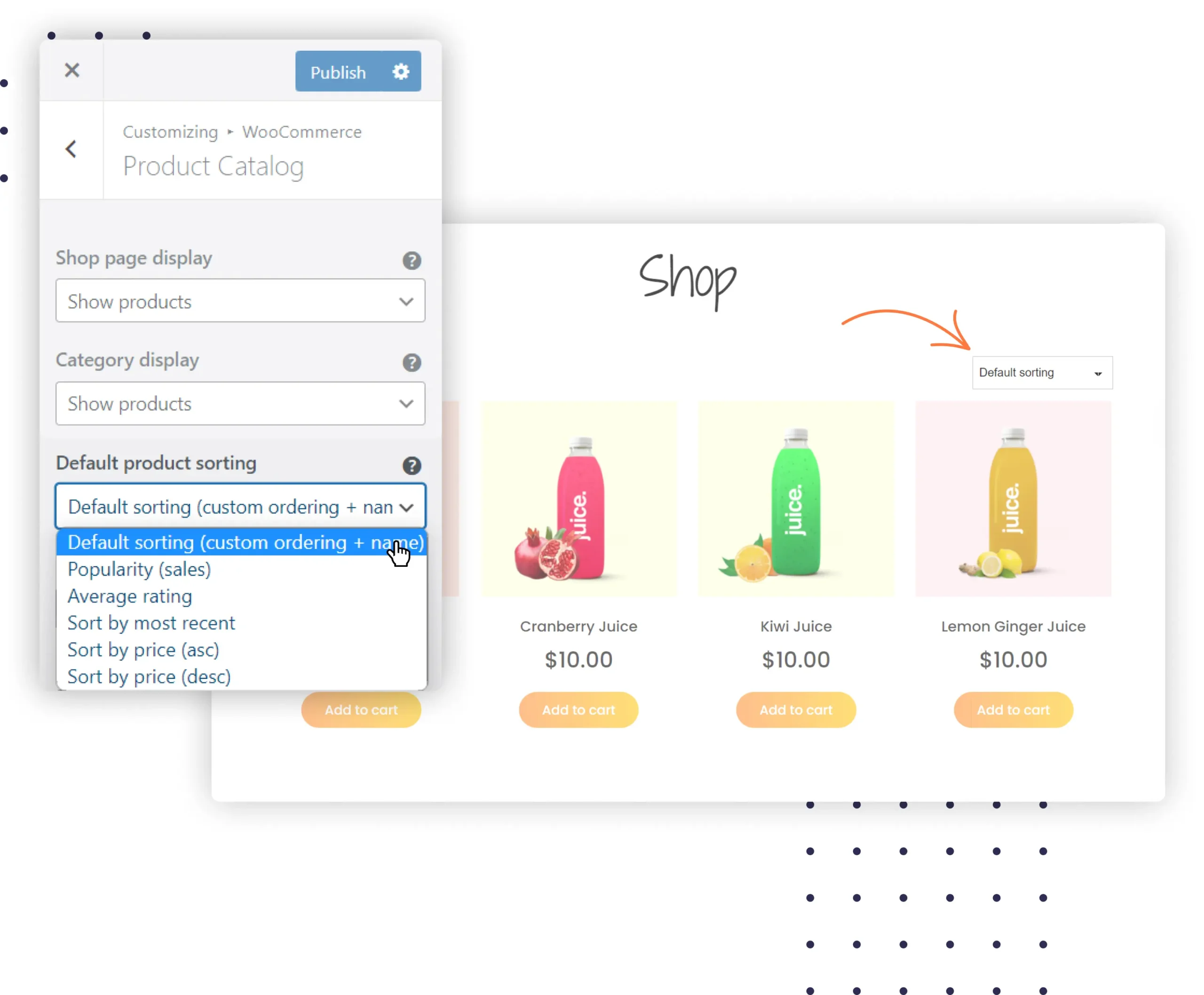
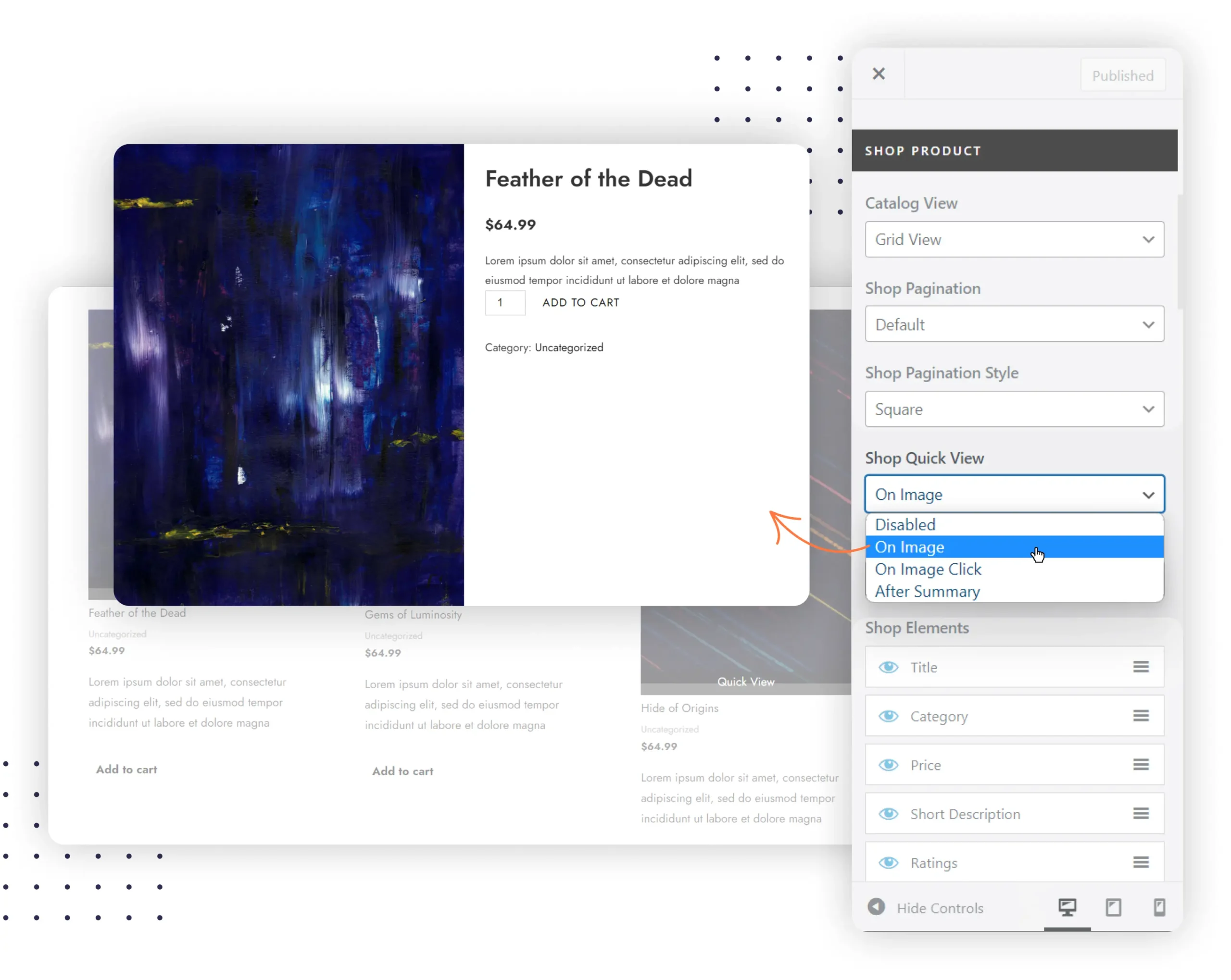
WooCommerce Integration
Responsive Theme offers deep integration with WooCommerce plugin so you can customize each and every aspect of your product pages. Create your own product page layout, typography, colors, live previews, and images!
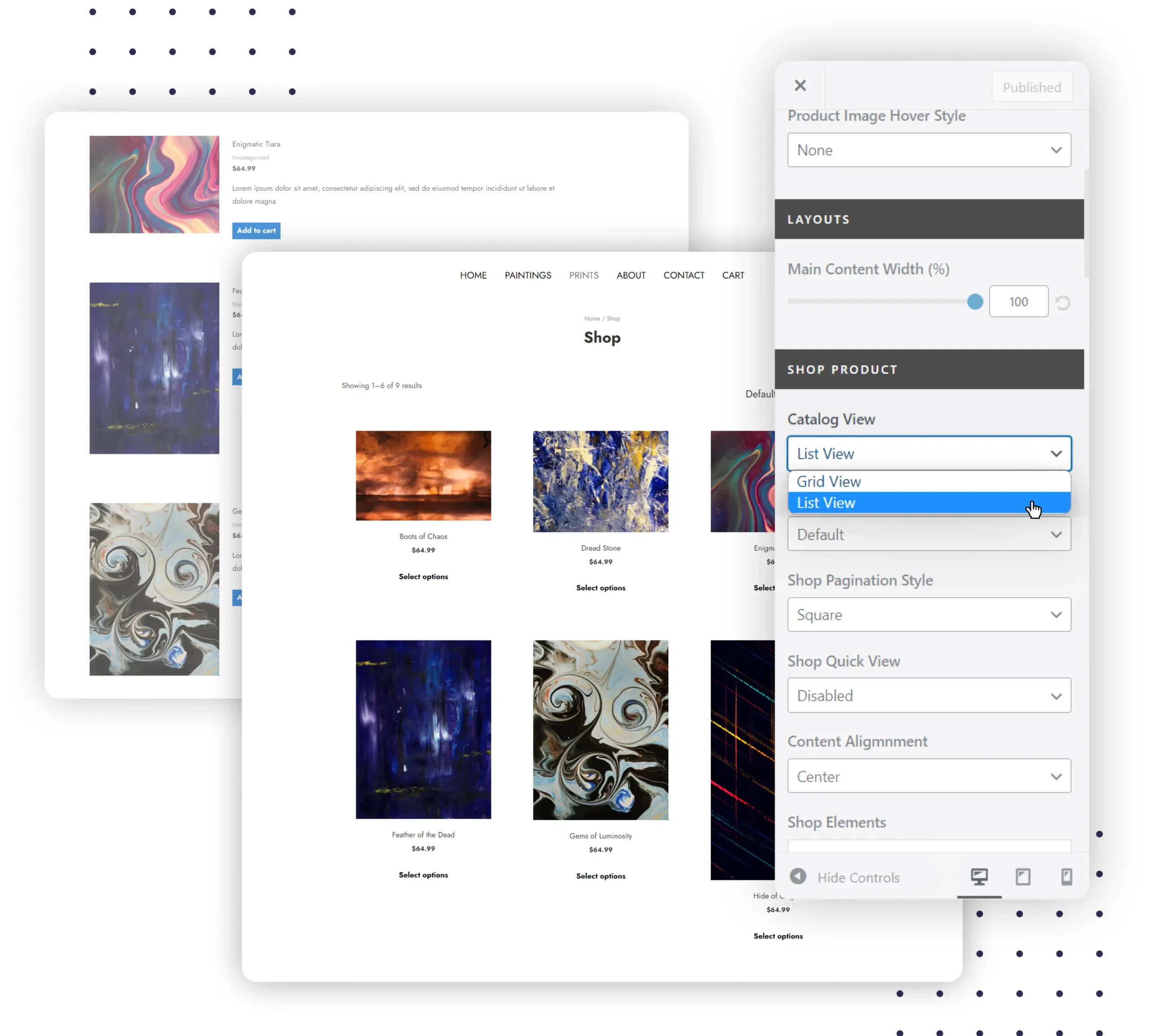
Custom Layouts
Easily change the layout of your WooCommerce pages. Choose the order in which product images, titles, descriptions, price and add to cart buttons appear.
Shop Pagination
Enhance your customer’s experience by changing the number of WooCommerce products per page.
Quick View
Provide your customers with a detailed preview of each product without opening a new tab. A variety of options are available to give your users a better product view.
Explore All WooCommerce Features
Product Catalogs
Create and edit product archive pages where you show products under different categories and provide sort options.
Cart Total
When a user shops in your store, they’ll see the WooCommerce cart total with the contents and make faster checkouts.
Custom Colors
Match your website color palettes to your business store. Set colors for every element including buttons, descriptions, sales bubbles, and other elements.
Typography
Easily customize the typography of your WooCommerce shop titles, product titles, price tags, and product descriptions.
What Customers Say About Responsive Theme
Five-star🤩 reviews from more than 550+ customers


More Theme Features
Responsive Theme comes with a lot of website customization options. So you can design your website exactly the way you want it to be.
Header Layouts
Add secondary headers above and below your primary header. Style your secondary header menu items to match your website needs.
Footer Layouts
Multi-column layouts along with a scroll to top button. Add embeddable scripts to footer.php directly from the customizer.
Fully Responsive
Welcome website visitors on all devices - desktops, tablets & mobiles. Give mobile users an exciting experience while navigating your website.
Customizable
Customize your website using the WordPress customizer. Change layouts, typography, buttons, and colors to match your brand.
Global Typography
Choose from any google font or a websafe font and define sizes, style, and text transform.
Global Color Settings
Customize colors for background, text, link, and button globally to make the site more visually appealing.
Predefined sets
Choosing fonts and colors is easy with pre-configured professional presets that integrate with your brand identity.
SEO Friendly Settings
Create the perfect header for your site with an easy to use drag and drop interface.
Schema Support
Responsive comes with inbuilt, valid schema.org microdata. This includes basic website schema attributes to help search engines understand your website better.
Page Layouts
Make each page on your website look unique by making page-level changes. Choose sidebar position, and showcase your posts in a list or a grid.
Post Layouts
Take full control of how your blog posts appear to visitors. Choose the order in which the post's title, meta, featured image & content appear.
Translation Ready
No hardcoded strings are present in Responsive theme, so it can be translated into any language.
Scroll To Top
Improve your website user experience by enabling the scroll to top button on your site. You can change the position, size, and color of the button.
Transparent Header
Easily create beautiful headers and you can also set your primary header background to transparent and pull the page content to the top.
Sticky Header
Responsive gives you several options to control the colors and background within the sticky header on your website.
Breadcrumbs
Breadcrumbs improve user experience and SEO significantly. These links at the top of pages help users navigate the website easily.
Super Charge with Addon plugins
We’ve also developed a suite of exclusive plugins that come bundled with your purchase, adding an extra layer of flexibility. This means the possibilities with the Cyberchimps Responsive Theme are virtually limitless.
ELEVATE GUTENBERG WITH
Responsive Blocks Plugin
Responsive Blocks is a Gutenberg editor based plugin that has over 50+ Blocks to enhance the website building experience using the default WordPress Gutenberg editor.
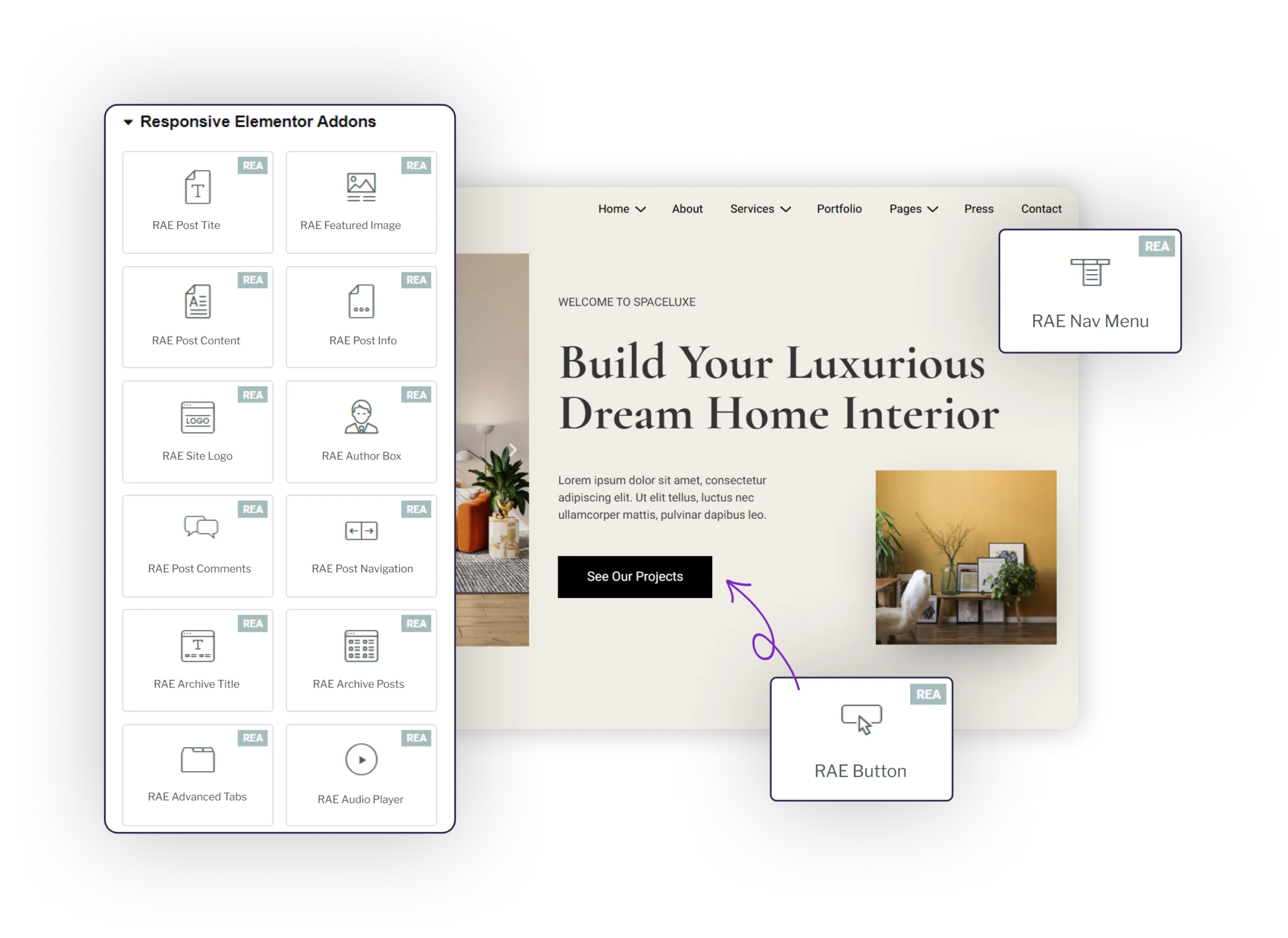
USE ELEMENTOR WITH
Responsive Addons for Elementor
A popular Elementor Addons plugin by the Cyberchimps team that offers 80+ widgets, productivity extensions like Cross Site Copy Patre and ready to import Elementor Templates.
Free Responsive WordPress Theme Lovers...
Developers, entrepreneurs, small business owners, and hobby users,everyone loves building websites using Responsive WordPress Theme.
4.8
510+ 5/5 Star Ratings