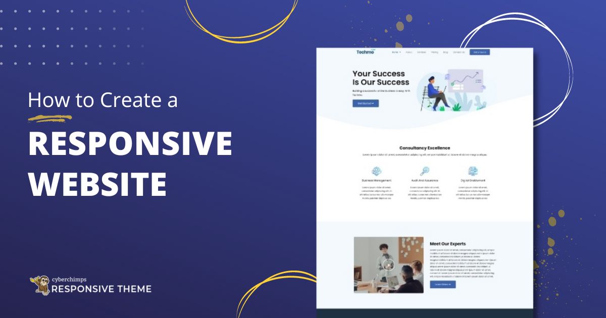
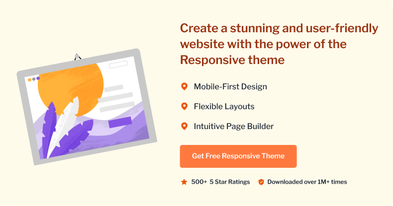
Responsive Pro is CyberChimps’ most popular theme and the best WordPress theme for web designers and developers alike. It follows all the guidelines for responsive web design . Now, why do you need a responsive website? Because it is slowly becoming an industry standard and is a crucial metric in SEO ranking .
With Responsive Pro, designing a website for mobile devices is super easy as it is a truly responsive WordPress theme and looks perfect across all devices – be it a tablet, mobile or smartphone.
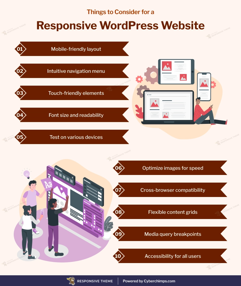
Things to Consider for a Responsive WordPress Website
[addtoany buttons=”facebook,twitter,pinterest” media=”https://cyberchimps.com/wp-content/uploads/2023/08/Things-to-Consider-for-a-Responsive-WordPress-Website.webp”]
What gives Responsive Pro that extra edge while creating a responsive website ?
- Theme Options that make customizing your website a cakewalk
- Responsive design – Adapts any device or screen sizes.
- 2 separate Menu Locations – Header and footer menu
- Fully customizable front page / Homepage – Like the one seen here
- Social icons
- 3 types of site layouts – Boxed, Content Boxed and Flat
- Responsive Pro comes with other 35+ ready-to-use website templates
Learn how to set up a yoga blog using Responsive Pro.
Here’s a quick guide on using Responsive Pro to create your responsive website
1. Installing and activating the theme
Follow the below steps to install the Responsive theme manually from the WordPress admin dashboard:
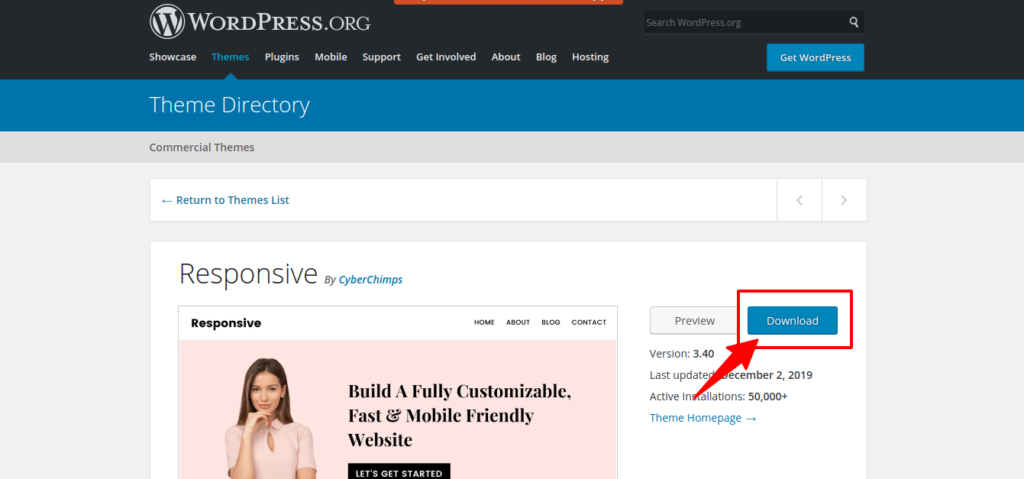
- Download the latest Responsive theme from the WordPress repository
- Login to your WordPress Dashboard
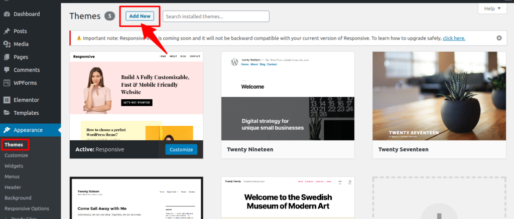
- From your WordPress dashboard, go to Appearance > Themes > Add New
- Upload the downloaded theme zip file
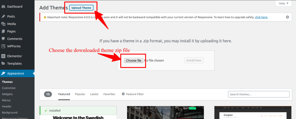
- Install the Responsive theme
- Activate it
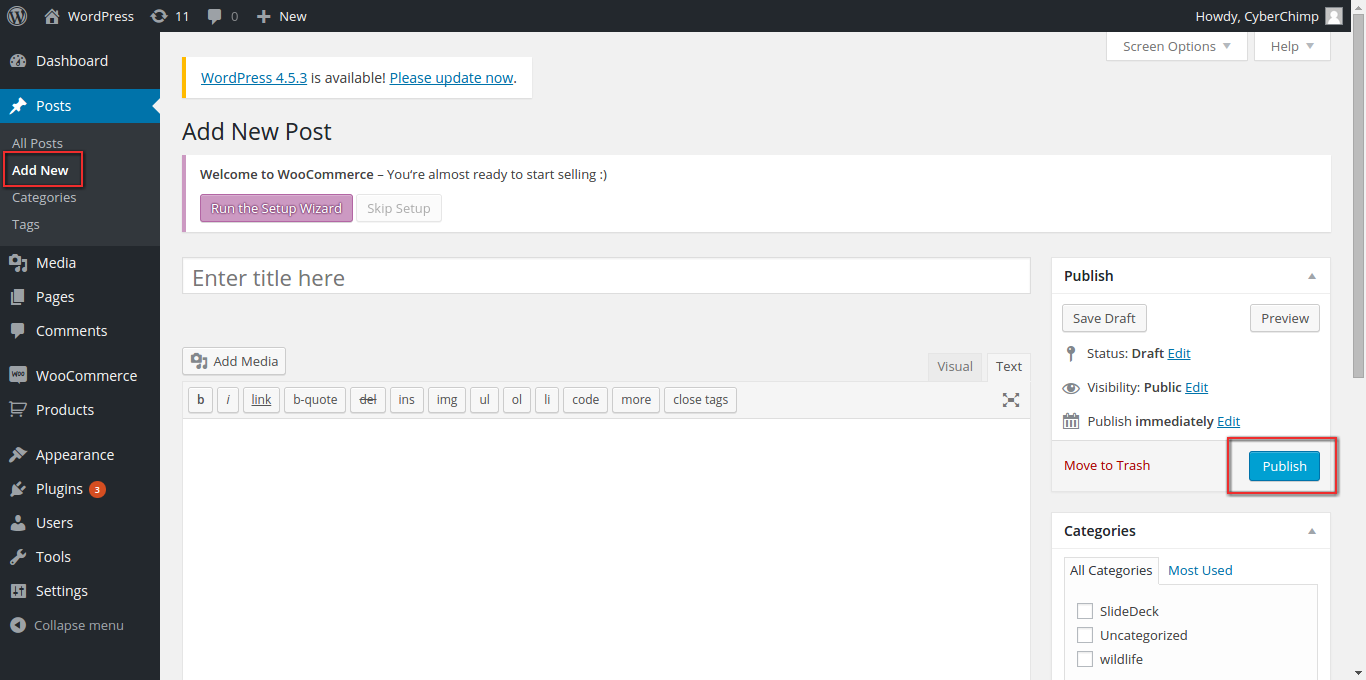
2. Creating your first Blog Post
Navigate to the Posts Tab on your WordPress dashboard, click on ‘Add New’ . Fill in the blank spaces – Title and content. You can either save it as a draft or publish the post. ‘Preview’ the post before publishing it.
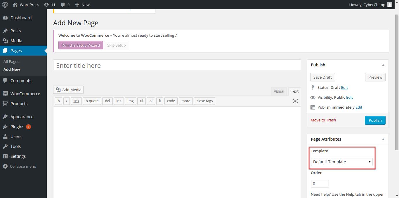
3. Creating Pages
Navigate to the Pages tab -> Click on ‘Add New’ -> Fill in content and select the template in ‘Page Attributes’ -> Hit publish and you’re done !
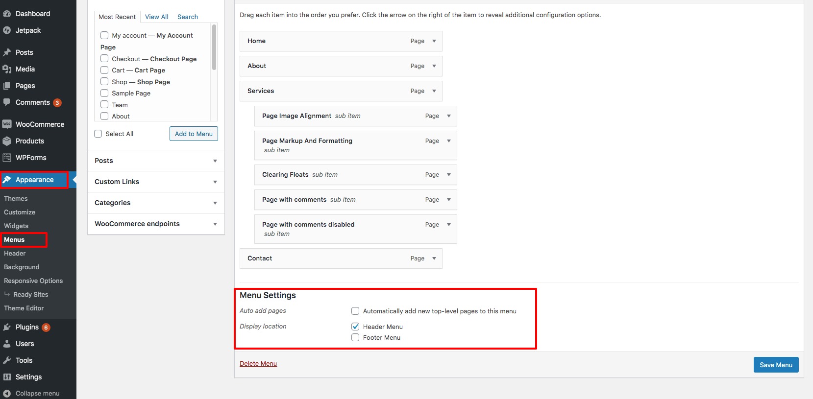
4. Menu Settings
You can select 2 menu locations using Responsive Pro. Here’s how –
Under Appearance -> Click on Menu -> Select the location in Menu Settings
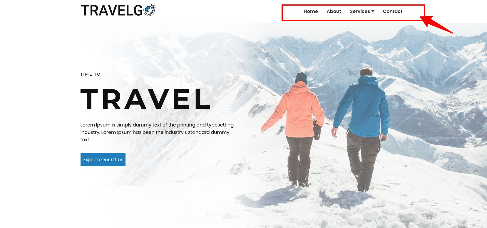
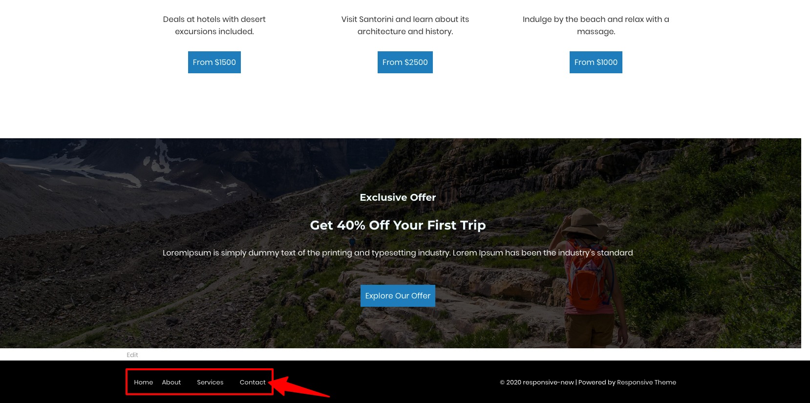
Here’s what the Menu Locations look like –
Header Menu
Footer Menu
5. Site Layout
Responsive Pro offers 3 different site layouts
- Boxed
- Content Boxed
- Flat
Here’s how you can select the one of your choice –
- From the WordPress dashboard navigate to Appearance > Customize
- On the next page, select Theme Options
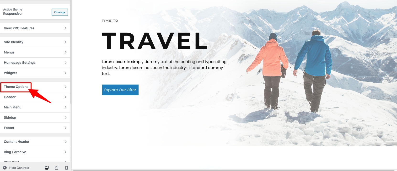
- Next, click on Layout option
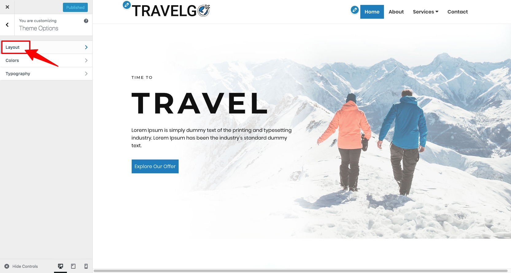
- On the next page, select the layout style you want for your website.
6. How to add & style the navigation menu?
To add a navigation menu, follow the steps below:
- From the WordPress dashboard navigate to Appearance > Menus
- Now, you need to click on Pages and View All. Select all the pages that you want to appear in your menu (use the checkboxes next to the pages’ names) and click on the Add to Menu button.
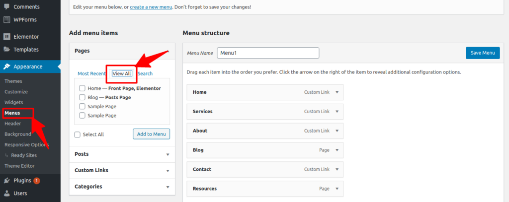
- If you want to edit the name of the added Menu, look below the Menu Structure and click on the name of the page you just added. Let’s say we want to edit the name of the Resources and rename it to Media and to do it, we will click on Resources to rename it to Media (Refer the picture below).

- Next, click on the Save Menu button to save the changes.
To change the style and look of the Navigation menu, follow the steps below:
- From the WordPress dashboard navigate to Appearance > Customize
- Next, go to Header > Layout. Then, you will get the below screen.
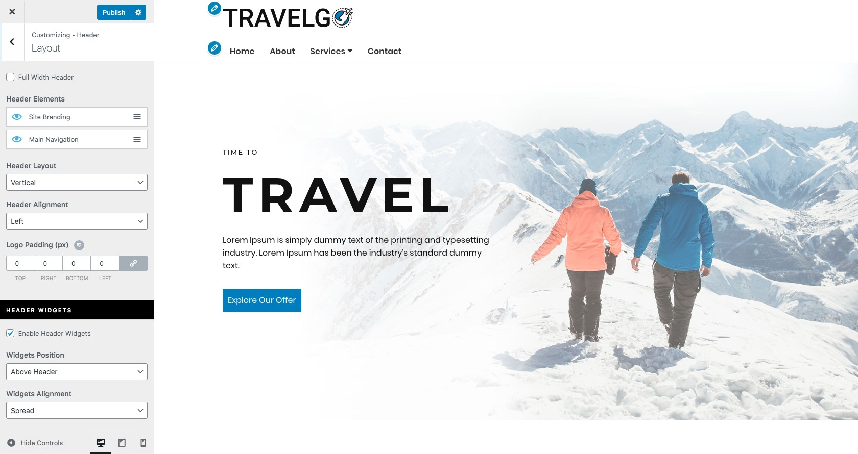
- Now, from the left panel, you can
- Change the position of header elements
- Change the header layout
- Change the header alignment
- Change the logo padding
- Enable or disable header widgets
- Change the widgets position
- Change the widgets alignment
After making all the changes, click on the Publish button to save all the changes and make it live.
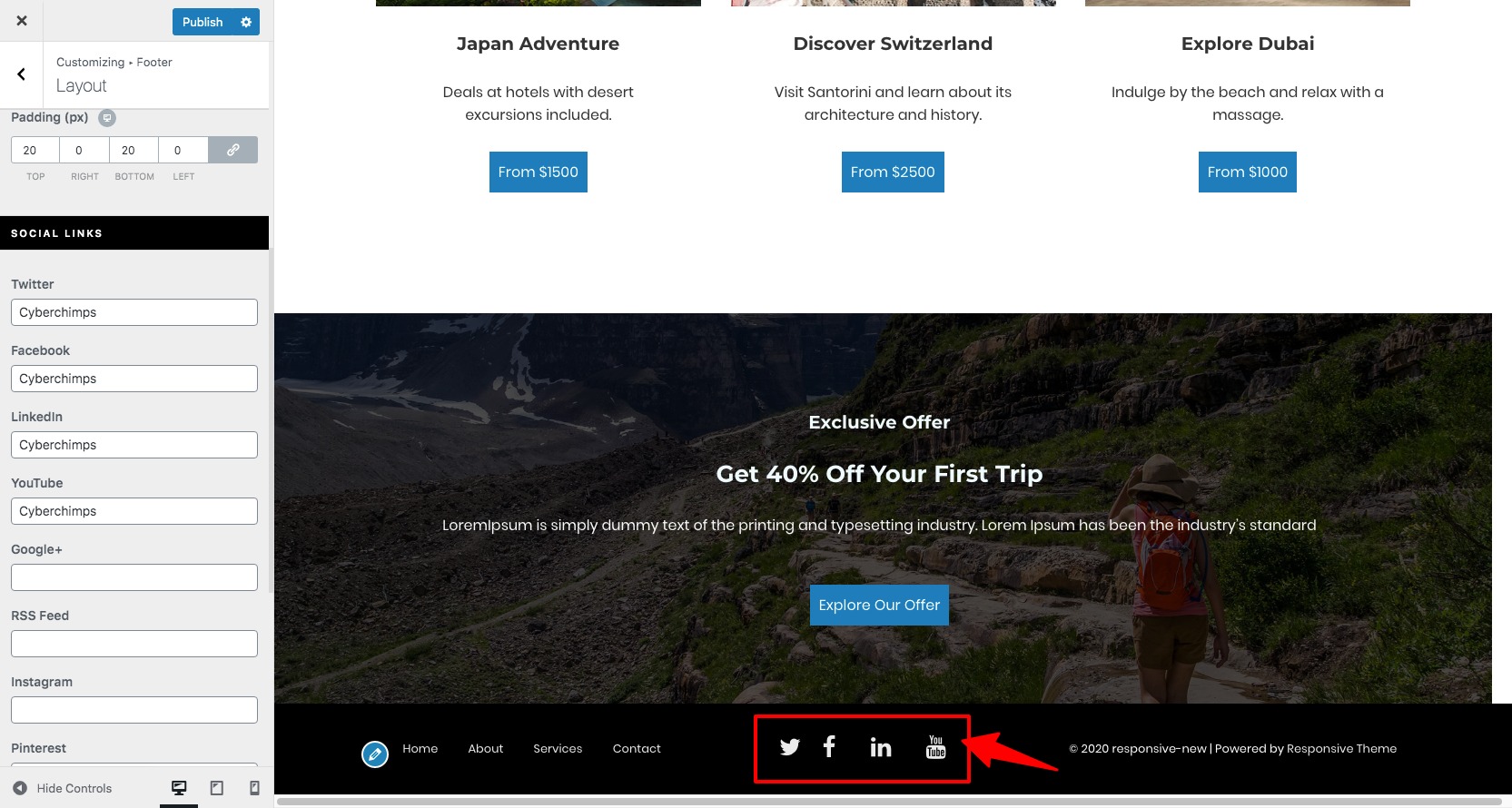
- Social icons
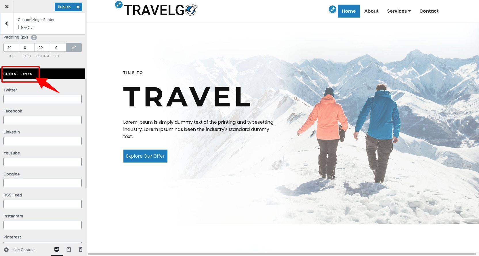
To add social icons on the footer area, follow the steps below:
- From the WordPress dashboard navigate to Appearance > Customize
- On the next page, select Footer option
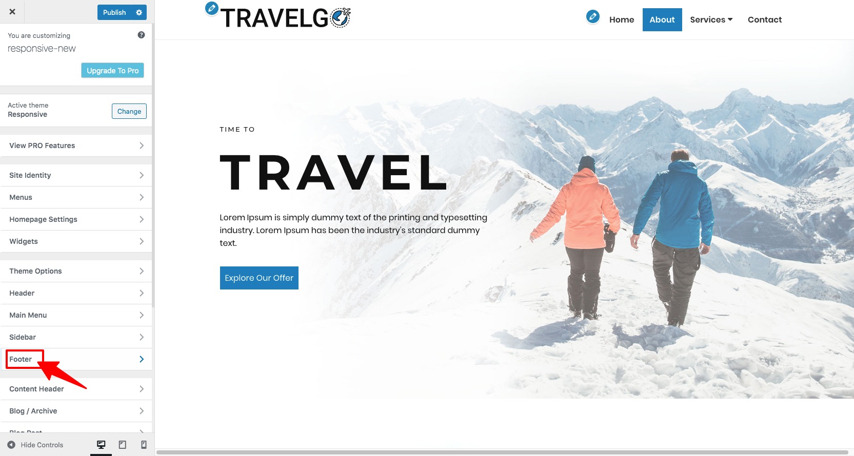
- Next, click on Layout option
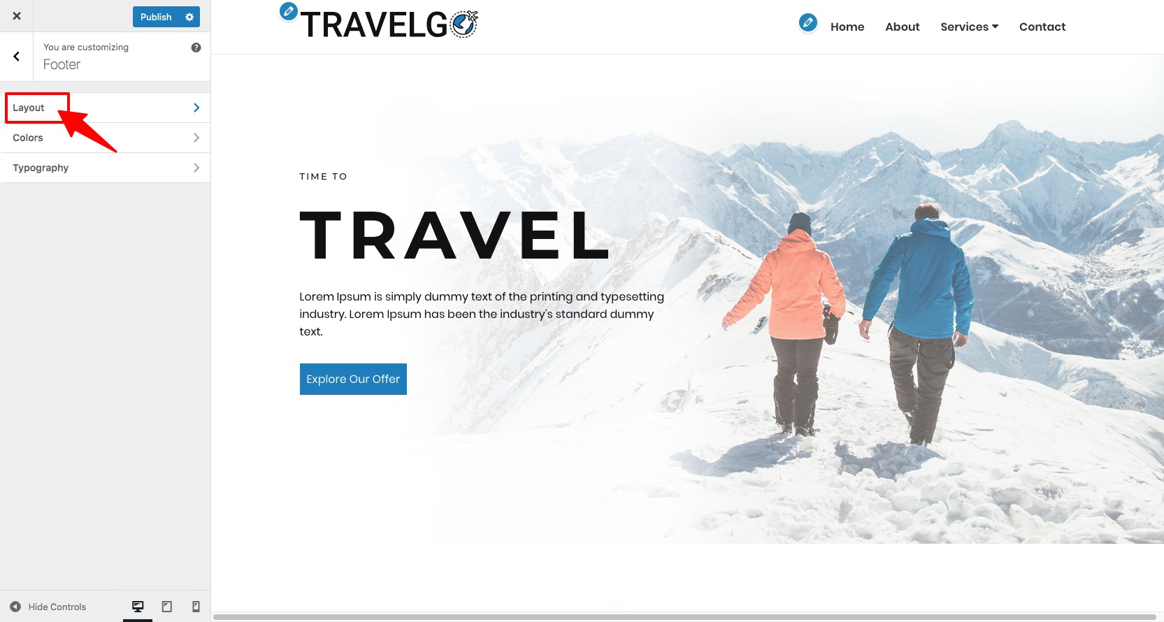
- On the next page, scroll down to Social links section and add your social media links
Here’s how your social icon will look like:
Conclusion
Being pioneers in responsive themes, CyberChimps very well know how to develop an all-pervasive theme that fits anyone’s needs. Responsive Pro is the best example of a theme that meets all requirements – as evinced by over 1.5 million downloads of the free version of responsive .
From selecting the layout, adding custom CSS and scripts, using eye-catching social icons and a powerful plugins support , Responsive Pro has all that it takes to make a website that turns heads.
Check out the websites that have used Responsive here .
The simple steps in this guide should help you in getting started with your website. Any questions ? Shoot a comment in the section below.