You don’t have to be a typography nerd to select font themes. It’s as simple as understanding the rules and experimenting with font styles. A lot of consideration goes into website design and font selection. There are thousands of WordPress fonts that you can use in your web design.
When choosing the right font theme for your WordPress site, you will be answering the following questions:
- What kind of personality do you want to reflect?
- What do you want your readers to feel when they visit your site?
If you are new to typography, then it could be hard for you to choose the right fonts for your WordPress website. Continue reading to learn how to make the proper selection of fonts that pair well with your web design.
Your Font Choice Matters And This Is Why.
Font selection is a component of readability which falls under presentation. The clarity of the font you use is an essential part of website design. There is more than clarity when it comes to font selection. Besides point size, weight and color, there is also the aspect of typeface or style.
The fun part about building a WordPress website is putting your personality on it. There are different ways to typography get your personality on your site. The font you use conveys different messages to different kind of people. Your readers may judge your character based on your font theme. Therefore, there is a need to pick and choose a WordPress font that fits your brand and personality.
Similar to the content on your website, fonts too deliver both messages and feeling to your reader. Therefore, it is essential to pick the right type of font. Font style is just as important as the words and colorful images you post on your website. If the reader is not able to distinguish between the characters on your site, then it would be hard for them to find meaning from your content.
Readability matters since our primary goal is writing is to convey information and convert readers into buyers. The type of font you use should help your readers distinguish and recognize the characters and words in your website text. Therefore, you have to make the content on your WordPress website readable to keep your readers engaged up to the end.
The typeface of a font can also affect the legibility of your website text. The readability of your content also depends on your reader’s visual acuity. Depending on the target audience and their level of vision, there are tons of fonts to use to meet their legibility needs.
The font style you choose should be able to bring out a high contrast between the background and the characters on your website. A busy or textured site should use a font theme that allows for the recognition of the fine details in the letterforms.
Your choice of font theme can also affect your SEO since Google’s algorithm considers readability as a factor of ranking. Without legibility, when writing for humans, it is hard for you to measure the readability of the content since the characters on the words are difficult to distinguish.
The Psychology of Fonts Selection
Most people associate font styles with different emotions and feelings. Therefore, the kind of font you use may evoke different moods on your readers.
There are three things that you must capture in your WordPress fonts choice:
- Emotions
- Feelings
- Association
Five primary groups distinguish the font styles that are still widely accepted: scripts, decorative, serifs, slab serifs, and Sans Serif.
Font categories:
Serif
The serifs font dates back to the Roman Empire era, but it came to fashion in the 15th century, perhaps due to the fall of the empire. Other popular classifications within this category include Old Style, Transitional, Classical and Neo-Classical.


The serif finds its use in printed materials due to its readability: The human eye can easily recognize its shapes. However, serifs are difficult to display on lower resolution of computer screens. It is suitable for use in website text as headings. The serif type font is best with the modern high-resolution monitors.
Example of Serif includes Times Roman, Georgia, Palatino and among others.
Slab Serif Fonts
These are the louder versions of the serif font which became popular from the 19th century. This font was useful in developing, pamphlets, posters, and billboards. The Slab serif fonts have evolved, now they can be applied in longer paragraphs of text. Brands that deal with outdoor activities use this style. It brings a vintage vibe in any web design work.
Example of slab serif fonts include Clarendon, Sentinel, Archer and among others


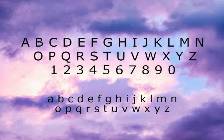
Sans Serif
The San serif font came into use in the mid-19th century also known as the “Modern” era. The Sans Serifs fonts are often applicable in web materials due to their less-detailed shapes and high readability. They work well on digital screens, even on lower resolution computer screens. The rise of digital design has been a significant boost for this font style.
It is the most popular font on WordPress sites. It finds application in body copy with long paragraphs text, headlines, and logos. Sans serif fonts are useful whenever you need a bold and a little bossy presentation.
Fun facts: they are new, flashy, and shorter like skirts
Example of Sans Serif includes Arial, Helvetica, Verdana, and among others.

Script
The script font mimics calligraphic writing and informal or formal hand-written writing styles. Others use patterns on manuscript lettering. This font is usually used to add style to the text on your website. This type of font has poor readability and are most available on logos.
Example of Script fonts: Alex Brush, Pacifico, Great Vibes and among others

Decorative
When you require a robust typographic statement on your website, the right font to use is the Decorative typeface. It is also famous for headlines and signage. The font theme evokes a particular a particular state of mind in time and also have an aspect of culture
Example: Outlaw, Boho, Boucherie and among others

Combining Fonts to Achieve the Best Theme
You will need to find the best font for your header, sidebar, and content. Just like peanut butter and bread, fonts can be combined to achieve the best readership results. Sometimes the combination of two or more font styles in your website text can bring out the required contrast and support the message you wish to convey.
If you wish to use more than one font then considered other font families. Fonts from the same category are just two North poles- they don’t attract. Choose font styles that are substantially different from one another. When making bold contrasts between fonts, ensure that they share a visual aspect. Gotham and Archer, Brandon Grotesque and Museo Sans or Museo Sans and Playfair Display are good examples of fonts that pair well.
Tips for picking the right font style for your WordPress website:
- Stick to two to three fonts and keep it simple.
- Keep it legible
- Consider different font families
Experimenting and Customization
Font styles can be tweaked to enhance readability on the screen. There are a lot of fun things you can do with fonts including italicizing, bolding, sizing and coloring. It gets even exciting when you find a font style that you love. However, you should not go overboard relying on how the font makes you feel.
Thanks to Google, Adobe® Edge Web, Web Safe and CSS there are a lot of free fonts to use when designing for the web. Most people opt for preinstalled fonts to custom fonts. However, the free fonts do not always match with the subject matter of every website.
WordPress offers three options (using code, theme settings or a plugin) of updating your fonts. Knowledge in CSS is required to pull them to your font style editor using code.
WordPress allows for the use of external fonts. Some of the fonts you use on your computers are web licensed. If you are looking for inspiration, then you need to explore the handwritten fonts. For font customs, you’ll have to purchase these licenses them from their designers.
Conclusion
The selection of font should aim to reduce eye strain and fatigue for the person engaging with your WordPress website. Thinking about the origin of the fonts will help you determine how to use it.
The process of choosing the right fonts for your WordPress website boils down to a simple three-step process:
- Decide what personality of your brand and emotions you wish to display
- Pick a font that conveys character and feeling
- Choose a sans serif font for your main body text that pairs well with the other fonts
Choosing the right font style requires familiarizing with the rules of WordPress fonts. Most seasoned web designers identify matching fonts by just playing with them. Finding the right font style is like stumbling on happiness. The fun stuff about choosing the right font theme is playing with them.
You can also consider checking A Review Of The Handmade Design Bundle From Pixelo.Net.