
Chances are you’re reading this on your smartphone. How mobile devices have become a part of our daily lives wouldn’t be a surprise.
Google says over 50 percent of search queries worldwide come from mobile devices. Page speed is now a ranking factor for mobile search results.
So, businesses and bloggers must ensure they use a WordPress theme built and optimized for faster performance. If you haven’t optimized your website for mobile, you should do it now or risk losing over half of your audience.
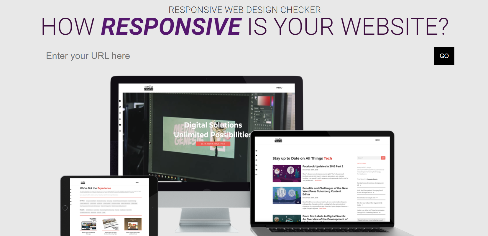
In this post, We’ll see what a responsive website design checklist is and why it’s essential, with a few examples.
We have also listed a 12-point website design checklist to ensure your WordPress website is responsive.
- What Is Responsive Web Design?
- Mobile-friendly Design Is Critical For Your Website
- 12+ Responsive Website Design Checklist
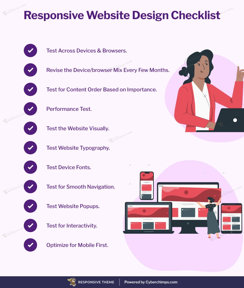
- 1. Test Across Devices & Browsers
- 2. Revise the Device/browser Mix Every Few Months.
- 3. Test Important Content
- 4. Test for Content Order Based on Importance
- 5. Performance Test
- 6. Test the Website Visually
- 7. Test Website Typography
- 8. Test Device Fonts
- 9. Test for Smooth Navigation
- 10. Test Website Popups
- 11. Test for Interactivity
- 12. Optimize for Mobile First
- Tools For Testing Website Responsiveness
- Responsive Web Design Examples
- Looking For A Responsive WordPress Theme?
- FAQ
- Final Thoughts…
What Is Responsive Web Design?
We live in a world full of smart devices. These smart devices come in all shapes and screen sizes. People use all these devices to browse and interact with web pages across the internet.
That means your website needs to look good and be easy to use, regardless of the device. That’s where the responsive website design checklist comes to the rescue.
Responsive testing checklist makes your website function well across devices. Depending on the device, this design approach hides, shows, shrinks, enlarges, or moves the content to make it look good on any device.
Many users have asked, “What does my website look like on mobile?” Being responsive has everything to do with mobile responsiveness.
Mobile-friendly Design Is Critical For Your Website
Think about it. Your audience has already embraced responsive design. Today, smartphones are owned by 80% of internet users. These users spend, on average, 69 percent of their media time on smartphones.
Businesses need a mobile friendly website to avoid turning away customers. According to socPub, 57 percent of users claim they won’t recommend a website with a poorly designed mobile site. Your competition, on the other hand, is laying out the red carpet for your customers.
According to MarketingLand, 72 percent of the US digital ad budget will be spent on Mobile advertisement. And 68 percent of businesses have integrated mobile marketing into their overall strategy. The verdict is clear.
Go responsive or go bust.
Let’s move on to the Responsive checklist for website design.
12+ Responsive Website Design Checklist
If you re-designed (or got a new website) in the last few years, chances are it’s already responsive. Since responsiveness is no longer an add-on, most web design companies offer responsive design as a standard.
However ensuring your website is mobile device friendly is not a one time task. You need to periodically do a responsive testing checker and update your website for responsiveness, keeping on track with your checklist for website design.
So if you’re wondering, “Is my website responsive ?”
Here’s a handy responsive design checklist to help you test your WordPress website.
[addtoany buttons=”facebook,twitter,pinterest”https://cyberchimps.com/wp-content/uploads/2023/08/Responsive-Website-Design-Checklist.webp”]
1. Test Across Devices & Browsers
Collect data mobile and web traffic data from Google Analytics to test responsive websites. This data includes the mobile devices and browsers used to access your website. It is an essential point in the website design checklist.
2. Revise the Device/browser Mix Every Few Months.
Based on newly collected data, retire old combinations and make space for new ones to test responsive design.
3. Test Important Content
Ensure that important page content appears on all devices. Other supporting content can be hidden on smaller devices.
4. Test for Content Order Based on Importance
Ensure important content appears before other supporting content on smaller devices.
5. Performance Test
Measure how long your website renders across browsers, devices, and internet speeds. Compress large resources and use caching to improve website performance.
6. Test the Website Visually
A significant step in responsive design testing is to ensure that text, images, and controls are aligned. And do not run or overflow the edges of the screen. Make sure the content scrolls and displays appropriately across devices.
7. Test Website Typography
Ensure that all text content is readable across devices. Make sure that font, style, and colors are consistent.
8. Test Device Fonts
When using device fonts, consider fonts across devices and operating systems. Make sure you specify the device default fonts in the font family of your website’s stylesheet.
9. Test for Smooth Navigation
Ensure that navigation elements do not run or overflow the edges of the screen. Use hidden navigation using the hamburger menu icon on smaller devices. Make sure the user can navigate using swipe gestures.
10. Test Website Popups
Ensure the popups on your website are responsive too. These include both inline and browser window popups.
11. Test for Interactivity
People use various devices to interact with devices. Keyboards, mice, styluses, and of course, fingertips. Ensure that your controls are tap-friendly and big enough for finger taps.
12. Optimize for Mobile First
When re-designing a section (or entire website), stick to the mobile-first design approach. Adapt your design to smaller mobile devices first. Then build for larger screens.
Tools For Testing Website Responsiveness
Many responsive tester tools are available to test if your website is responsive. We’ve shortlisted the top three for you:
1. PageSpeed Insights
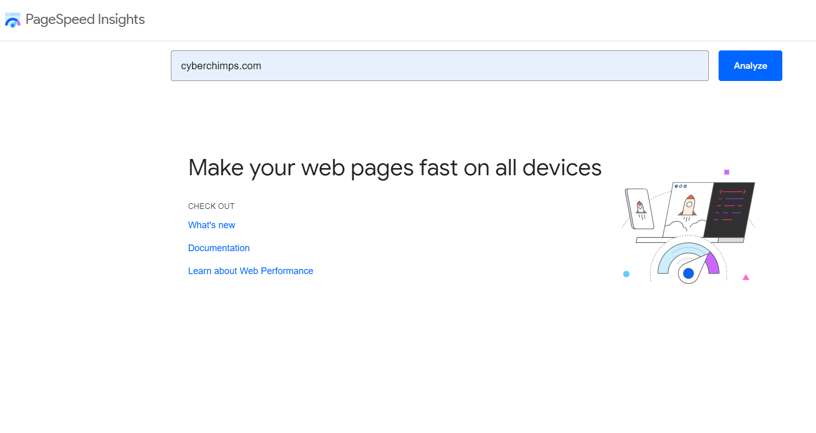
Enter a page URL; this tool will tell you if the page is mobile-friendly. You can also use this tool to get a sitewide analysis report for responsiveness.
Being a Google tool, these recommendations are also suitable for search engine optimization.
2. Am I Responsive?
Use this responsive checker tool to check how your website looks on standard devices quickly.
Again, enter your page URL, and Am I Responsive will show how your website looks on a desktop, laptop, tablet, or mobile phone.
3. Responsive Design Checker
On the other hand, if you want to test your webpage across a range of devices, use Responsive Design Checker, a responsive web tester.
While the responsive design checker tool works similarly to Am I Responsive, it gives you many more screen resolution options. In addition to standard devices, you can also test your page on specific devices like Amazon Kindle and Google Pixel phones.
Responsive Web Design Examples
Now that you know why responsive design is critical to your website, let’s look at three examples showcasing responsive design best practices.
1. DropBox
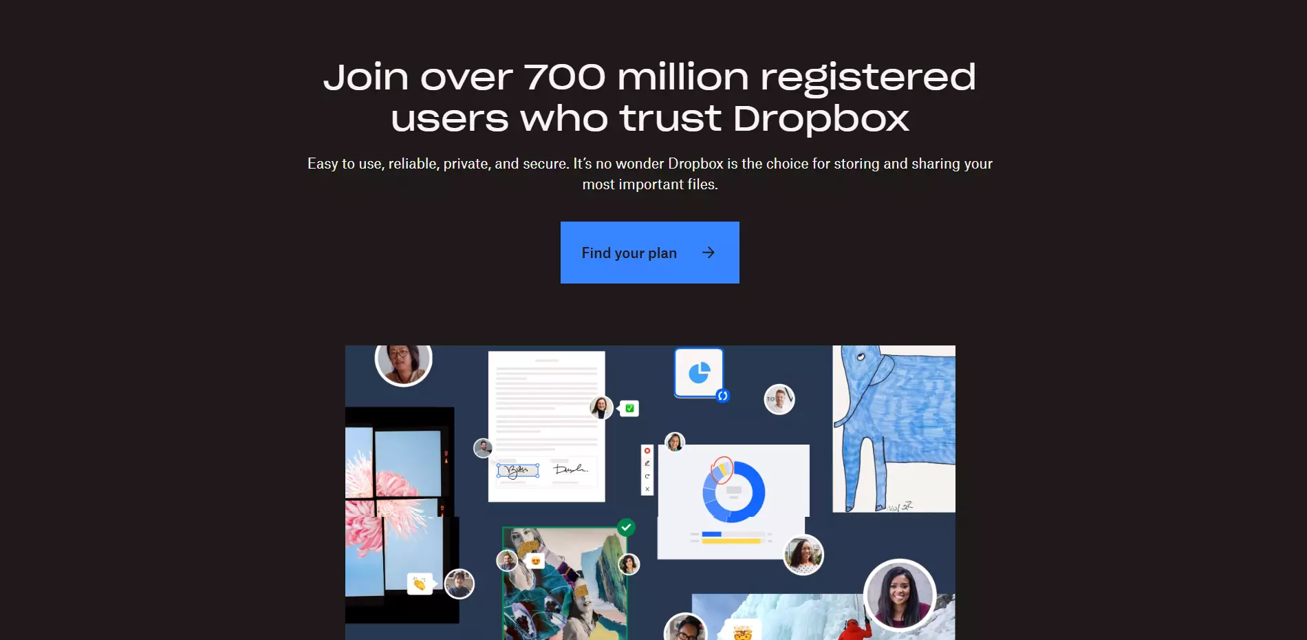
The DropBox hero area and the call to action adapt beautifully depending on the screen size. Notice how the signup form appears on larger screens.
Also, notice the arrow on a larger screen below the hero area. This arrow is absent on smaller screen devices, where users scroll down naturally.
2. Treehouse
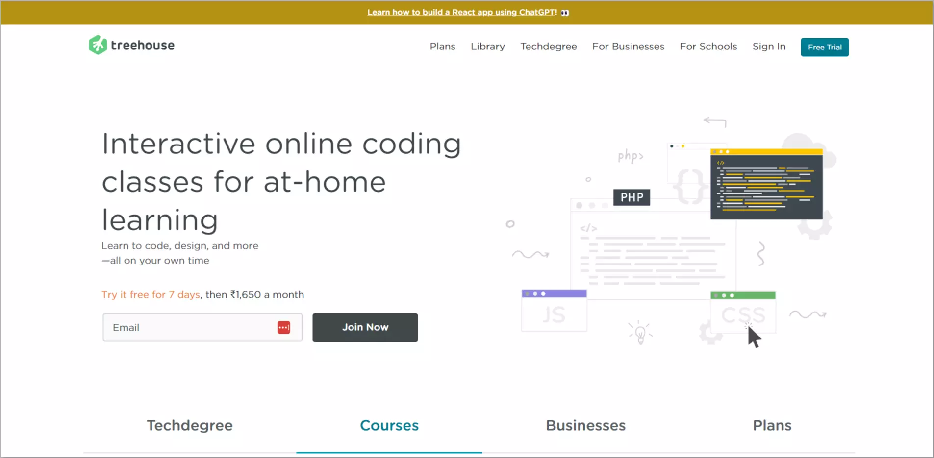
The Treehouse website navigation menu showcases responsive navigation design at its best. Notice how the number of navigation menu items reduces as the screen gets smaller.
The missing navigation menu items are hidden behind the hamburger icon button in the top-left corner of the website’s header.
3. Dribble
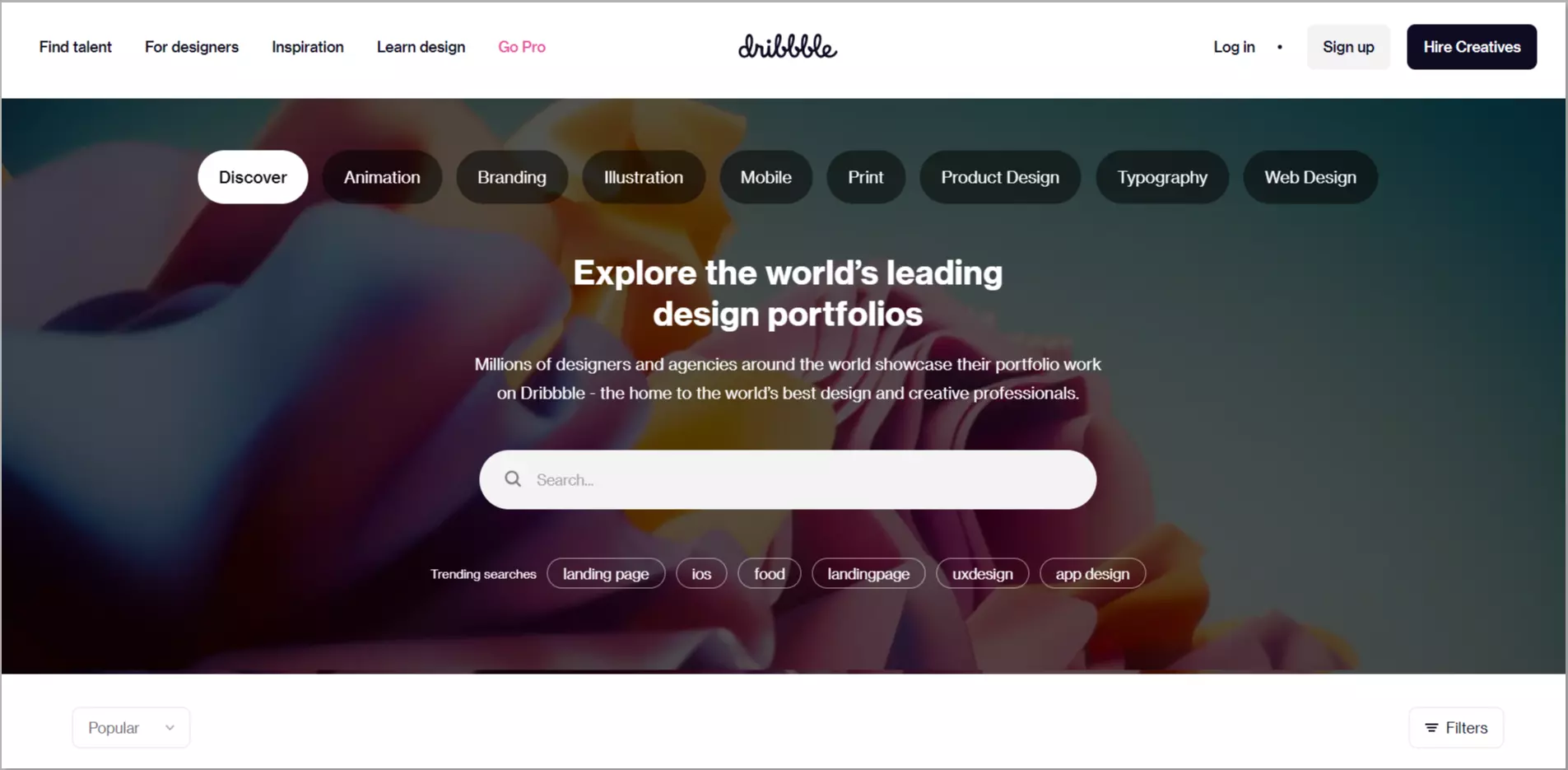
Dribble’s content adapts depending on the user’s screen size. Notice how the number of columns in the design items grid decreases as the screen size gets smaller.
Looking For A Responsive WordPress Theme?
Look no further. All our free and premium WordPress themes look beautiful and work well across devices. All of these themes have gone through the responsive design test.
Please take a look at some of our free Responsive WordPress Themes.
Responsive WordPress Theme
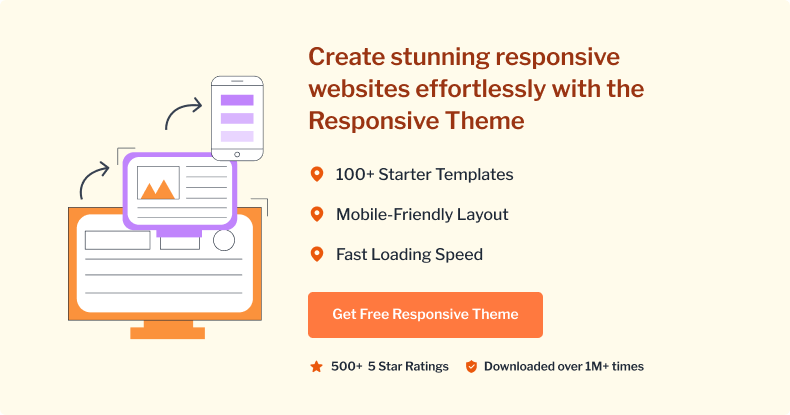
Responsive is among the very first responsive WordPress themes. Downloaded over 1,000,000 times, this theme is going strong with each day.
The theme comes with 40 free & premium ready-to-use website templates that can be imported in just 1-click and easily customized with Gutenberg & Elementor page builders.
These ready-to-use website templates will make launching your website a breeze! Below are some of the free Responsive themes that you can check out
1. Free WordPress Travel Blog Template
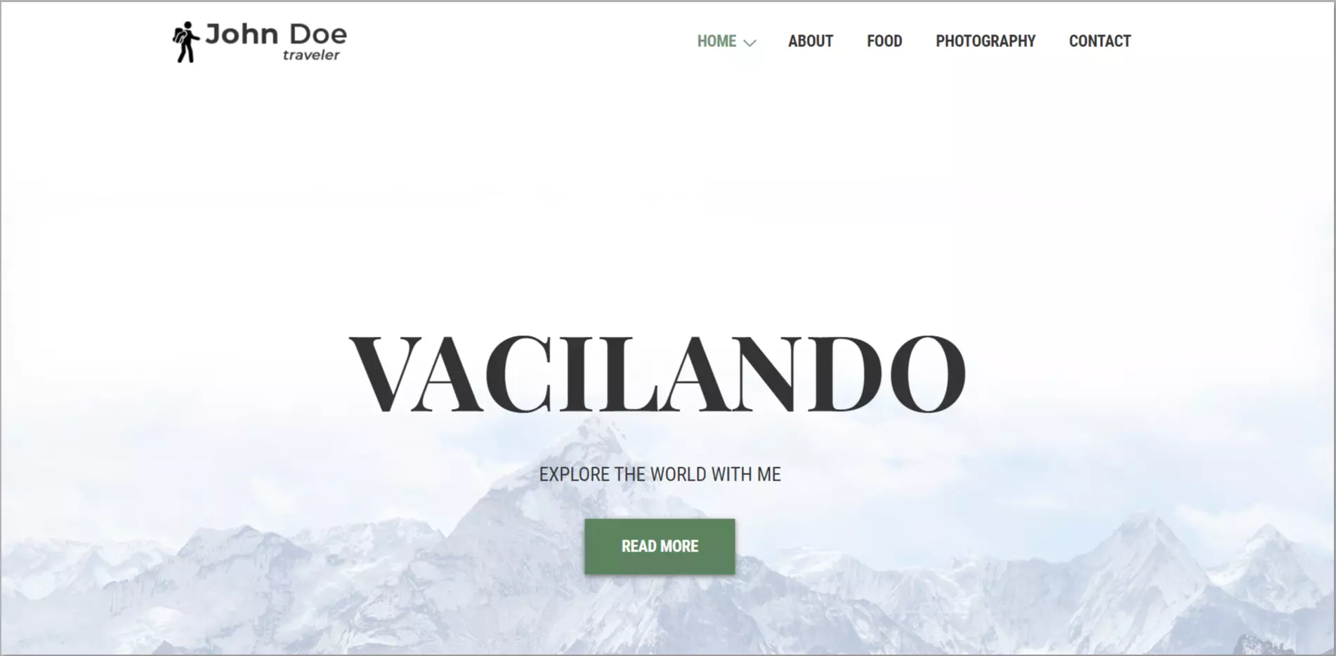
Travel Blogger is ready to use a template with pre-designed pages waiting to be imported. If you are someone looking to share your travel experiences or even want to build a career in it, this travel template will give you a head start with its unique responsive features.
The template has a beautiful responsive gallery to display your favorite destinations or recommend them to your audience.
2. Free Interior Design WordPress Template
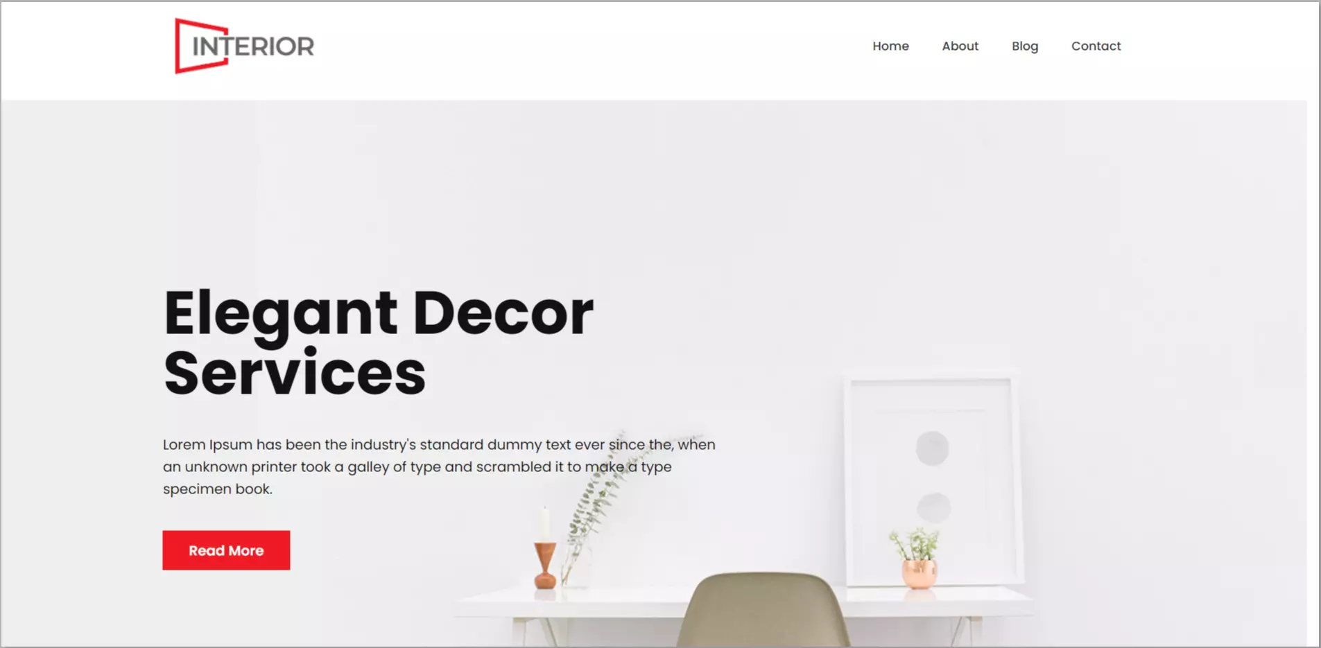
Interior Design Template is very easy to use. Most customers want to look at your work before making a buying decision. With the interior design template, change the contents easily with the drag-and-drop editor, and launch your website.
You can easily build a mobile responsive website and showcase your designs or recent projects using a grid-style layout, allowing customers to book appointments directly from the website.
3. Free Lawyer WordPress Template

Lawyer WordPress Template comes with this easy-to-use responsive template, so you don’t have to build anything from scratch.
This pre-designed theme has a ready-to-use Home page, an About me page, a Blog section, and much more. You can showcase your team members’ details with a separate Team section.
4. Free Medical WordPress Template
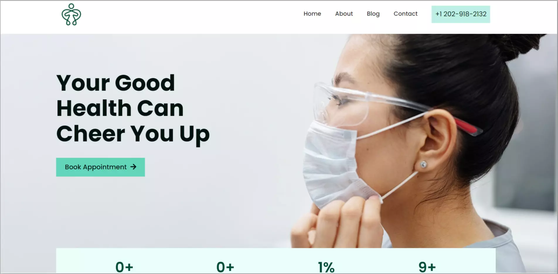
Medical WordPress Template has all the features you need to grow your medical or healthcare website. The pre-designed responsive pages get your website up and running within minutes.
With the integrated contact form, you can easily increase email inquiries, enabling customers to book appointments directly from your website.
5. Free Lifestyle WordPress Template

Lifestyle WordPress Template is a beautifully designed template that includes re-designed elements like the home page, about page, blog section, integrated contact form, and more.
These elements are easily customizable with the drag & drop editor, and you can get your website up & running within minutes!
FAQ
The 3 Major Principles of Responsive Design are
1. Fluid Grid Systems.
2. Fluid Image Use.
3. Media Queries.
Responsive web design lets your website adapt to different screens and devices, creating an equal user experience for your audience. Elements such as mobile navigation, flexible visuals, and fluid grids must be included for a more responsive web design.
Second, these key variables can be grouped into three categories or dimensions of responsiveness – product, process, and volume – to provide a holistic understanding of responsiveness and its fundamental determinants.
1. Understand your customers.
2. Provide consistent support experience.
3. Use canned responses, personalization, and self-support resources.
4. Train your employees.
5. Trust technology.
Final Thoughts…
New devices, operating systems, and browsers come out every day. You must periodically refresh the list of devices and browsers your website supports and test against those.
This website design checklist covers the fundamental components needed to create a successful, user-friendly website with the best possibility of drawing in, keeping, and converting users.
This article helped you find the best WordPress theme for your website. If it did, don’t forget to check out our other articles!
- Best Responsive WordPress Themes
- What Are Responsive Starter Templates And How To Use Them?
- How to Install the Responsive Theme?
Start with our Responsive WordPress theme now and make your website responsive on all devices.


25 Comments on “The Ultimate 12-Point Responsive Website Design Checklist For Websites”
You have made good efforts to explain the tips to be kept in mind while making a responsive website. Thanks for providing RESPONSIVE THEMES also.
Thank you for all these great tips for website design. i think it’s a great idea to optimize your site for mobile searches. I use my phone for a lot of the stuff I do during the day, and it is pretty inconvenient if the website doesn’t fit.
The first site to feature a layout that adapts to browser viewport width was Audi.com launched in late 2001,[40] created by a team at razorfish consisting of Jürgen Spangl and Jim Kalbach (information architecture), Ken Olling (design), and Jan Hoffmann (interface development).
The first site was actually the first website created because it was made only on text and links. So we can say it was responsive :)
Chrome has a feature when using right click and view page source. You can check site responsiveness to various devices screens using this. On bottom left corner you can find it. I think is the best.
Amazing.. Your Article was simply Good.. Great Research for sure and you have a awesome resource Page
Thanks alot. For designing new websites, using templates is the best ideas.
some nice tips here and I love the infographic
The infographic is very good! you make it look so easy to understand.
thank you
Thanks for the very useful infographic on responsive web design. Today’s website themes have to be responsive in order to provide a better viewer’s experience.
awesome article, and some really good info. it is shocking a number of big brand websites that still aren’t responsive – they include a large amount of SEO and web design companies that should know better!
Awesome post, though Responsive design has been made mandatory, and there are many css frame works which help building responsive and very attractive website fast and easy. However I will be including this article in next website resources.
Keep the good work. Thanks
I think it is very important to accommodate multiple device sizes on the web. People tend to use their phones for much of their web browsing. I agree with you that mobile web design has come a long way since it first began. Creating a responsive design can help viewers have a better experience with your website.
Thanks for these great tips. Responsive web design is really necessary to improve business. Most people use their phone for a lot of the stuff during the day, and it is pretty inconvenient if the website doesn’t fit.
Nice Blog. I think responsive sites and adaptive sites are the same in that they both change appearance based on the browser environment they are being viewed on (the most common thing: the browser’s width).
Creating a mobile friendly site, became a ranking factor for Google in 2015, which made the need for responsive websites even more pressing. Nice post.
Great tips. Infographic is really good to follow for designing a responsive website.
Thank you for the great Tipps! The infographic really helped!
Amazing information and easy to understand. great tips about responsive webdesign.
Lovely piece of writing. Keep up the good work. I think the combination of Great Content+Responsive Web Design is the key to success in today’s scenario
It is very useful responsive website design testing tool and an informative checklist.
I love your infographic, it’s absolutely beautiful. Really well done. You’ve reminded me of how I used to see big brands creating a mobile-version of their website. But I think that practice is dying down in lieu of RWD.
Good Reading, thanks for sharing your such good websites to test online.
Hello, you have a great finesse in writing the blogs. Keep writing more on these lines, enjoy reading this. great insights. Thanks!
Thank you for sharing this amazing list, LambdaTest has also launched its developer-oriented browser by the name of ‘LambdaTest LT Browser’ would be amazing if you can add that to your list – https://www.lambdatest.com/lt-browser